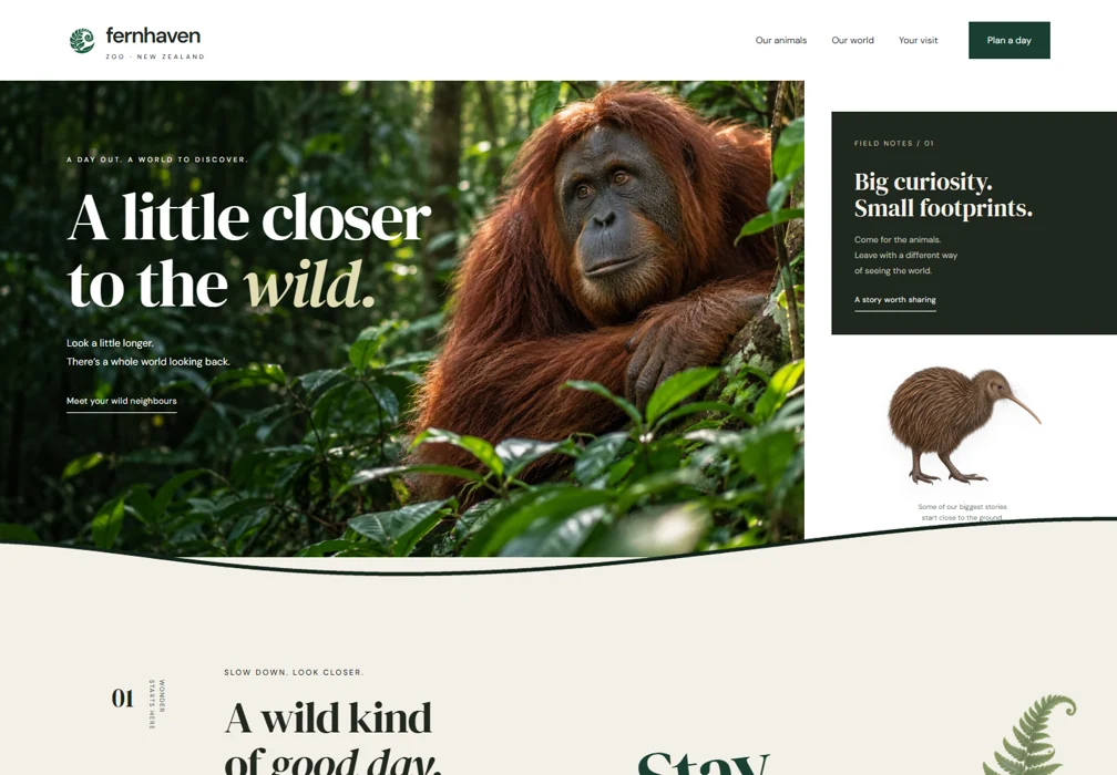
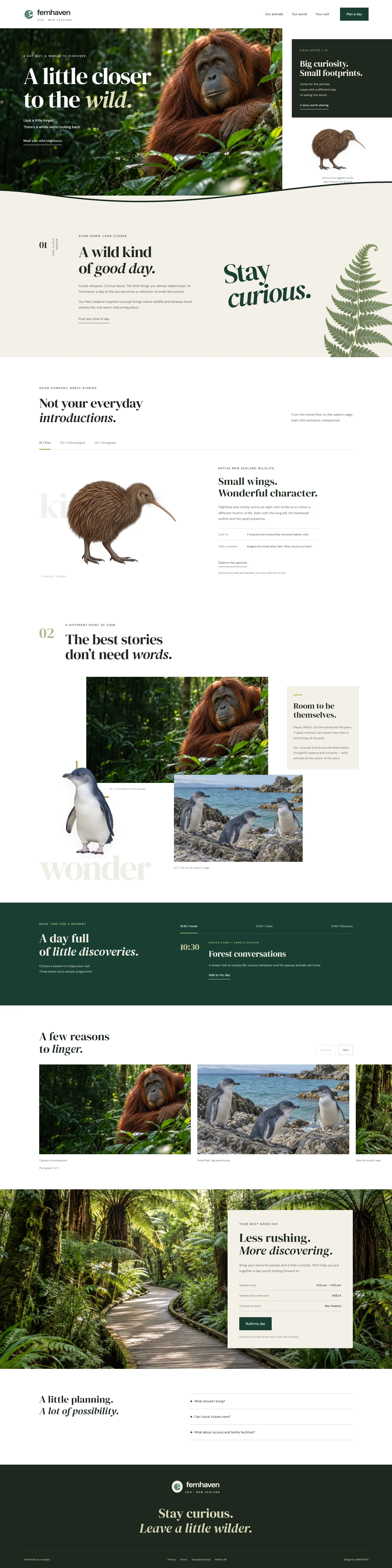
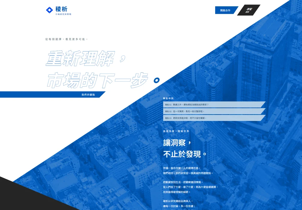
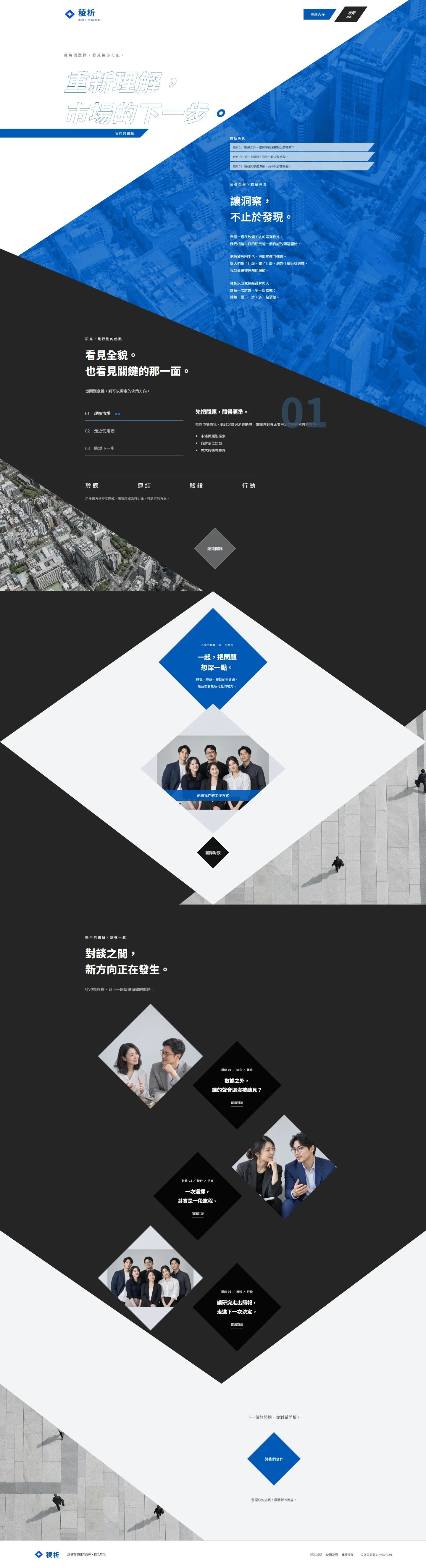
Art directionDigital experiencesThoughtful interactionCreative development
01 / A CHANGE OF PERSPECTIVE
Never one size fits all.
Different voices. Different visual worlds. Hover to explore the full page, or open a design to take your time.
Hover to explore
01 / Business
CHERRITEX 晨瑞國際
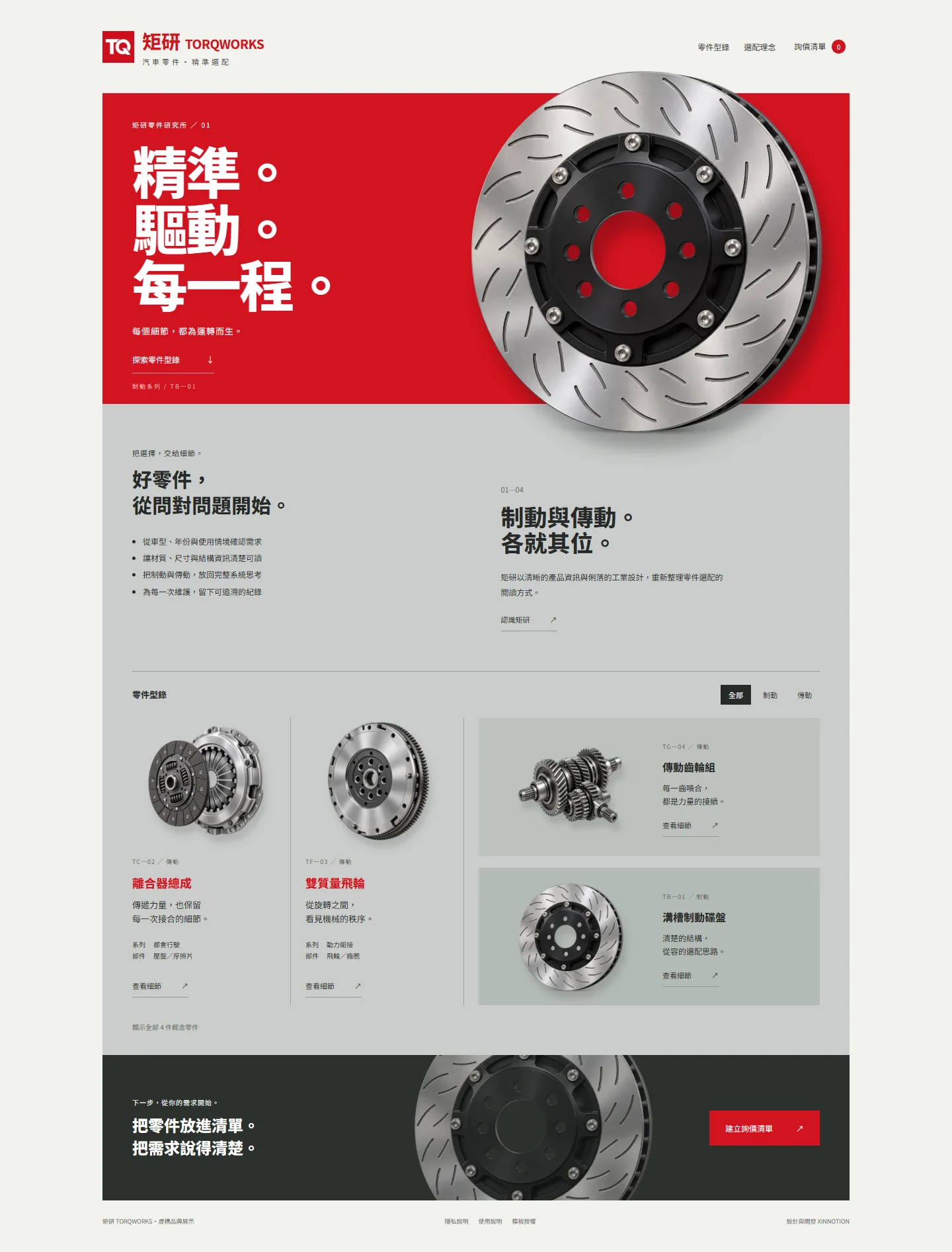
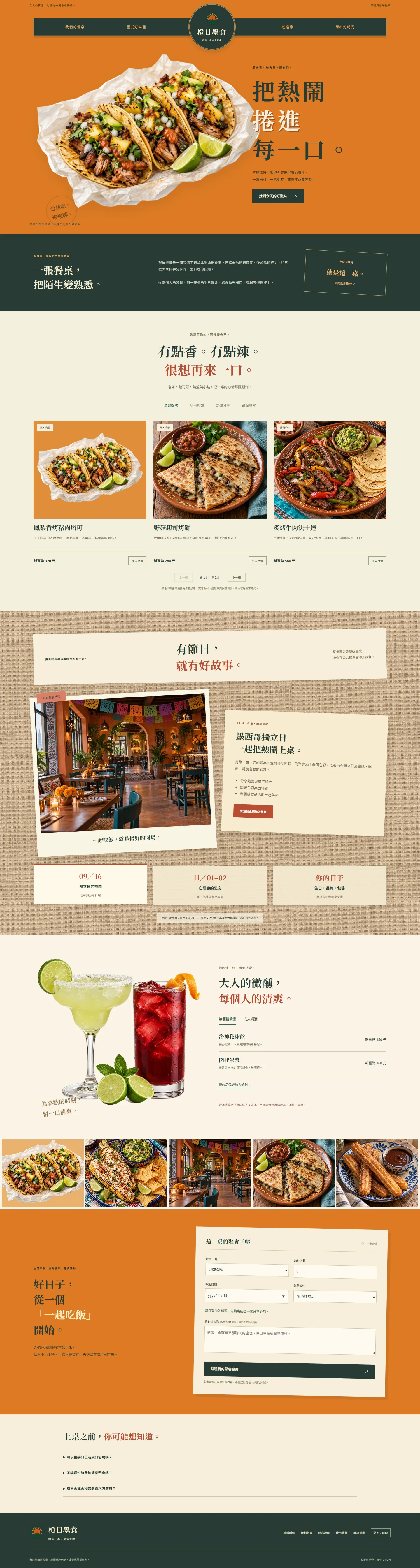
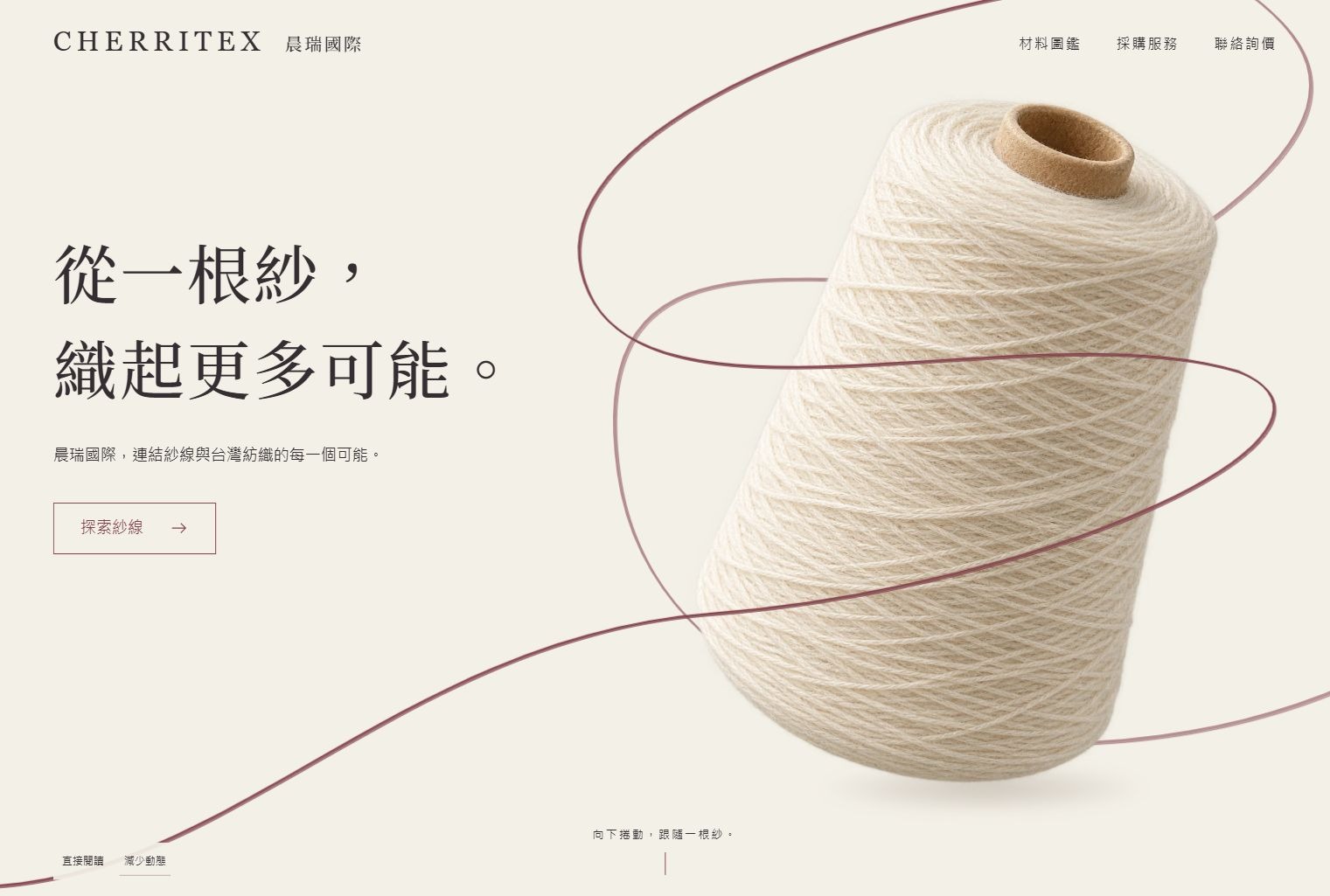
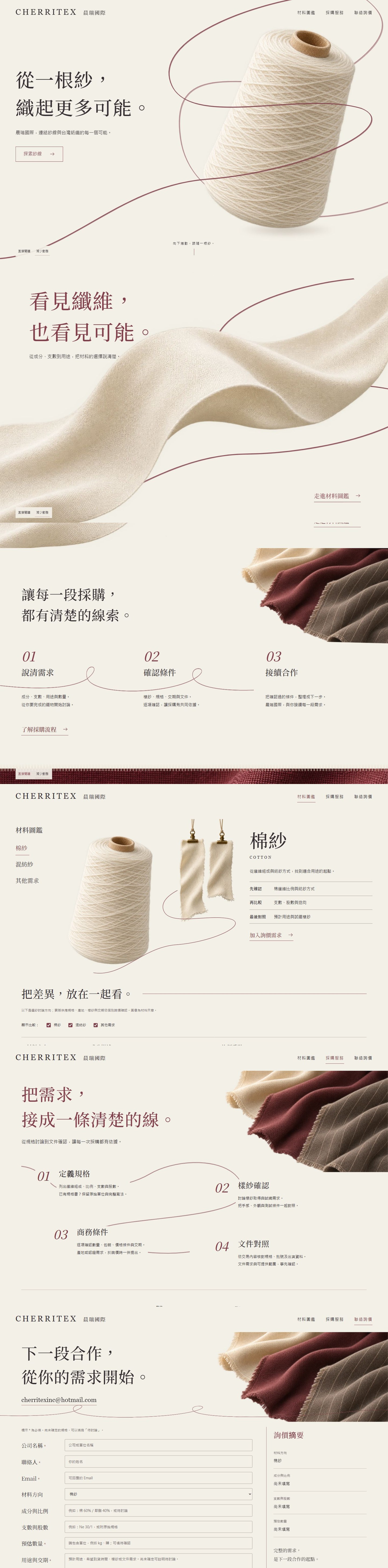
A fine thread connects yarn, fabric and procurement. A material-led website for Taiwanese yarn importer Cherritex, pairing tactile textile imagery and reversible scrolling with a useful material atlas, count converter and enquiry worksheet.
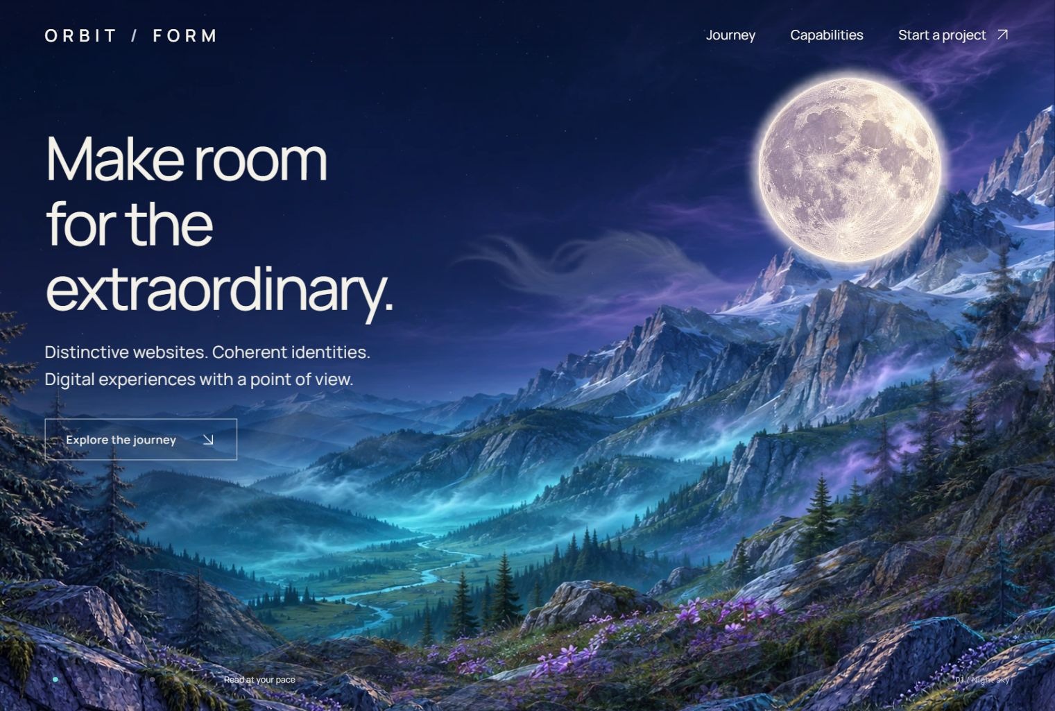
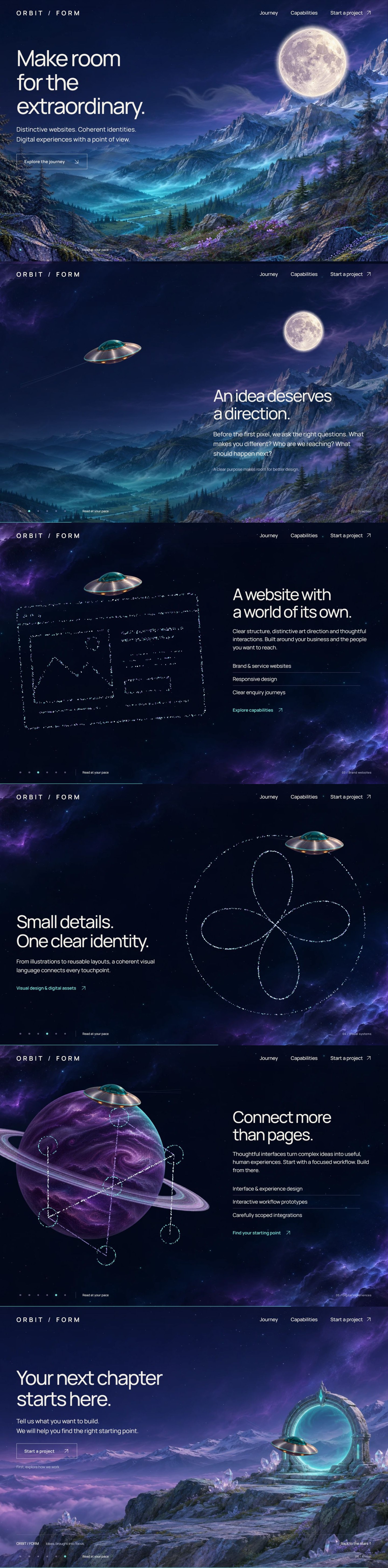
A continuous cinematic journey from a moonlit alpine valley into deep space. An orbital guide connects brand websites, visual systems and digital experiences through layered scenery, reversible flight and glowing particle formations.
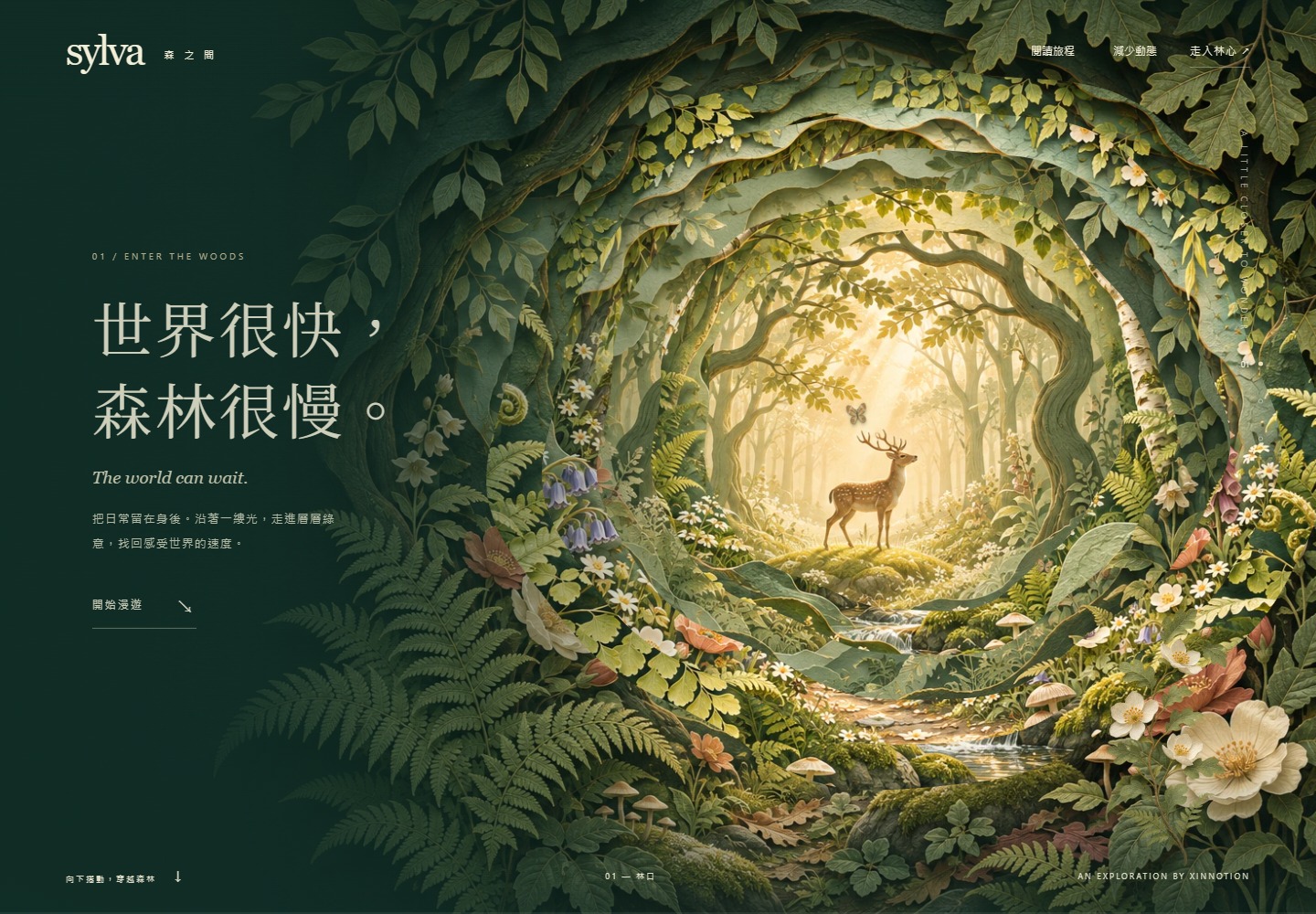
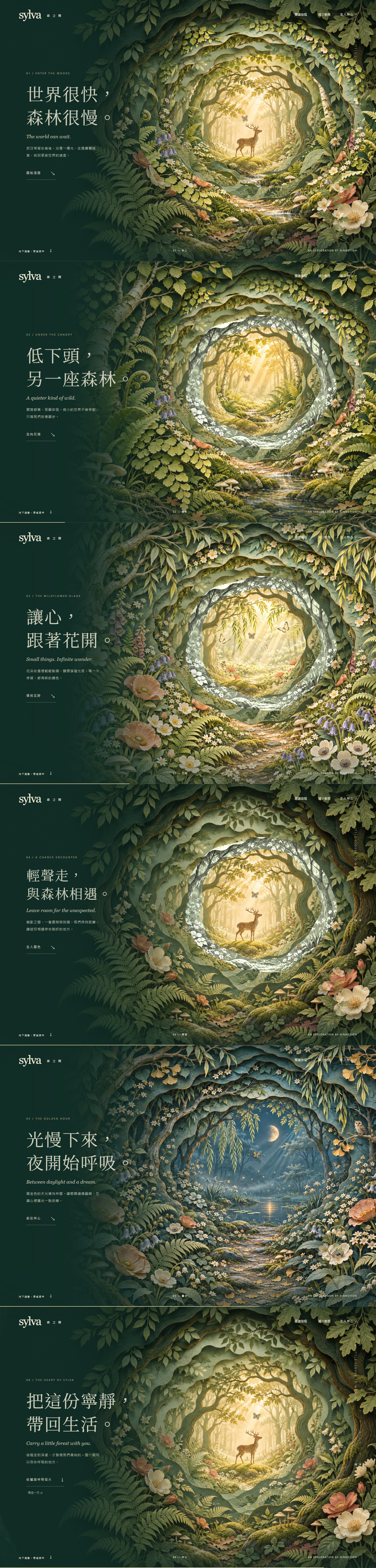
A six-chapter journey through a richly illustrated paper-cut forest. Layered botanical textures, transparent openings and reversible scrolling lead from ferns and flowers to a deer clearing and moonlit woodland.
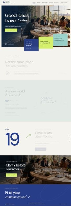
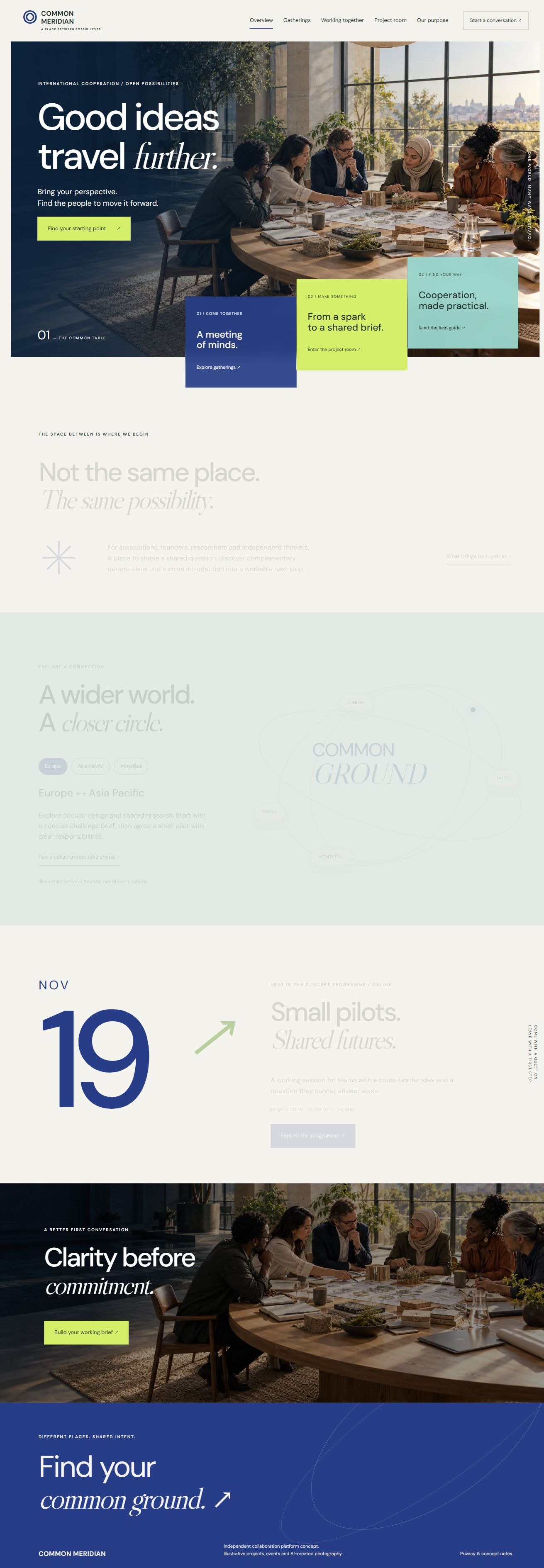
An international collaboration platform concept with five distinct pages for regional discovery, gatherings, practical guides and project dossiers. Indigo, warm paper, orbital linework and offset photography create a layered public-information experience.
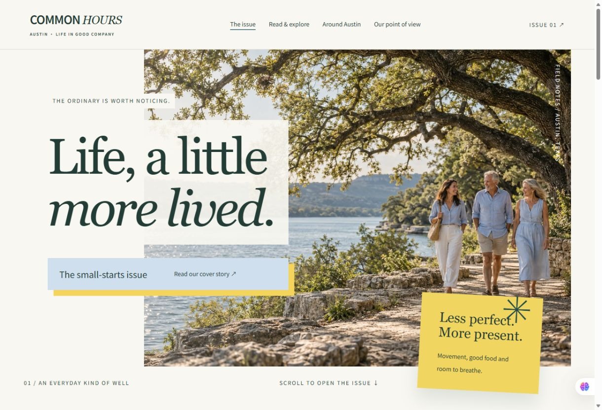
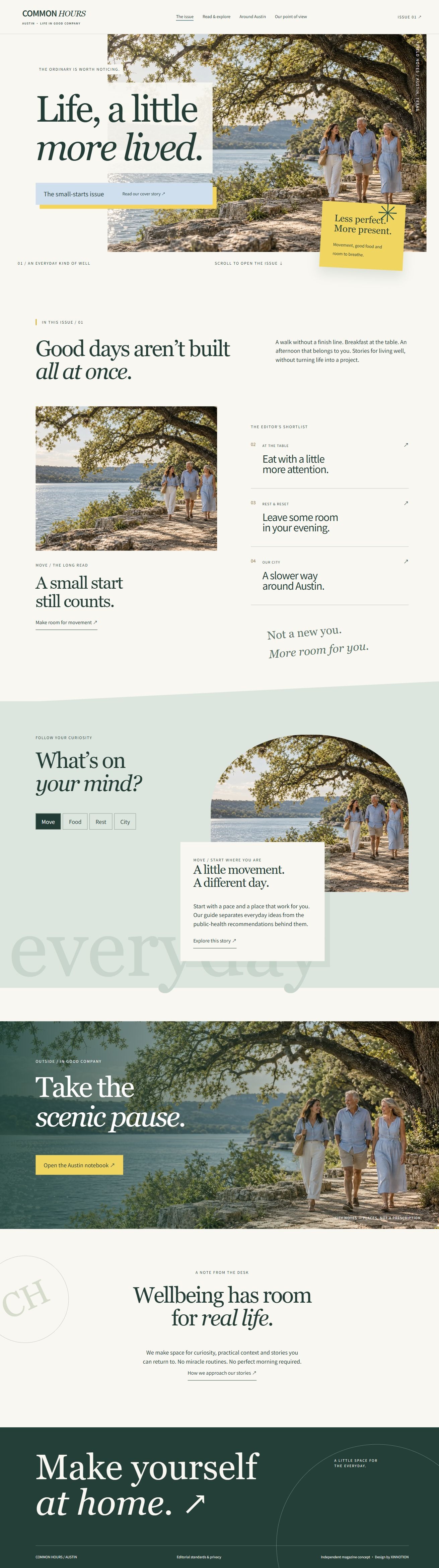
An Austin-based lifestyle and wellbeing magazine concept. Five distinct pages combine literary typography, offset photography, paper tones and delicate linework with everyday movement, food, rest and city reading.
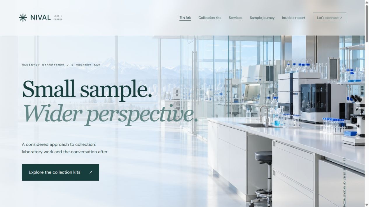
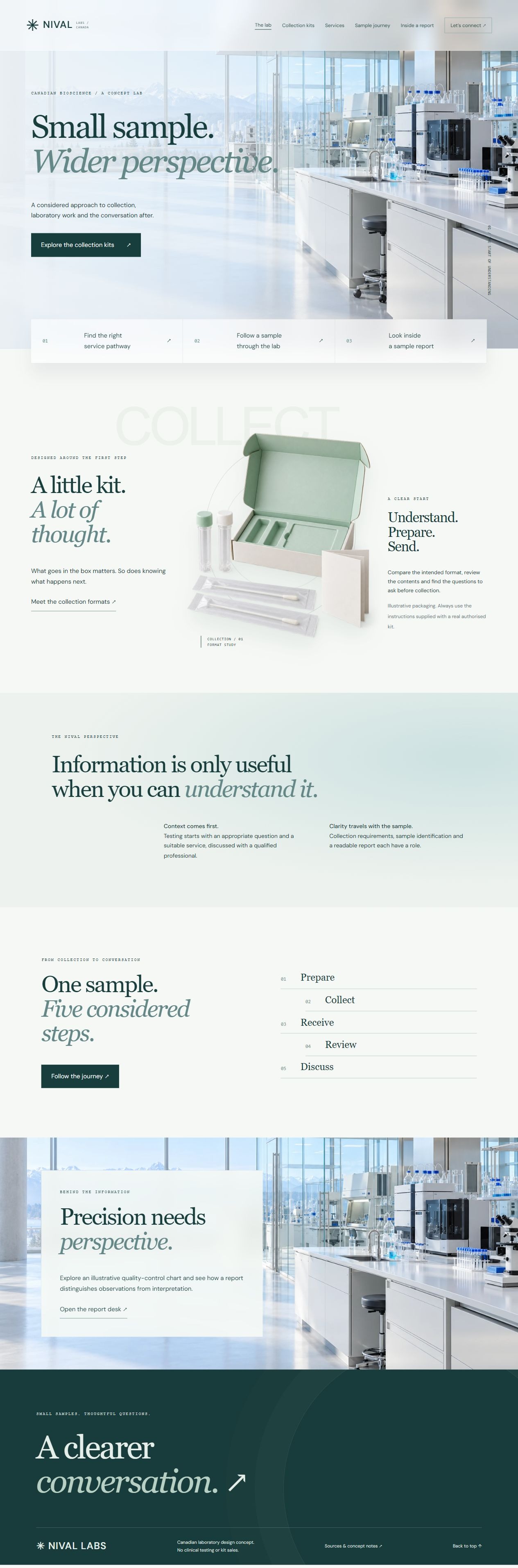
A Canadian bioscience concept in glacial blue, porcelain and deep green. Six distinct pages combine realistic laboratory imagery, a cutout collection pack, service pathways, a sample journey and an interactive synthetic quality-control report.
A fine thread connects yarn, fabric and procurement. A material-led website for Taiwanese yarn importer Cherritex, pairing tactile textile imagery and reversible scrolling with a useful material atlas, count converter and enquiry worksheet.
A continuous cinematic journey from a moonlit alpine valley into deep space. An orbital guide connects brand websites, visual systems and digital experiences through layered scenery, reversible flight and glowing particle formations.
A six-chapter journey through a richly illustrated paper-cut forest. Layered botanical textures, transparent openings and reversible scrolling lead from ferns and flowers to a deer clearing and moonlit woodland.
An international collaboration platform concept with five distinct pages for regional discovery, gatherings, practical guides and project dossiers. Indigo, warm paper, orbital linework and offset photography create a layered public-information experience.
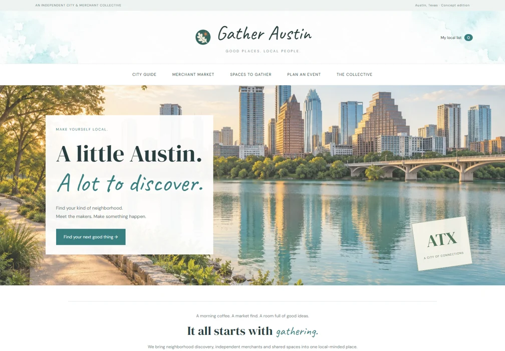
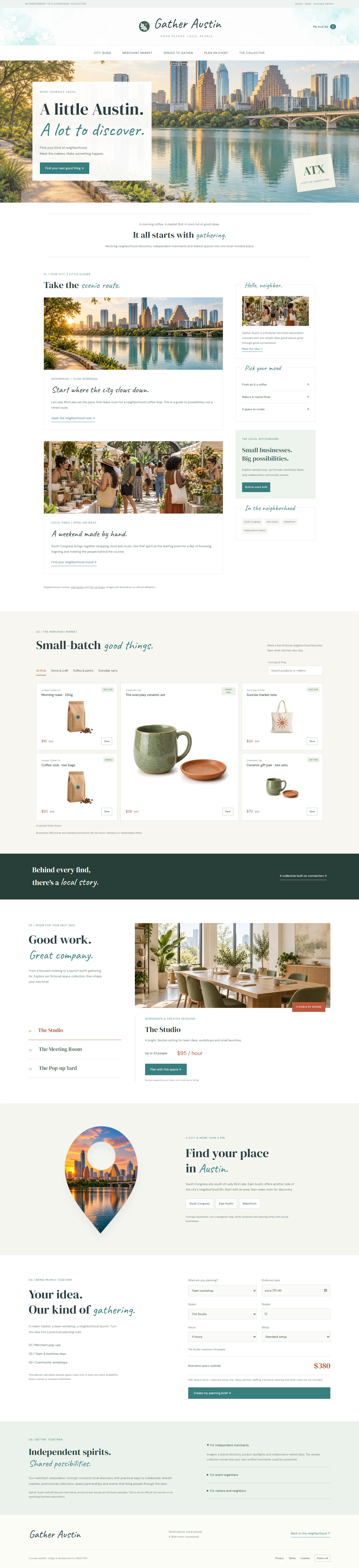
An Austin-based lifestyle and wellbeing magazine concept. Five distinct pages combine literary typography, offset photography, paper tones and delicate linework with everyday movement, food, rest and city reading.
A Canadian bioscience concept in glacial blue, porcelain and deep green. Six distinct pages combine realistic laboratory imagery, a cutout collection pack, service pathways, a sample journey and an interactive synthetic quality-control report.
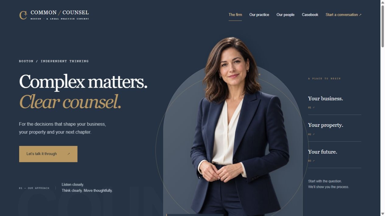
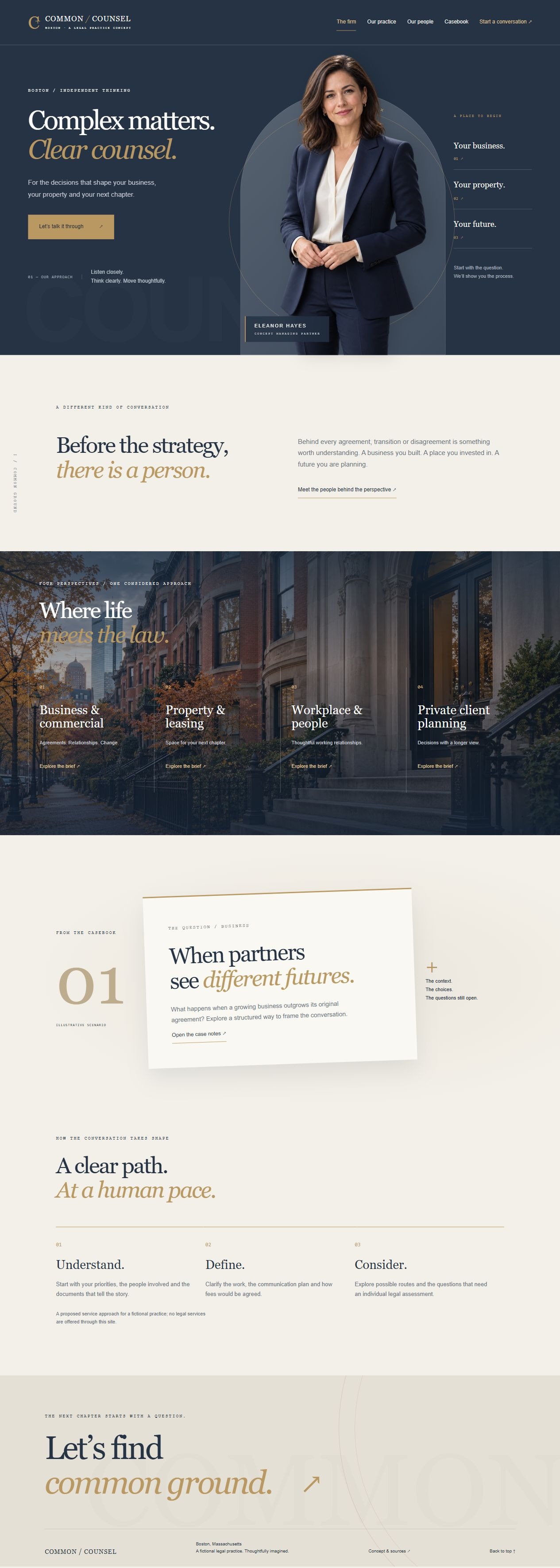
A Boston legal-practice concept in navy, limestone and brass, pairing realistic portraits with editorial dossiers. Six distinct pages cover practice areas, people, scenario case studies, conversation preparation and source notes.
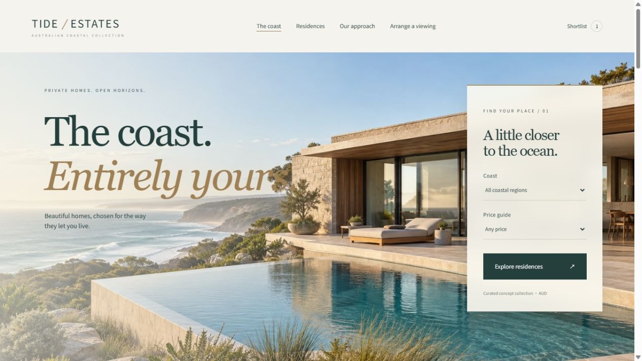
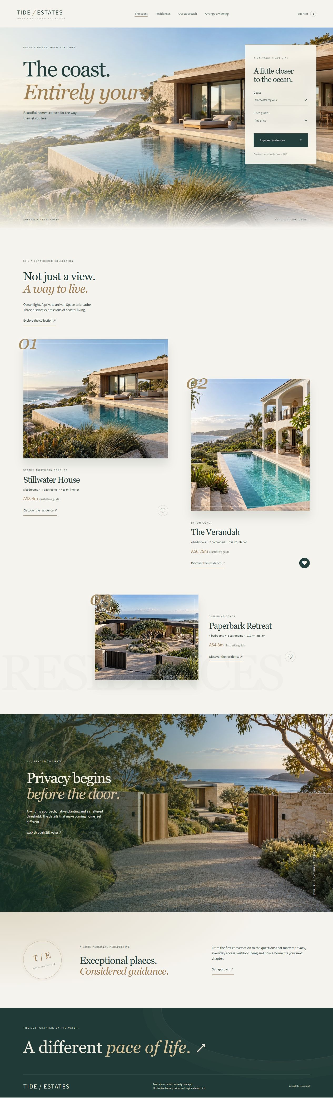
An Australian coastal real-estate concept pairing oceanfront architecture, private gardens and quiet editorial luxury. Six page types cover discovery, a regional map, residence details, agency services and viewing enquiries.
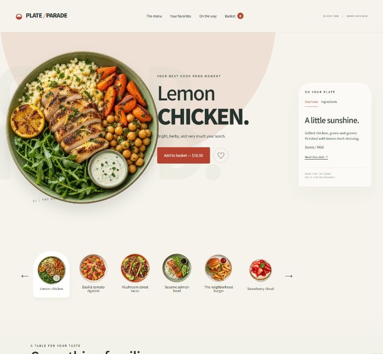
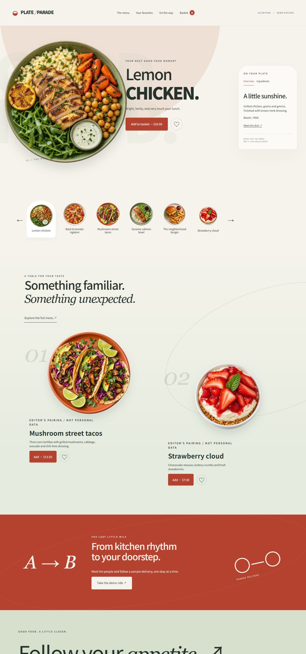
A US food-ordering concept with realistic isolated dishes, a sliding plate strip and warm cream styling. Six distinct page experiences cover categories, favourites, basket calculations, ingredients and a simulated delivery map.
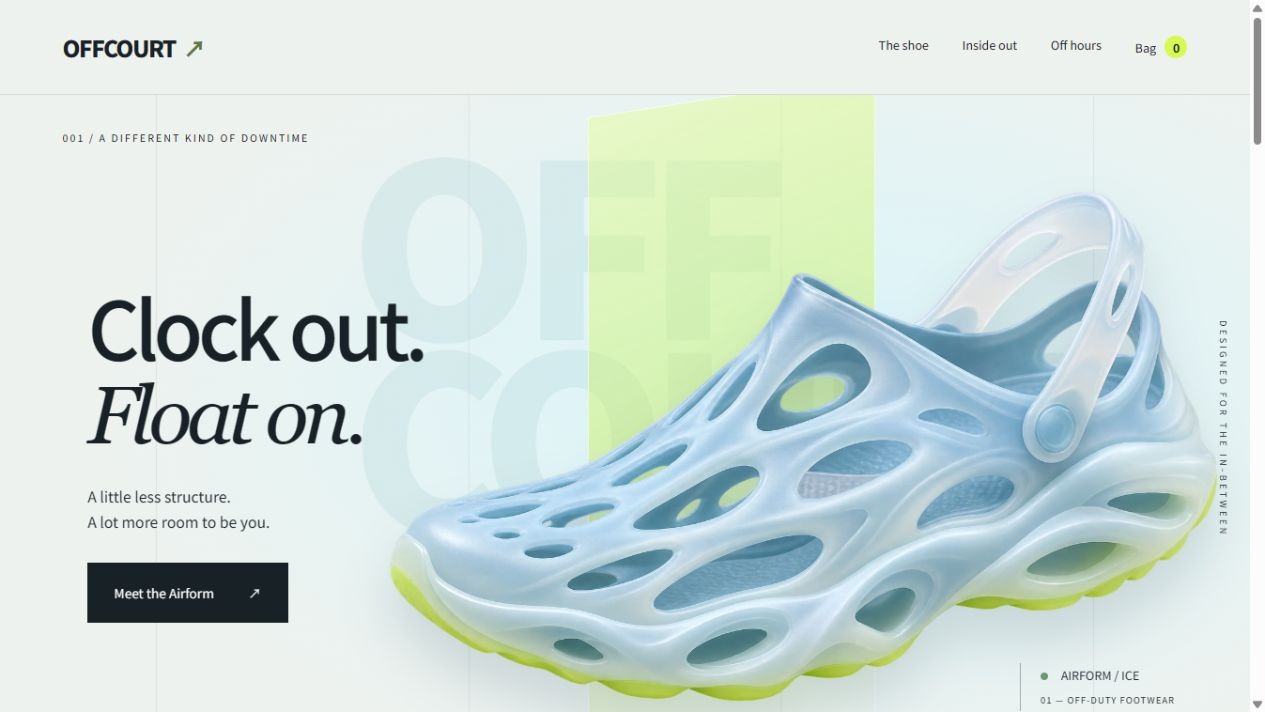
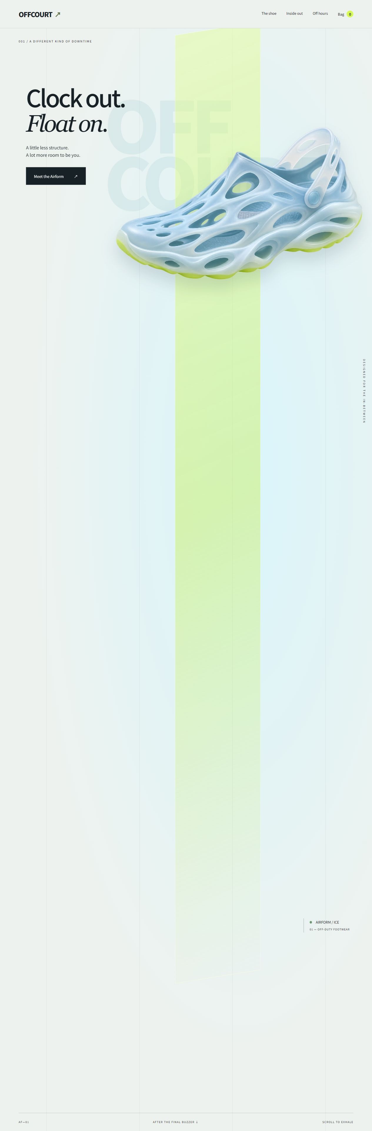
An original five-page aerated footwear concept with translucent product imagery, court-line graphics, colour and size selection, a local shopping bag, interactive construction notes and real sports photography.
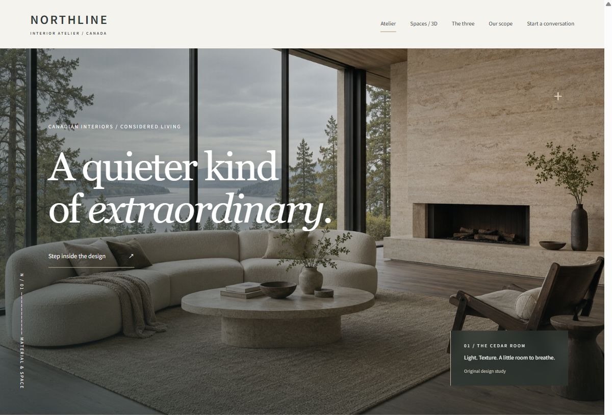
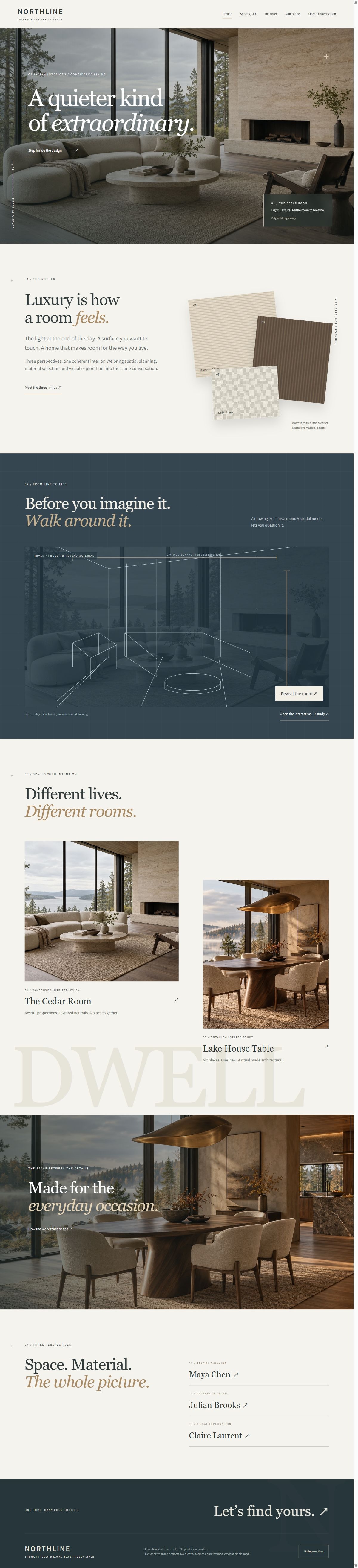
A five-page Canadian interior atelier concept with three design perspectives, tactile material compositions, blueprint reveals, an interactive 3D room and a local consultation brief builder.
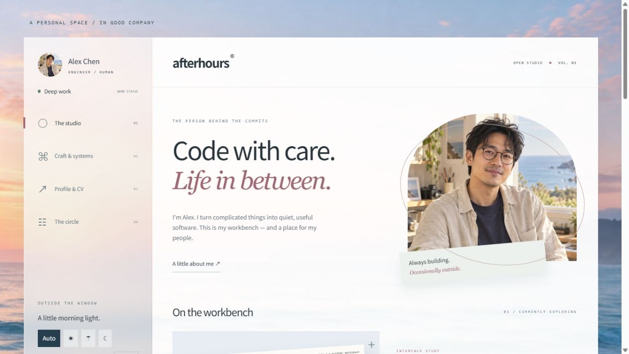
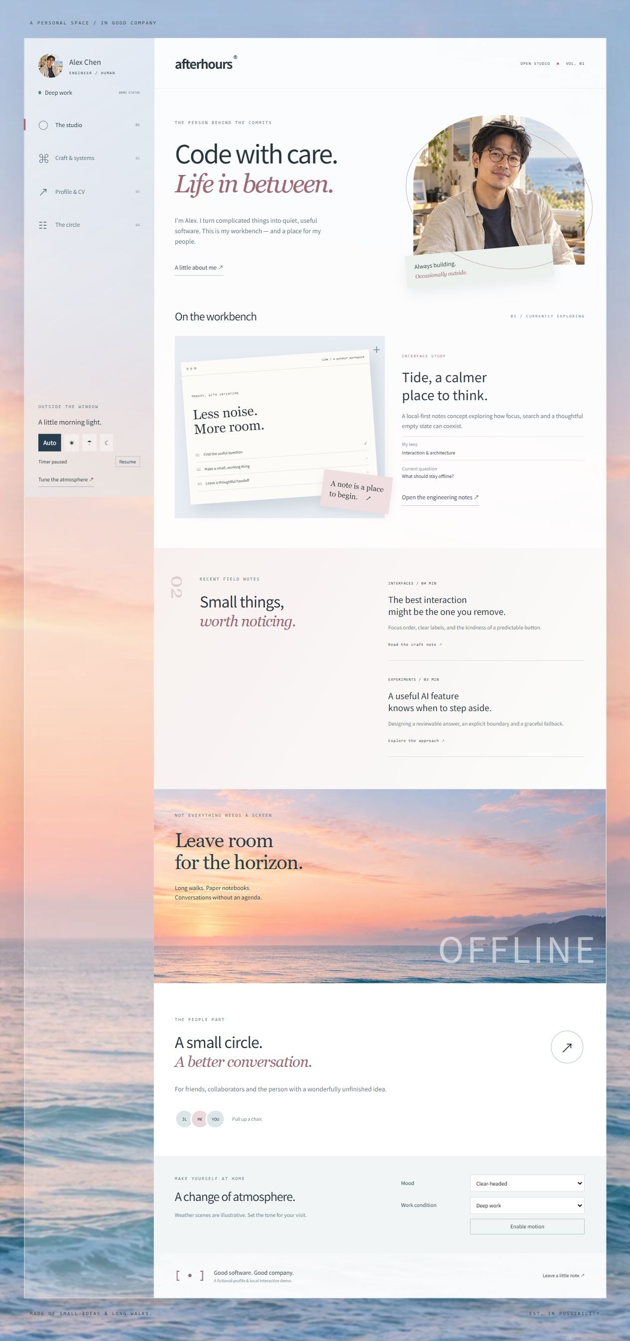
A four-page developer profile concept with a frosted sidebar, timed coastal backgrounds, an interactive skill atlas, an evidence-aware CV and a local message board.
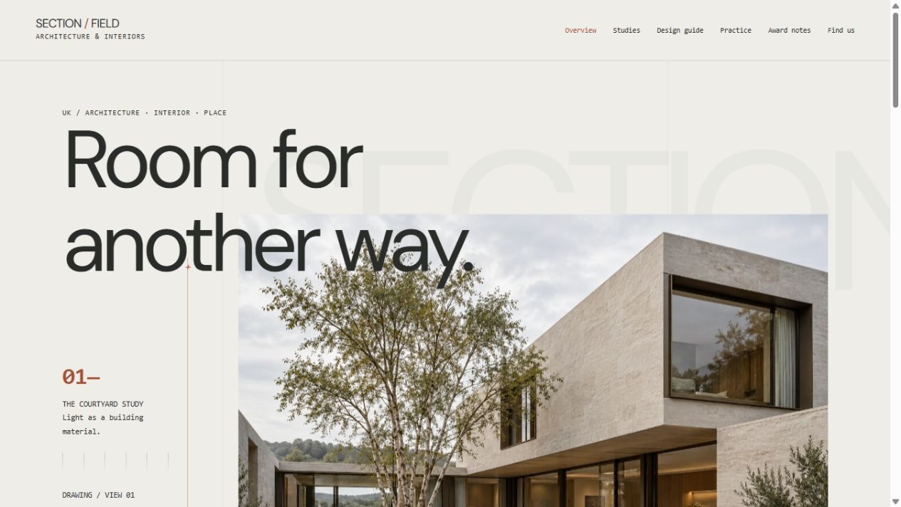
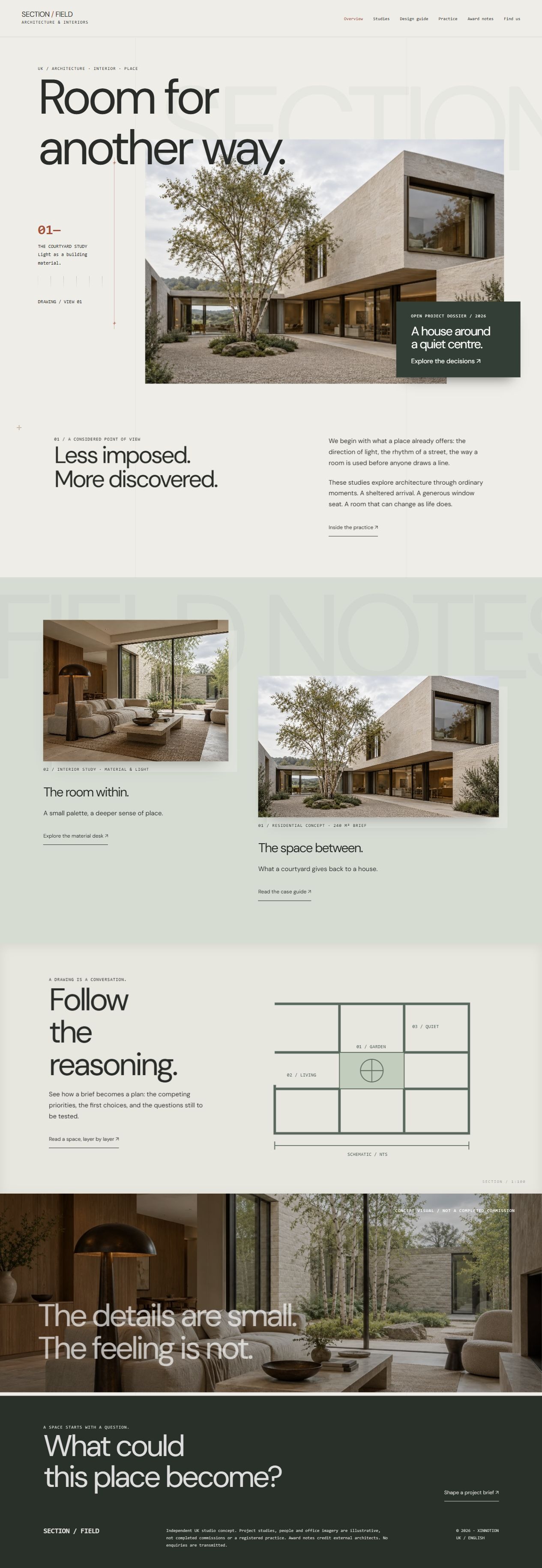
An eight-page UK architecture studio concept, combining offset architectural imagery, annotated plans, a material workbench and oversized ambient typography.
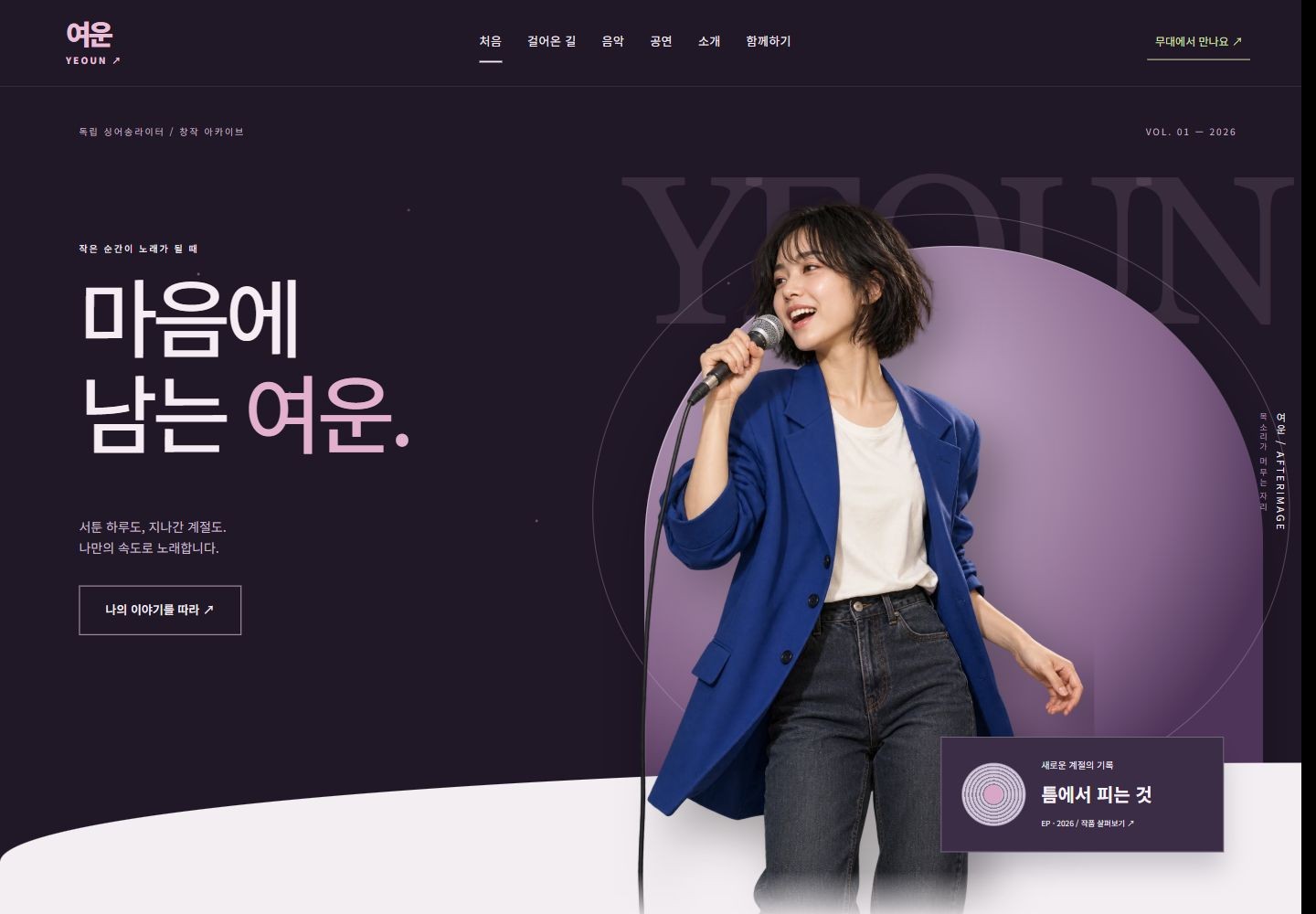
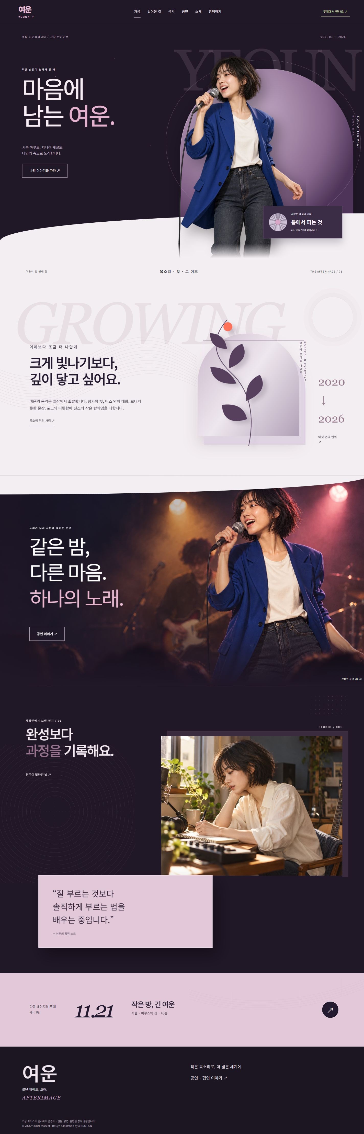
YEOUN AFTERIMAGE reimagines a Korean independent artist through ink-plum stage scenes, pearl-pink editorial surfaces, silver discs and overlapping portraits. Six distinct pages explore the creative timeline, production notes, show sequences, an artist interview and backstage collaboration briefs with reversible scroll motion.
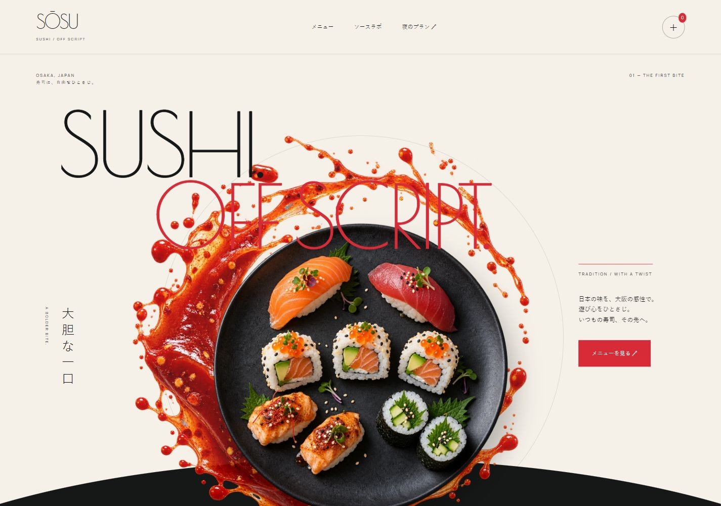
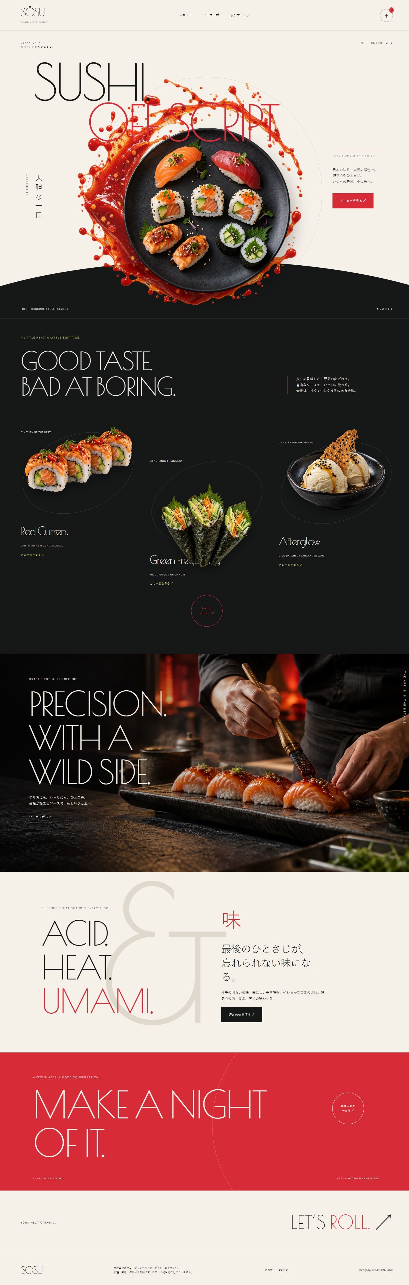
SŌSU combines sauce splashes, floating plates, expressive typography and reversible parallax. Five distinct pages cover a Japanese menu, dish studies, sauce concept diagrams and an evening planner.
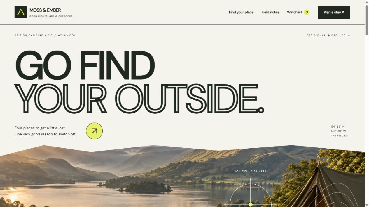
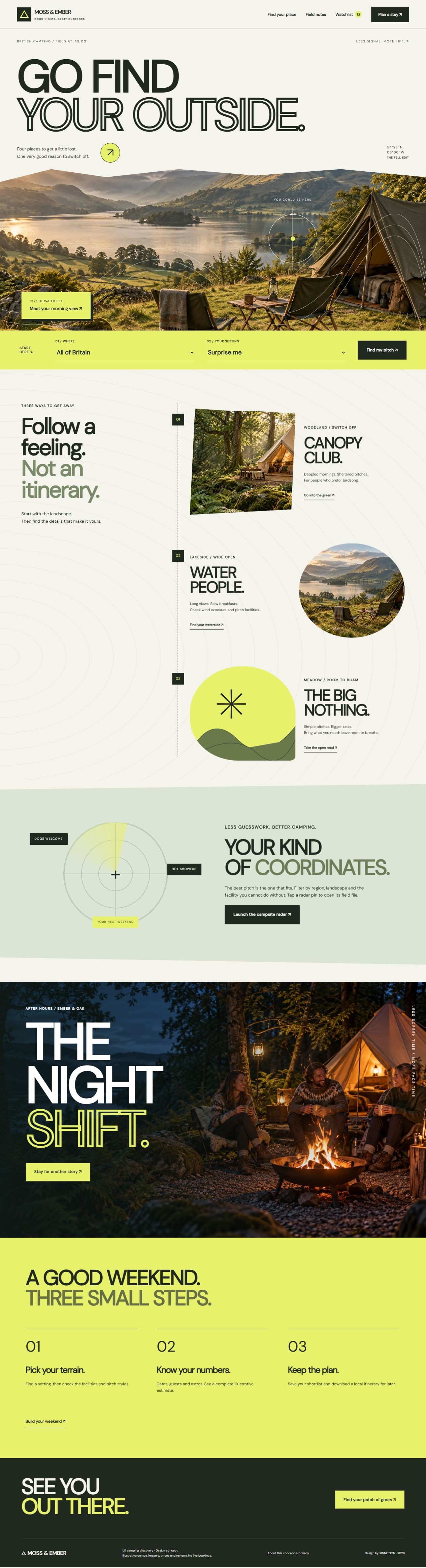
A British expedition atlas across six distinct pages: outlined cover typography, panoramic fell scenery, a connected landscape trail, campsite radar, yellow location dossiers, a departure desk and a blue personal shortlist. Working filters, review examples, comparison and itemised estimates connect the journey.
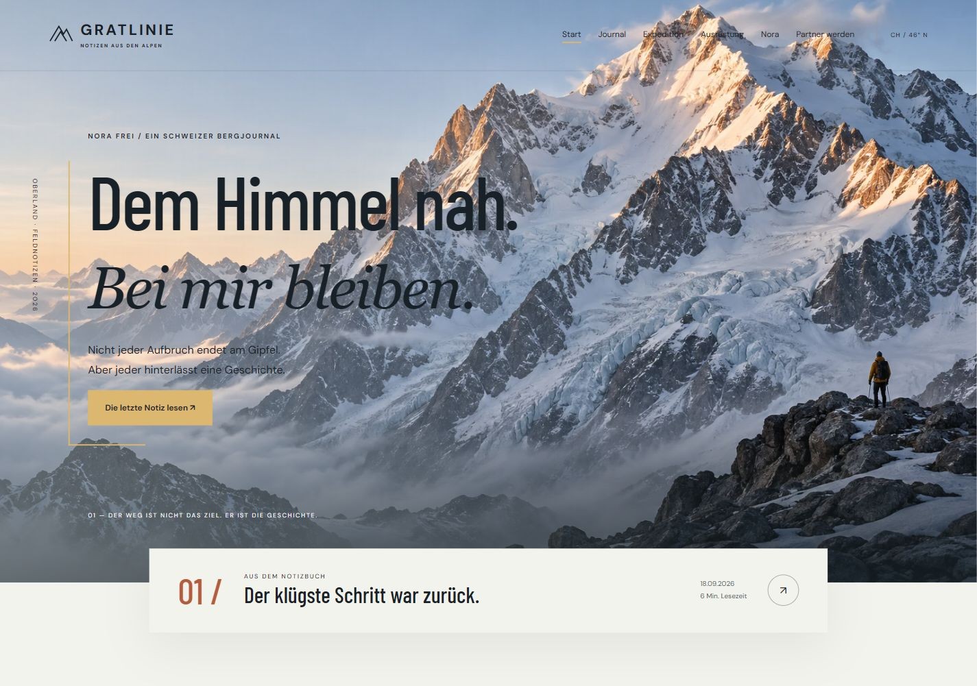
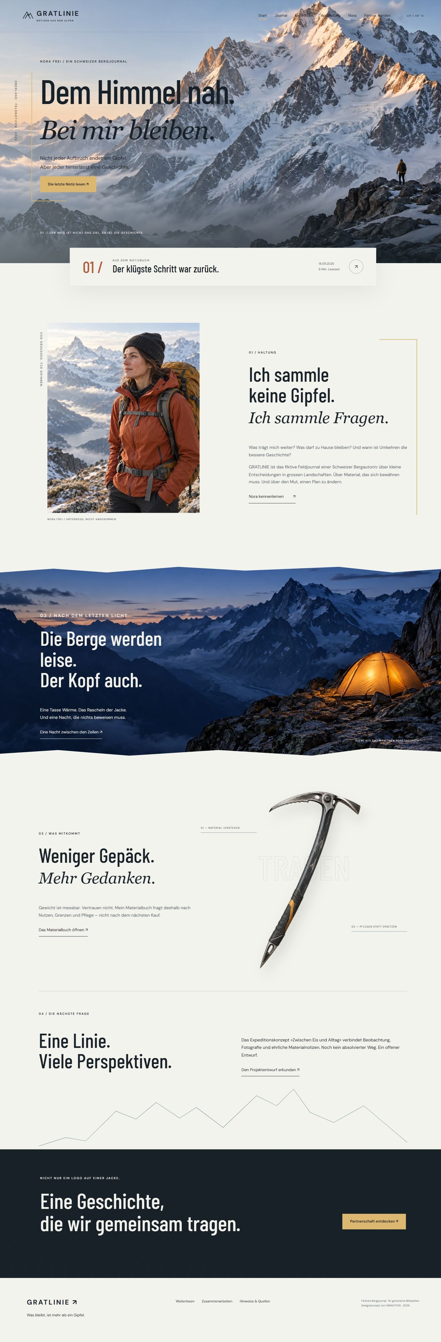
GRATLINIE is a Swiss-inspired mountaineer journal concept. Immersive mountain scenes, alpine camp photography and isolated equipment connect complete diary essays, expedition phases, a pack-weight workbench and a sponsorship brief across eight distinct pages.
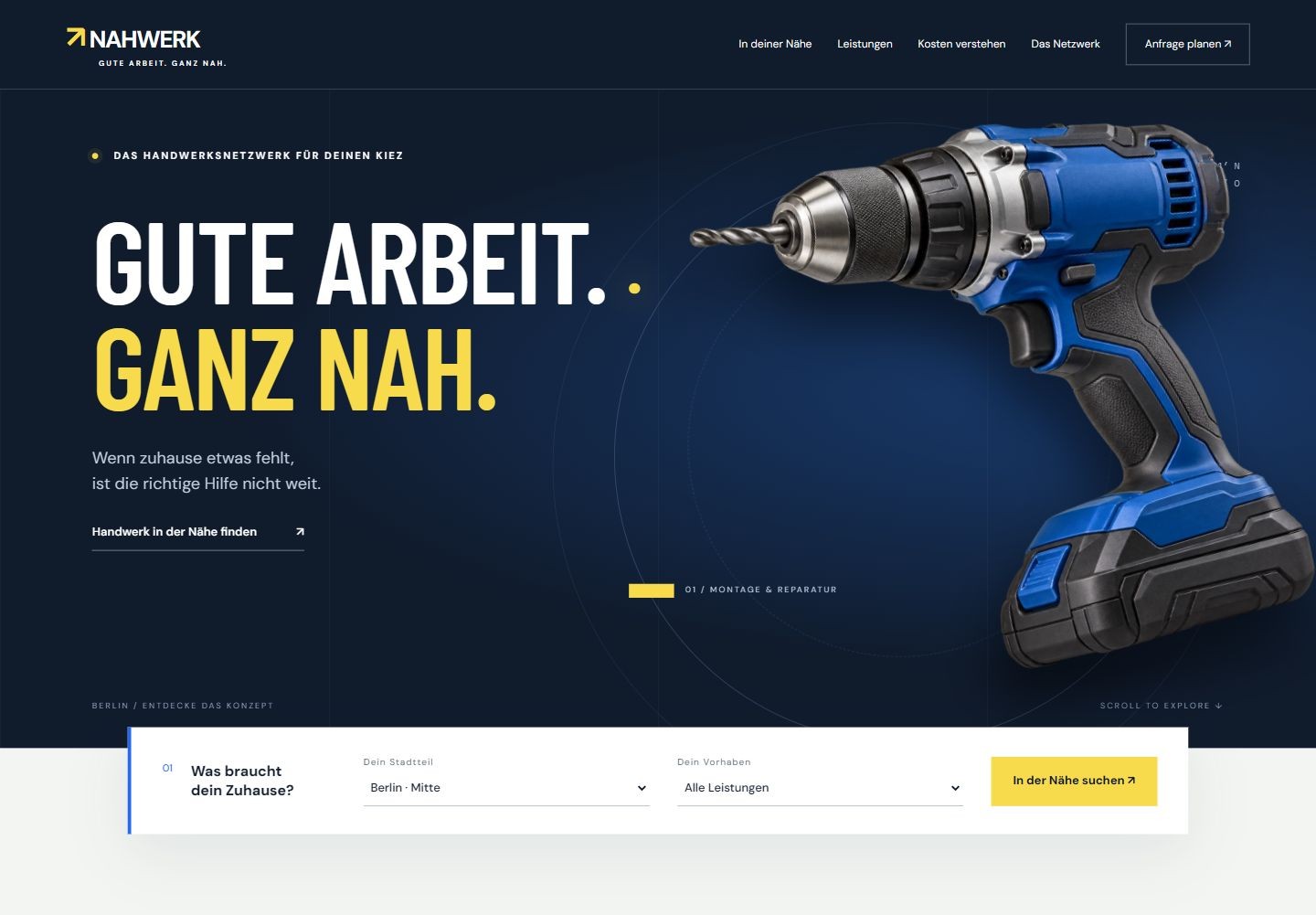
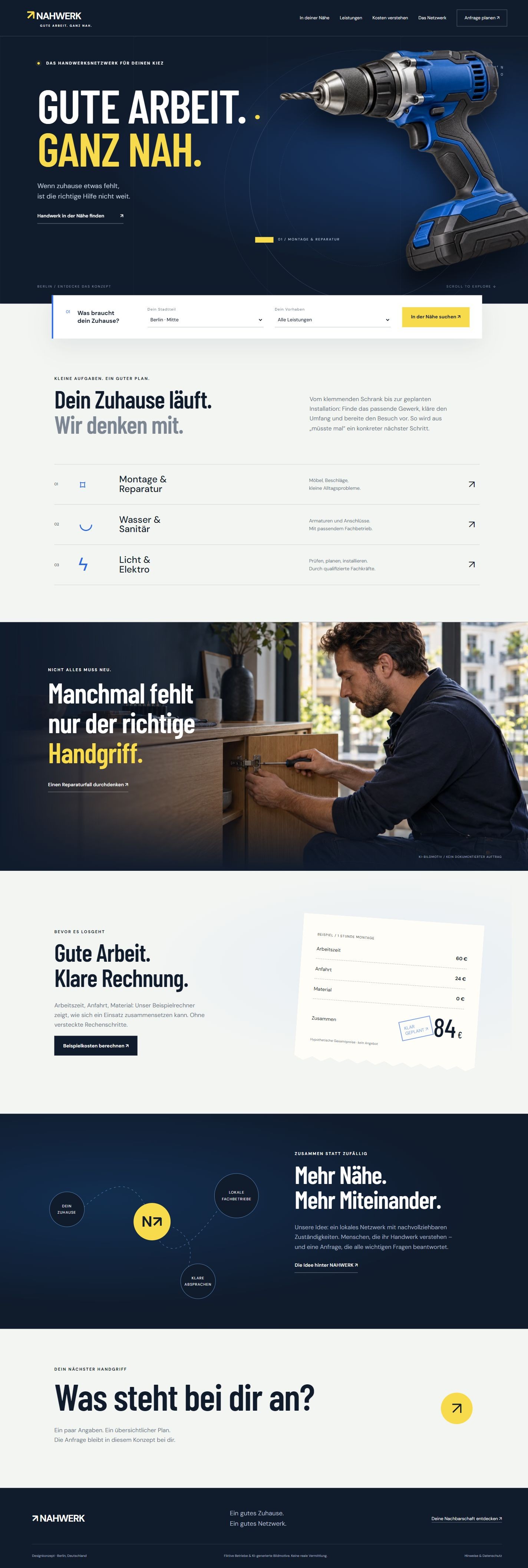
NAHWERK is a German-language local handyman network concept. An industrial tool-led scene connects a real Berlin map, fictional provider profiles, service scope, transparent cost breakdowns and a local enquiry memo across eight distinct pages.
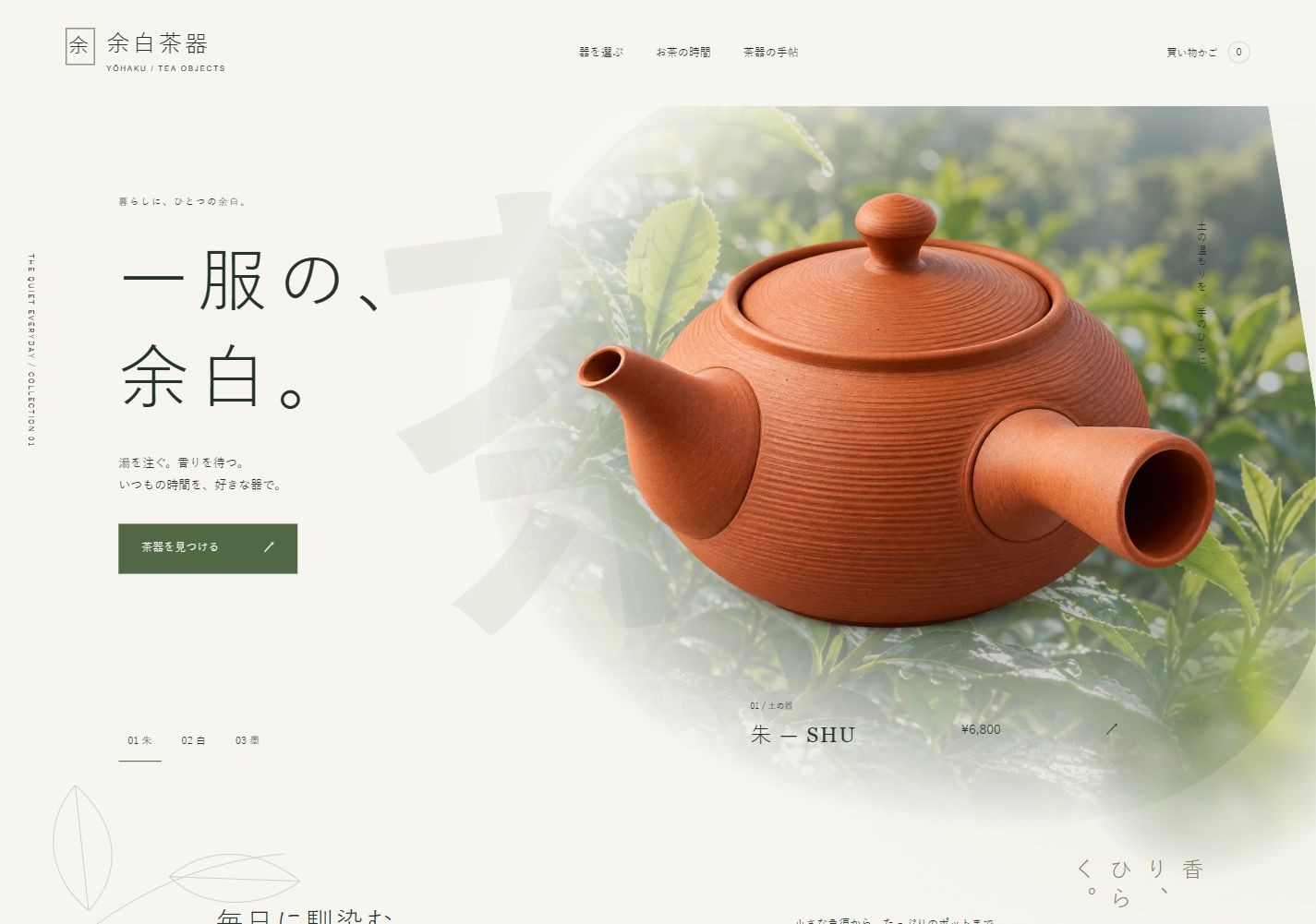
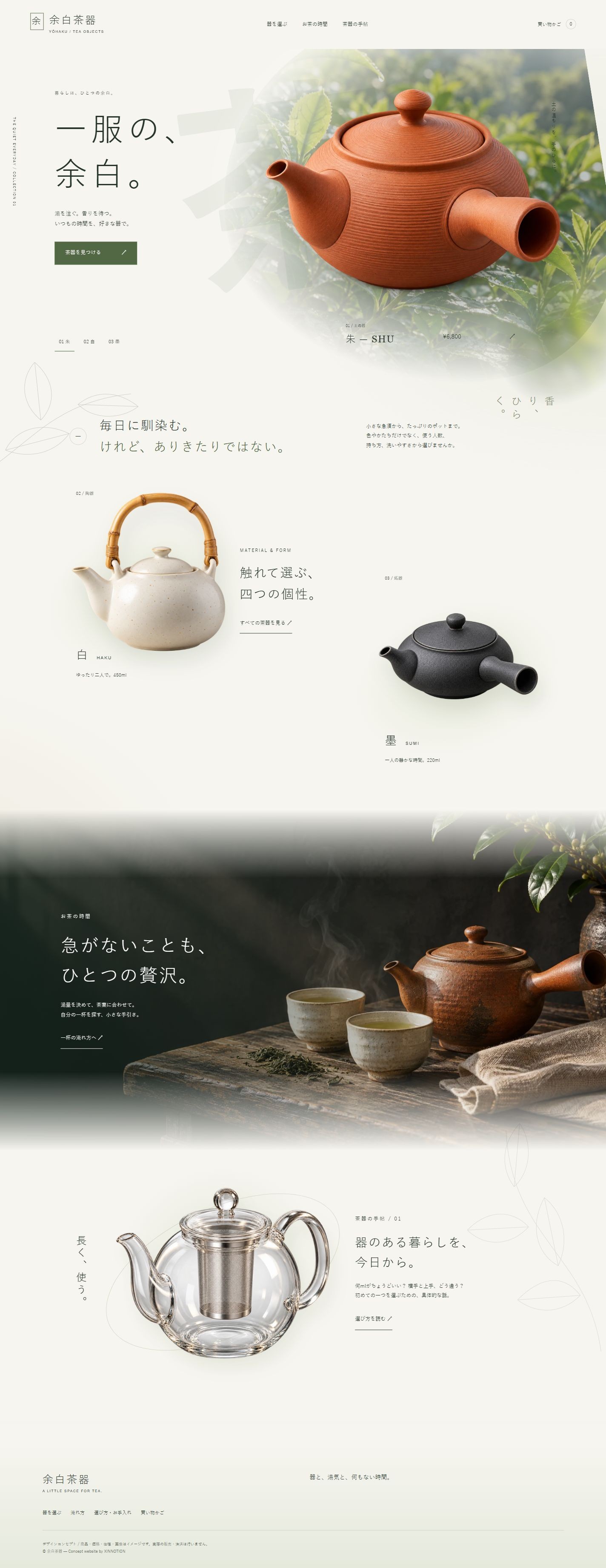
YŌHAKU is a Japanese teaware store concept. A diagonal tea-leaf window, floating kyusu, staggered object exhibition, specification plates and a brewing path connect six distinct pages for discovery, comparison, water calculation and a local shopping memo.
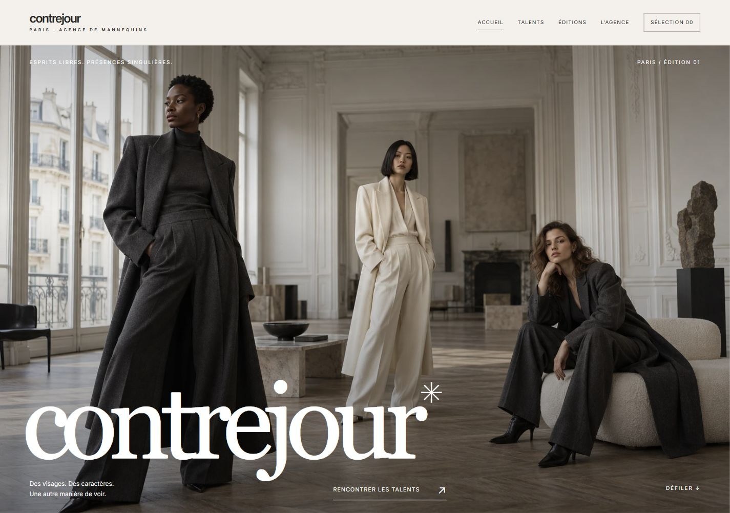
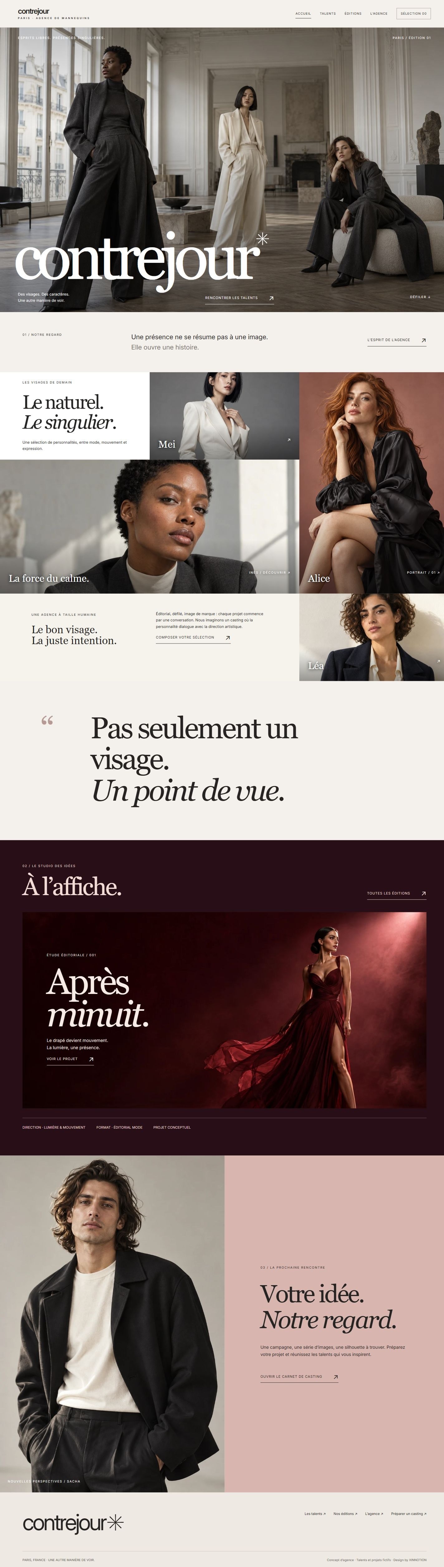
CONTREJOUR is a Paris model agency concept. Editorial photography, seamless image mosaics and a burgundy screening room connect six distinct pages, a staggered talent directory, individual profiles, creative project notes and a downloadable casting brief.
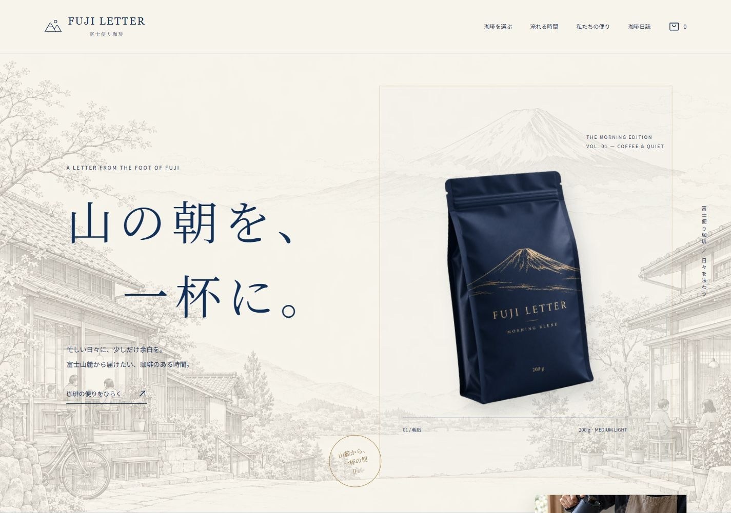
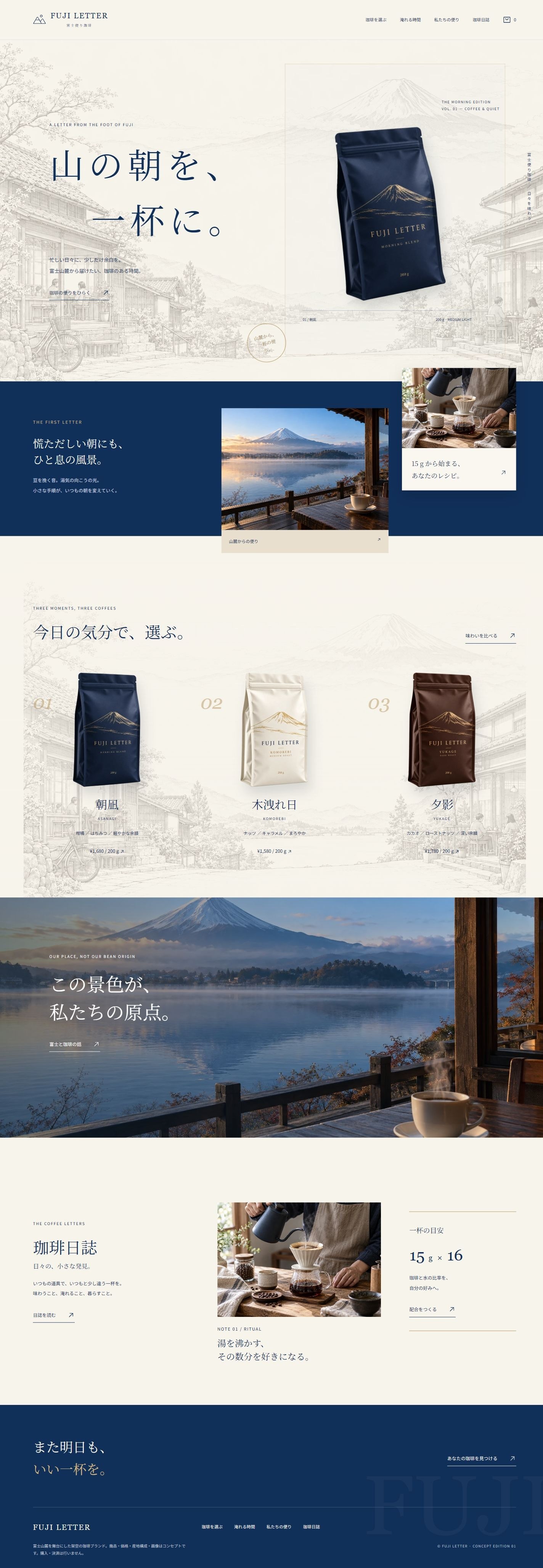
FUJI LETTER is a Japanese coffee brand concept set at the foot of Mount Fuji. Indigo packaging, pale illustrated streets and editorial typography connect seven distinct pages for roast discovery, product specifications, brewing ratios, brand narrative, coffee notes and a saved selection memo.
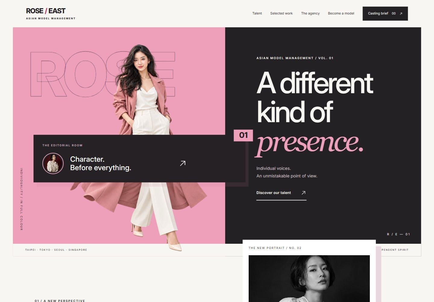
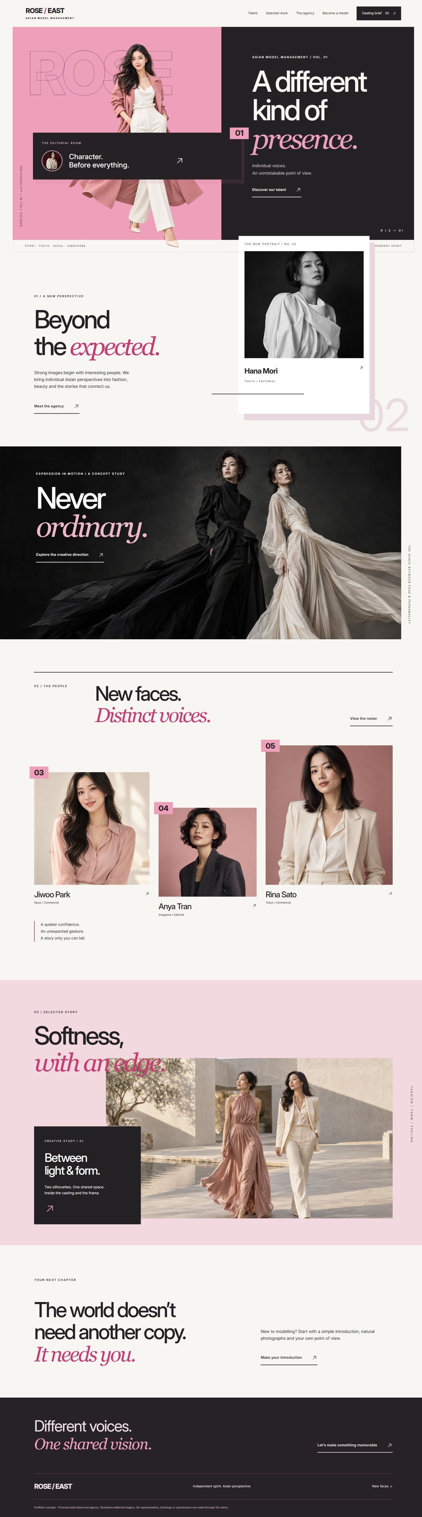
ROSE / EAST is an Asian model agency concept in blush, deep berry and original editorial portraits. Seven distinct pages connect a talent roster, individual profiles, concept stories, representation philosophy, application preparation and a downloadable casting brief. Version 1.1 rebuilds the visual system as a casting contact sheet, portrait folio, editorial pinboard, agency image bridge, new-face photo guide and production call sheet.
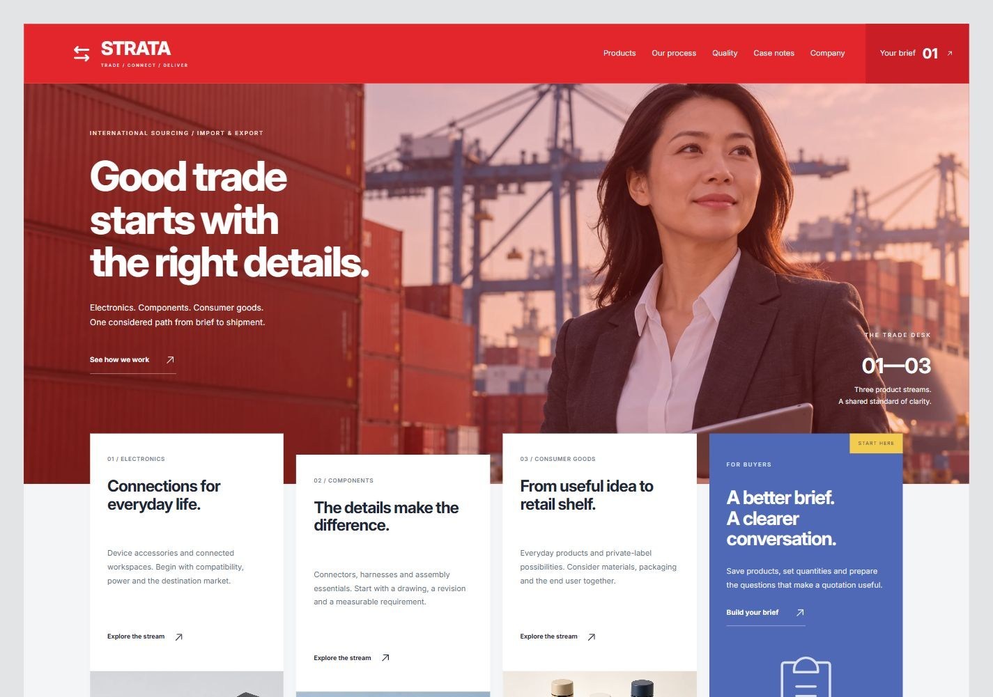
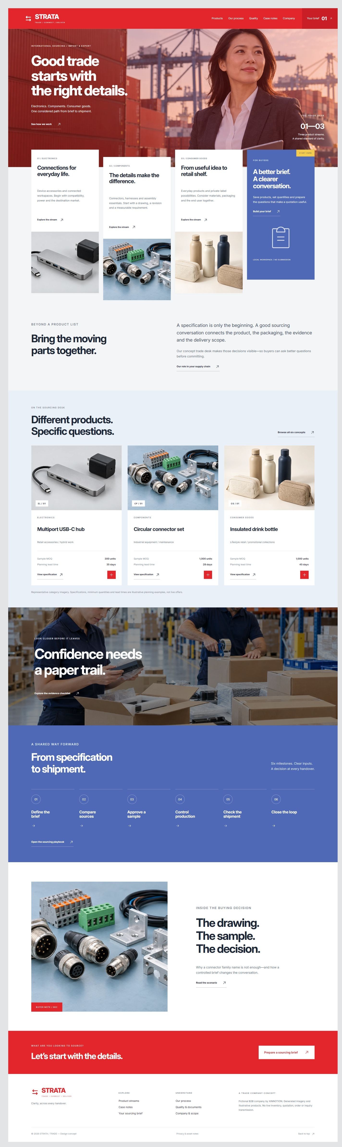
STRATA / TRADE is an import and export company concept. A red editorial hero, staggered product columns and a blue process section connect electronics, components and consumer goods. Eight pages cover six buying briefs, specifications, document review, sourcing scenarios and a downloadable RFQ workspace. Version 1.1 gives each inner page its own composition through editorial spreads, annotated imagery, inspection framing, layered documents and a cost receipt.
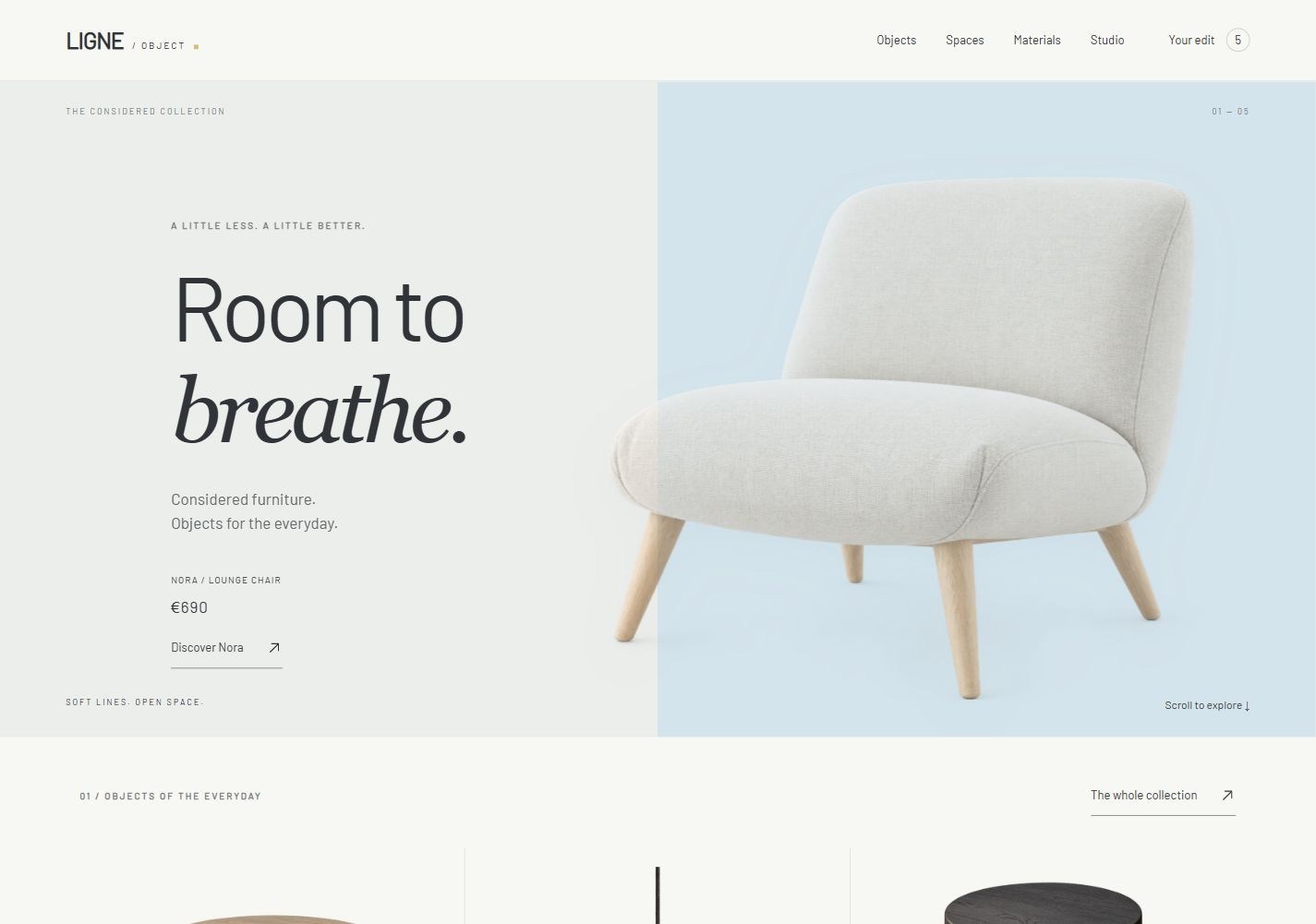
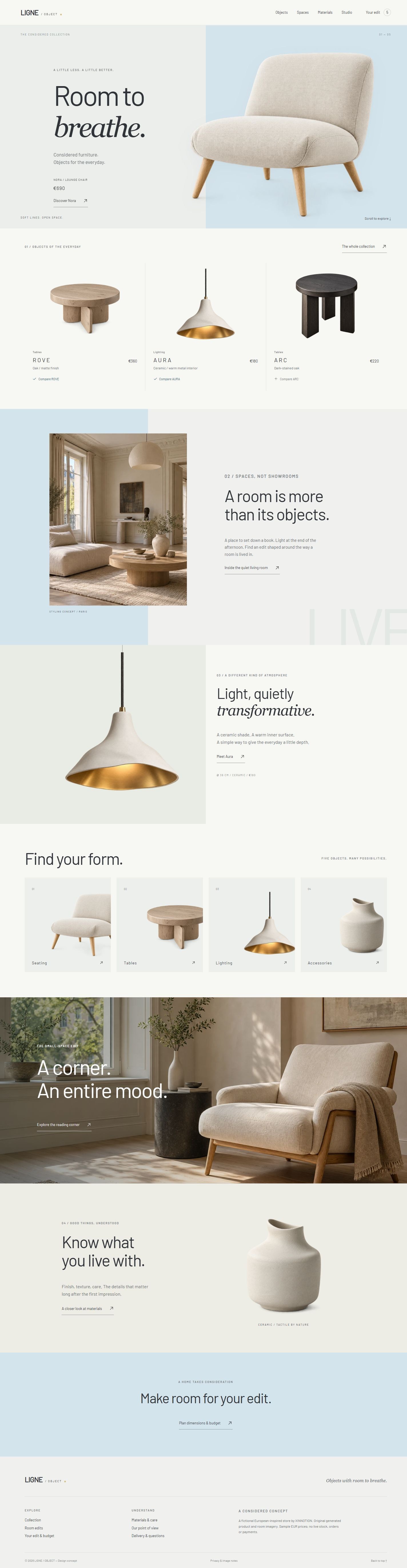
LIGNE / OBJECT is a modern European minimalist furniture and accessories concept. Powder-blue and sage fields, oversized isolated furniture, suspended lighting and realistic interiors connect eight distinct pages. Specifications, care, room studies, filters, comparison and a planning budget support considered selection.
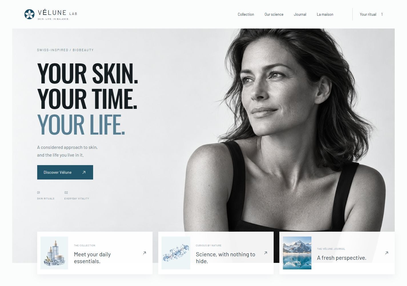
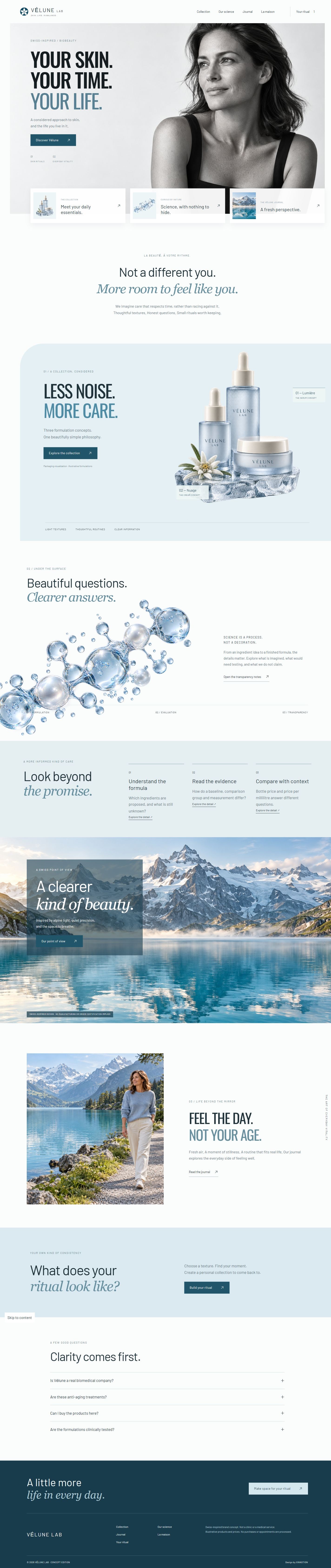
VÉLUNE LAB is a Swiss-inspired biobeauty concept combining monochrome portraiture, ice-blue product still life, transparent molecular imagery and panoramic alpine scenery. Seven pages connect formula discovery, science transparency, editorial stories and a locally saved, downloadable ritual. Version 1.1 adds substantive topic content, interactive comparisons, case analysis and sources; all synthetic datasets and sample reviews are clearly labeled.
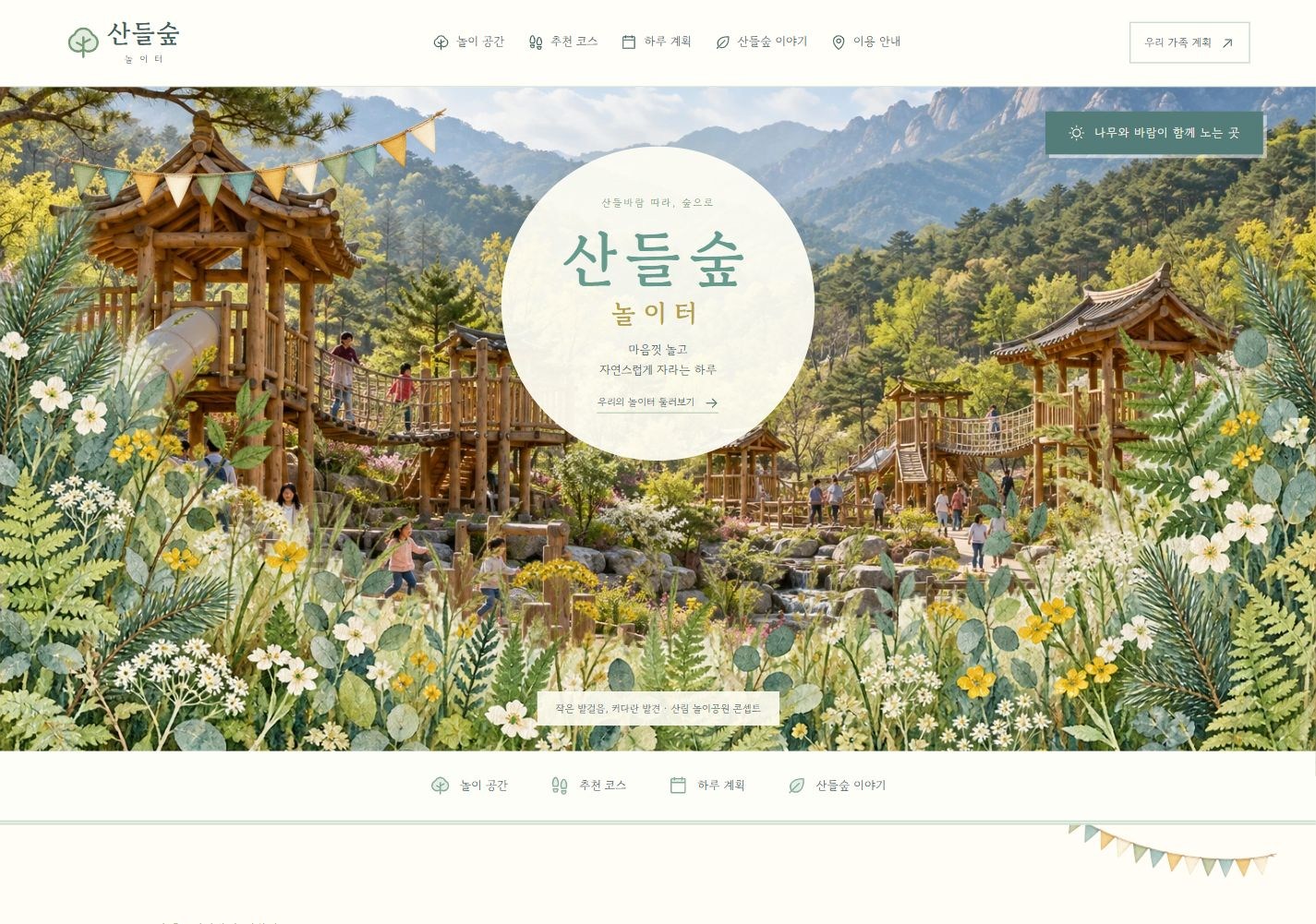
SANDEUL FOREST is a Korean mountain family-park concept. Seven Korean-language pages combine traditional timber play, woodland challenges, a miniature train and picnic scenes with facility discovery, suggested routes and a family-day planner.
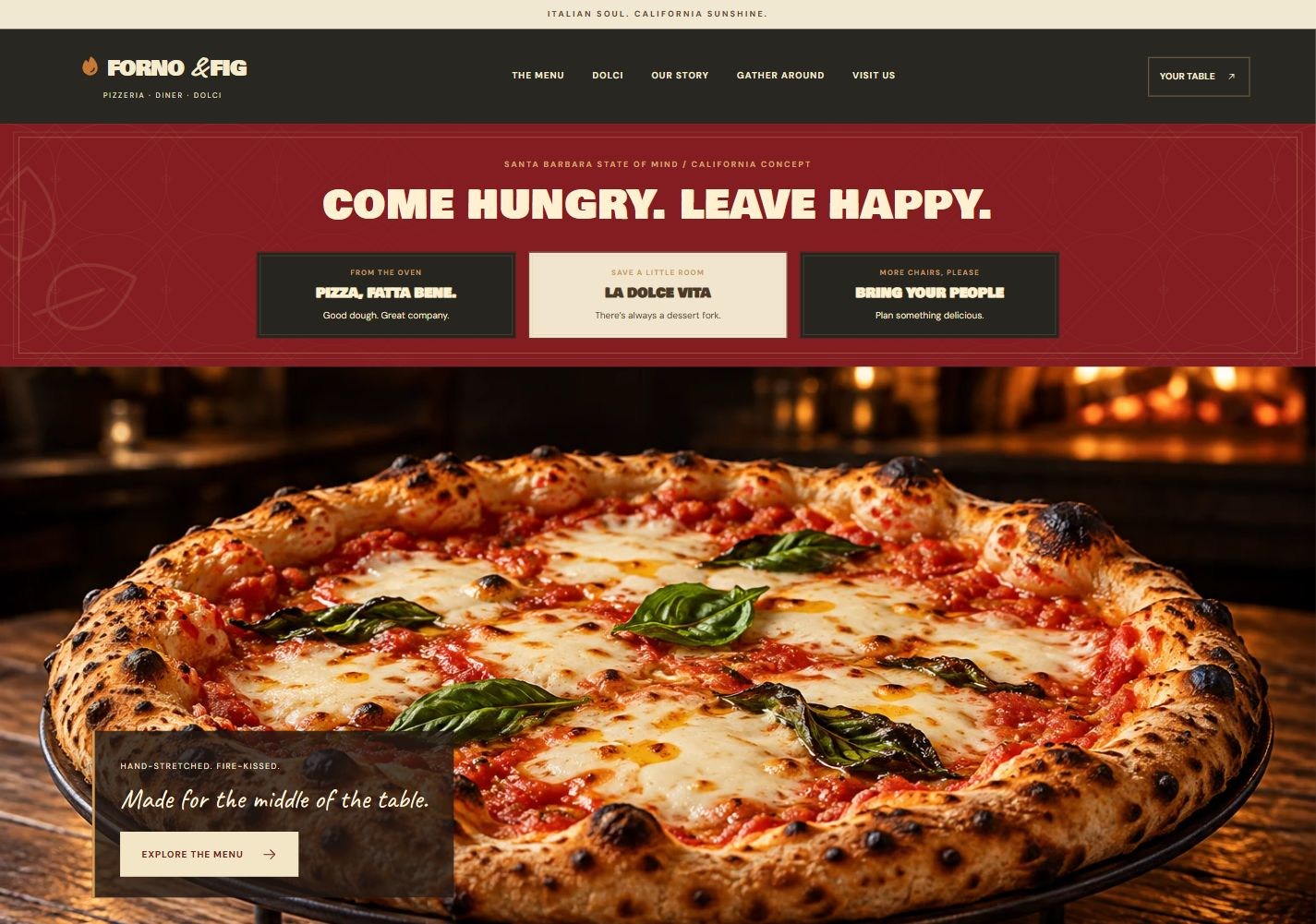
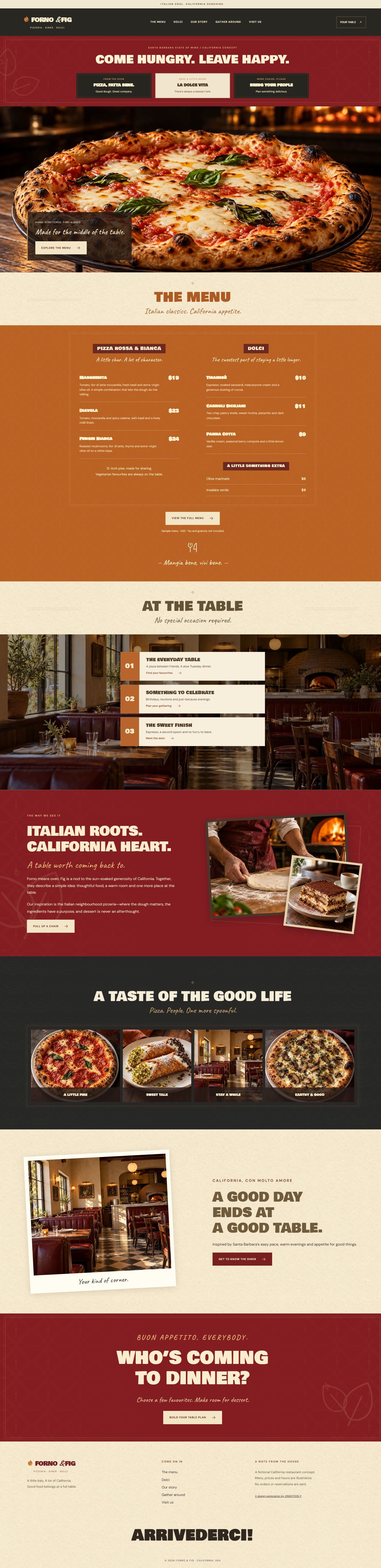
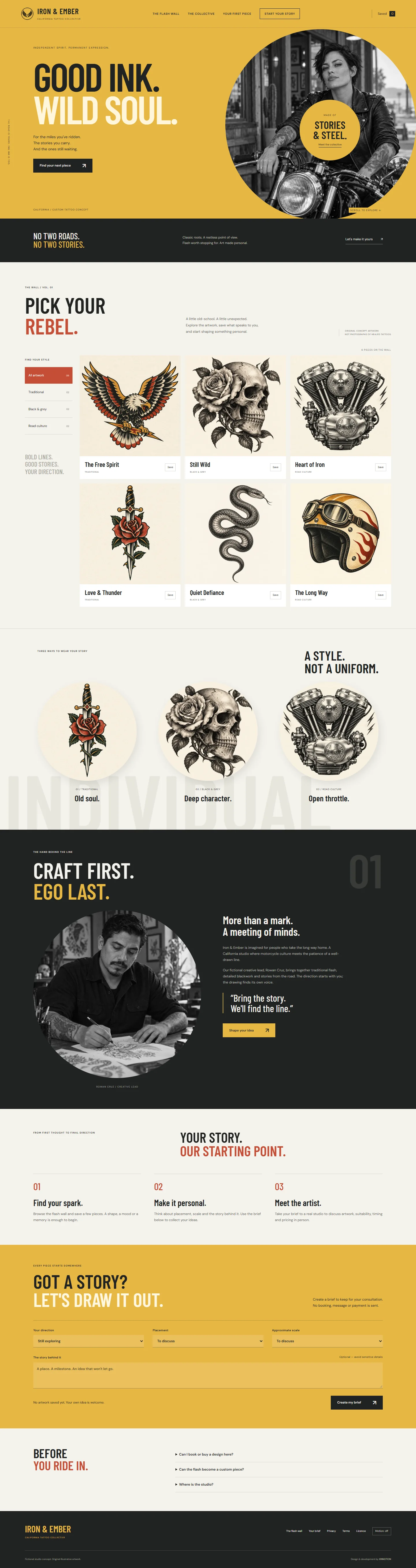
FORNO & FIG is a California-inspired Italian pizzeria, diner and dolci concept. Oxblood, burnt orange, cream paper and chalkboard menus connect seven pages, realistic food imagery, menu filters and a downloadable table planner.
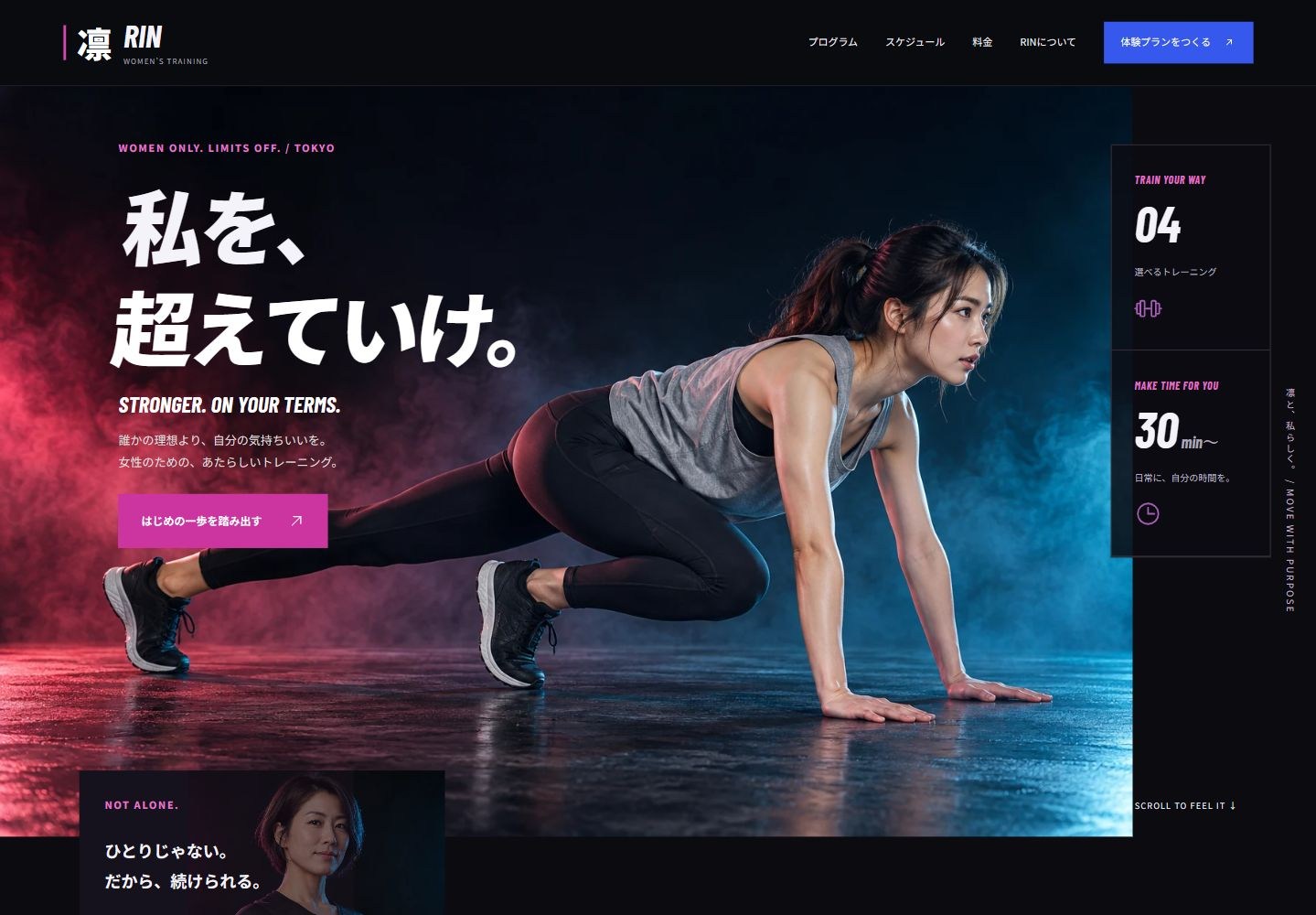
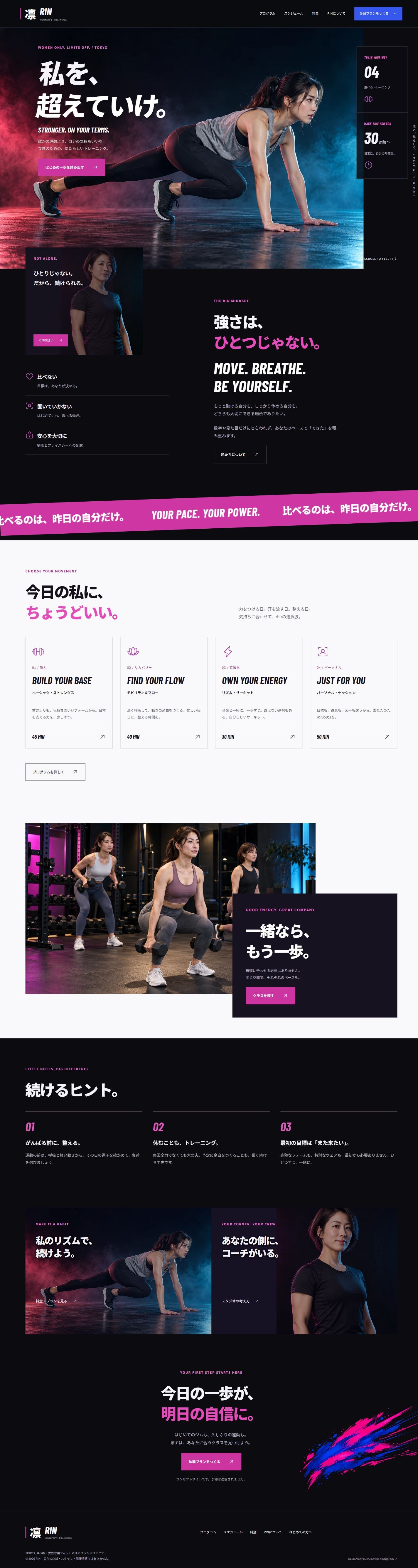
RIN is a Tokyo-inspired women-only training studio concept. Bold Japanese typography, shout banners and magenta/cobalt sports photography connect seven pages, four programmes, a filtered timetable and a monthly cost calculator.
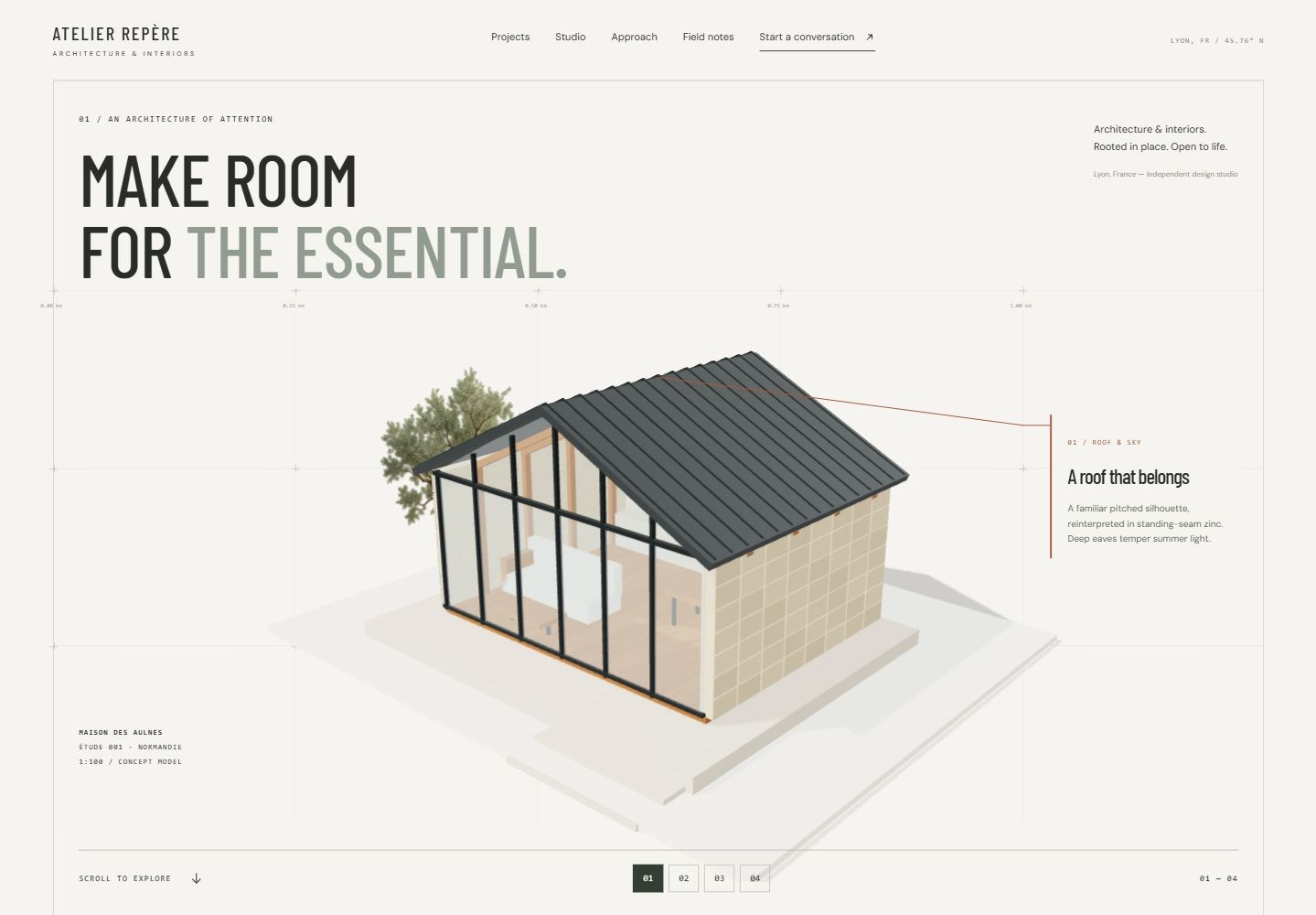
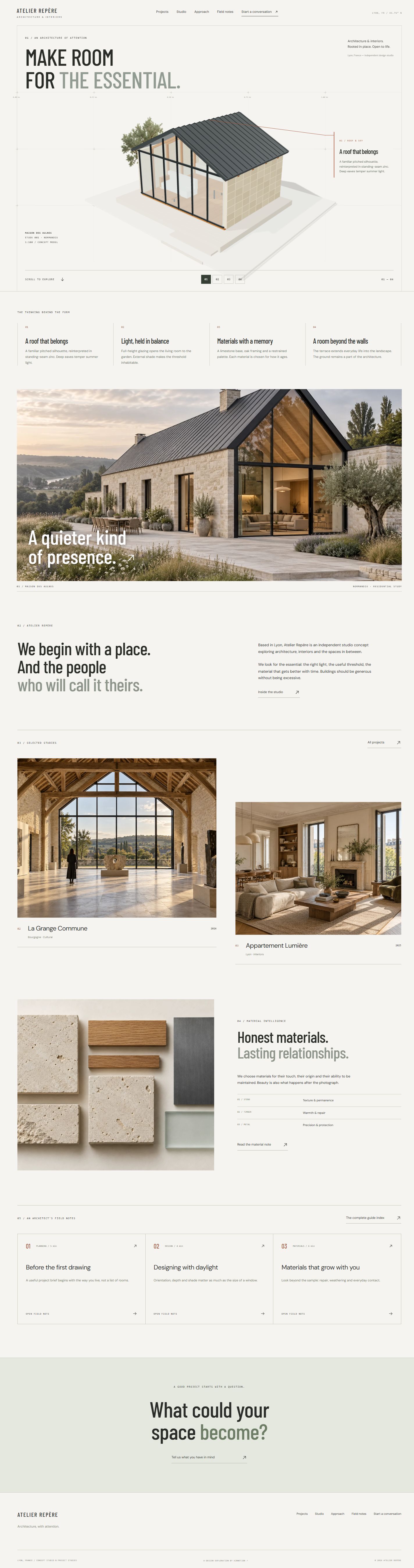
A Lyon-based architecture and interiors studio concept. Survey grids, a scroll-driven three-dimensional house and projected annotations connect eight pages, three design studies and six architectural field notes.
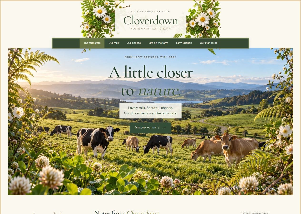
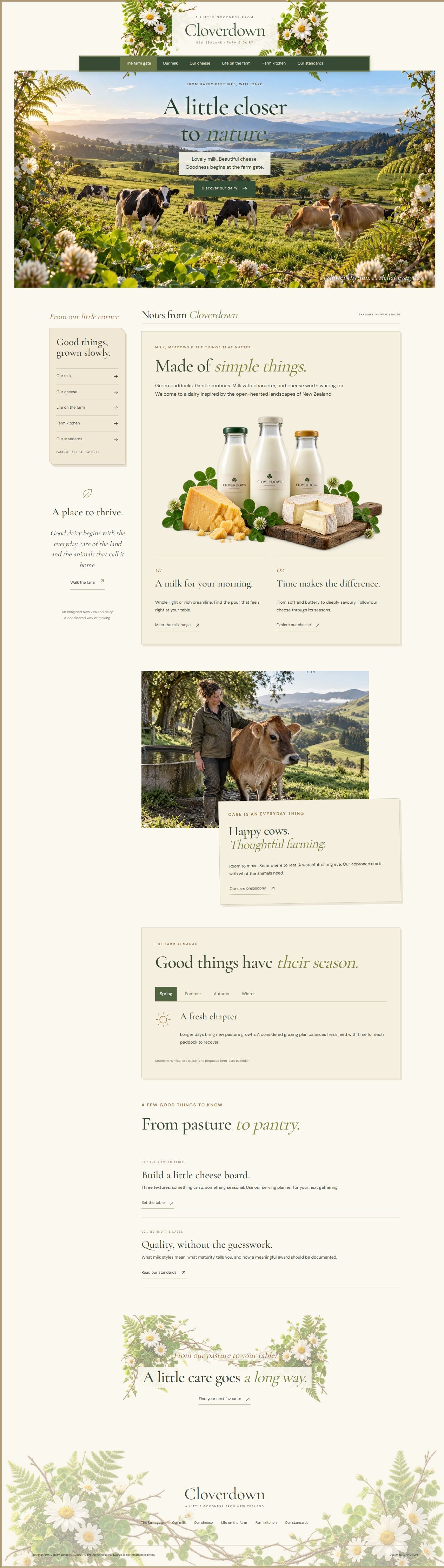
A New Zealand-inspired farm and dairy concept. Botanical framing, cream paper panels and green pasture imagery connect seven pages of milk styles, cheese maturation, animal care, farm-kitchen ideas and quality stories.
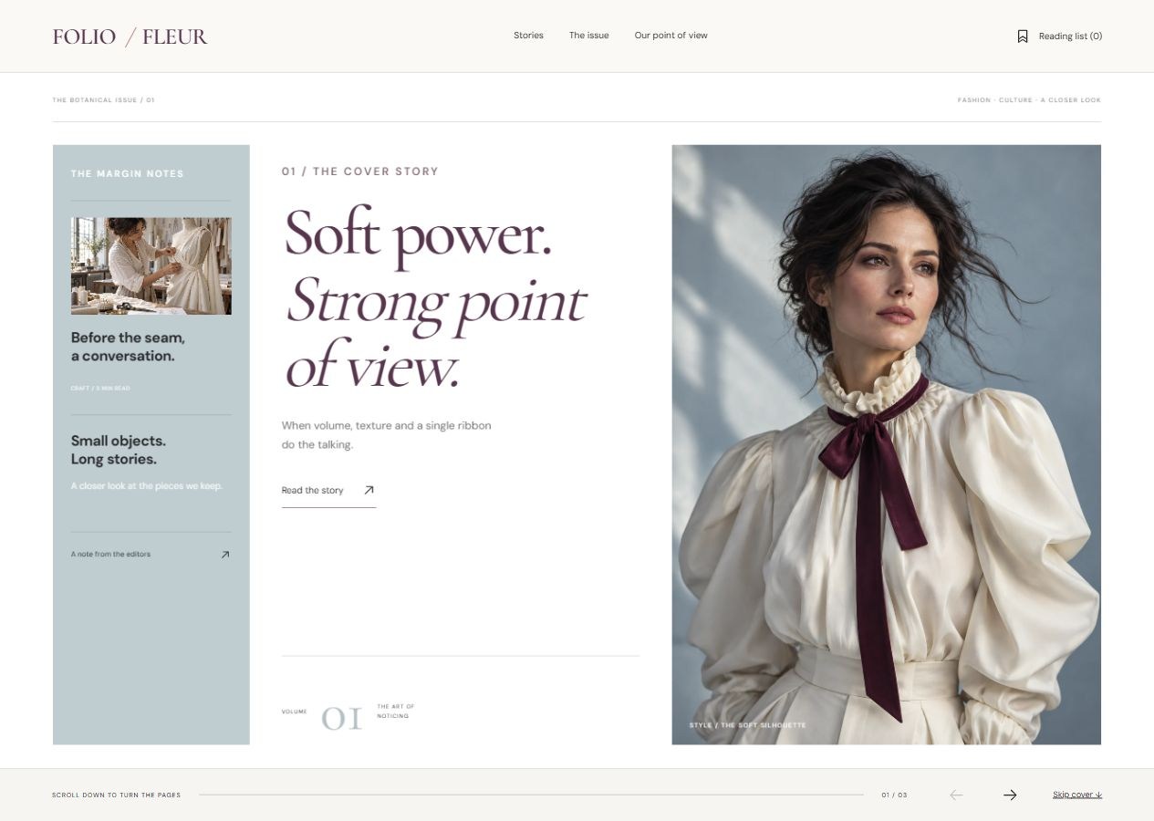
An independent fashion magazine concept combining blue-grey editorial columns, plum serif typography and botanical watercolours. Two scroll-linked horizontal sequences move forward and reverse with the page, connecting six pages of stories, an issue index and a personal reading list.
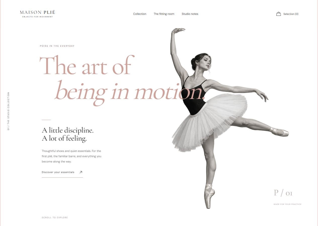
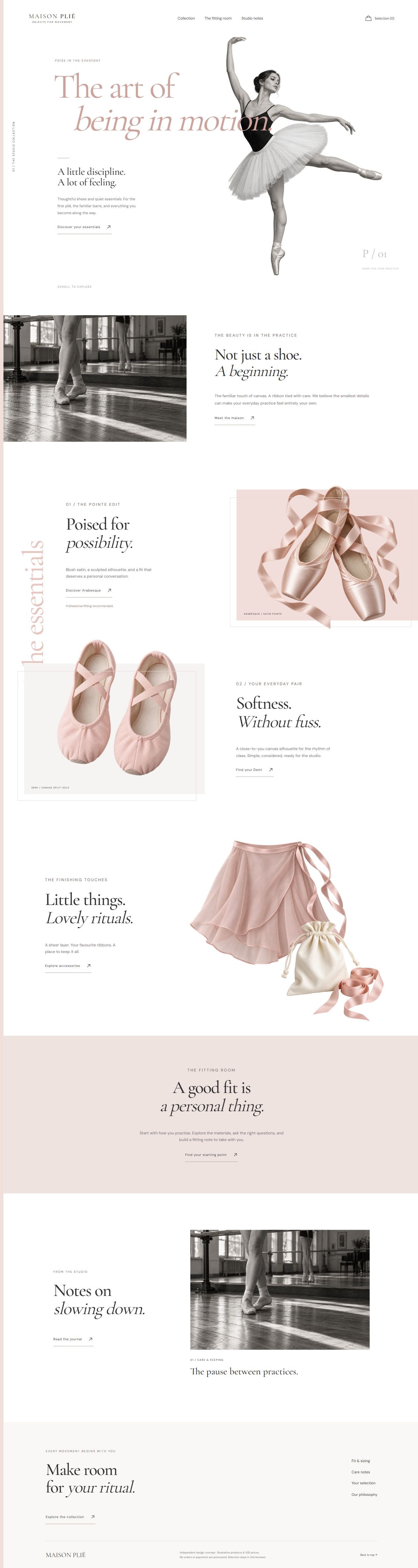
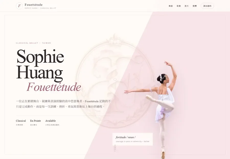
An editorial ballet boutique concept. Blush tones, monochrome dance photography, fine serif typography and offset product compositions connect six distinct pages, with gentle scroll depth, useful filters, size selection and a private studio edit.
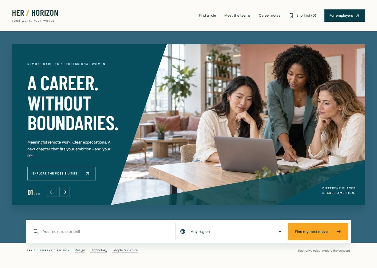
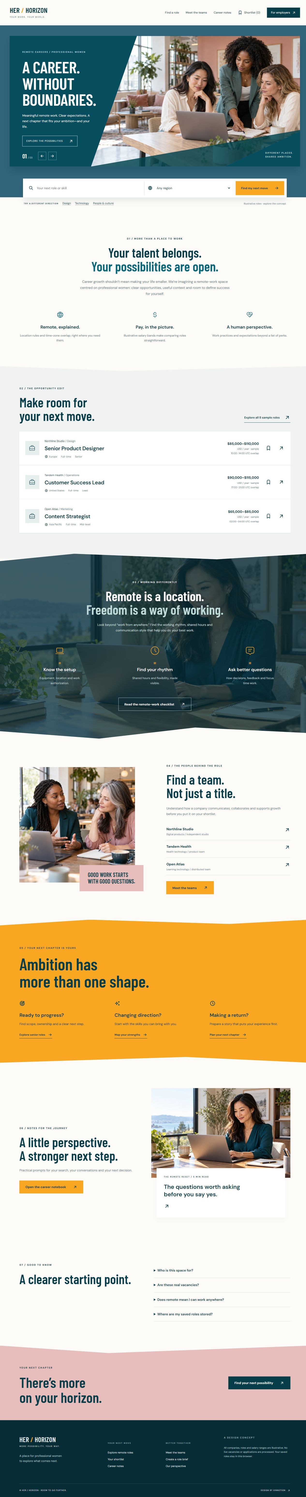
A remote-career platform concept centred on professional women. Angled teal photography, condensed typography and warm orange sections connect eight pages of role discovery, employer context, practical career notes and a private shortlist.
A vibrant young-adult fashion concept built around a purple cutout campaign, cyan and lime colour fields, a slim vertical rail and an editorial sidebar. Six pages connect outfit stories, collection filters, product details, fit guidance and a device-saved personal style edit.
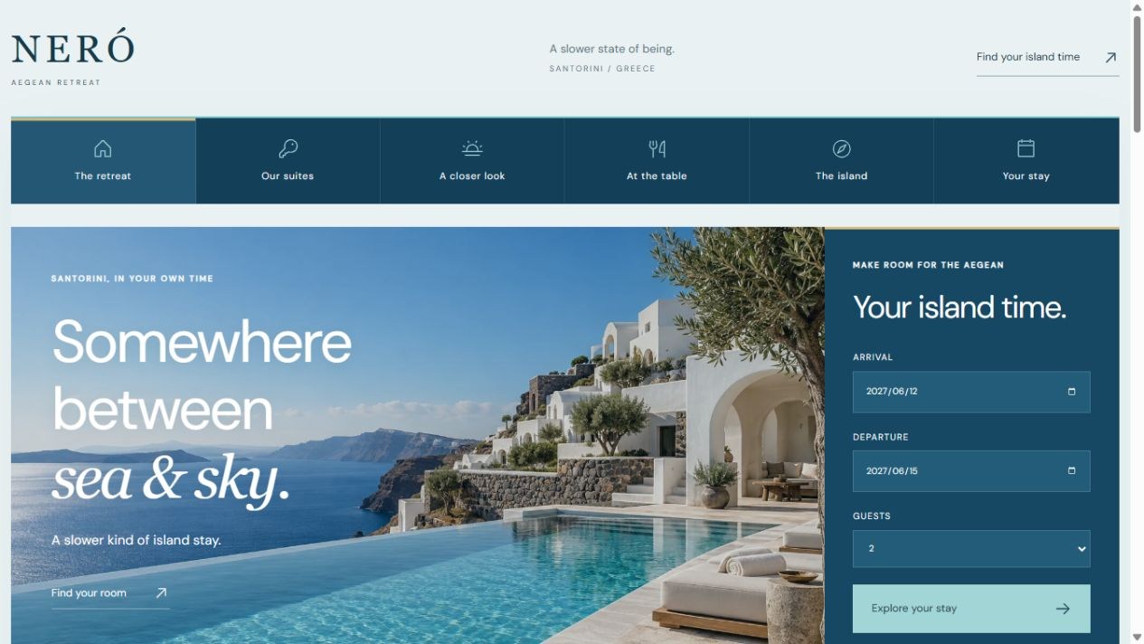
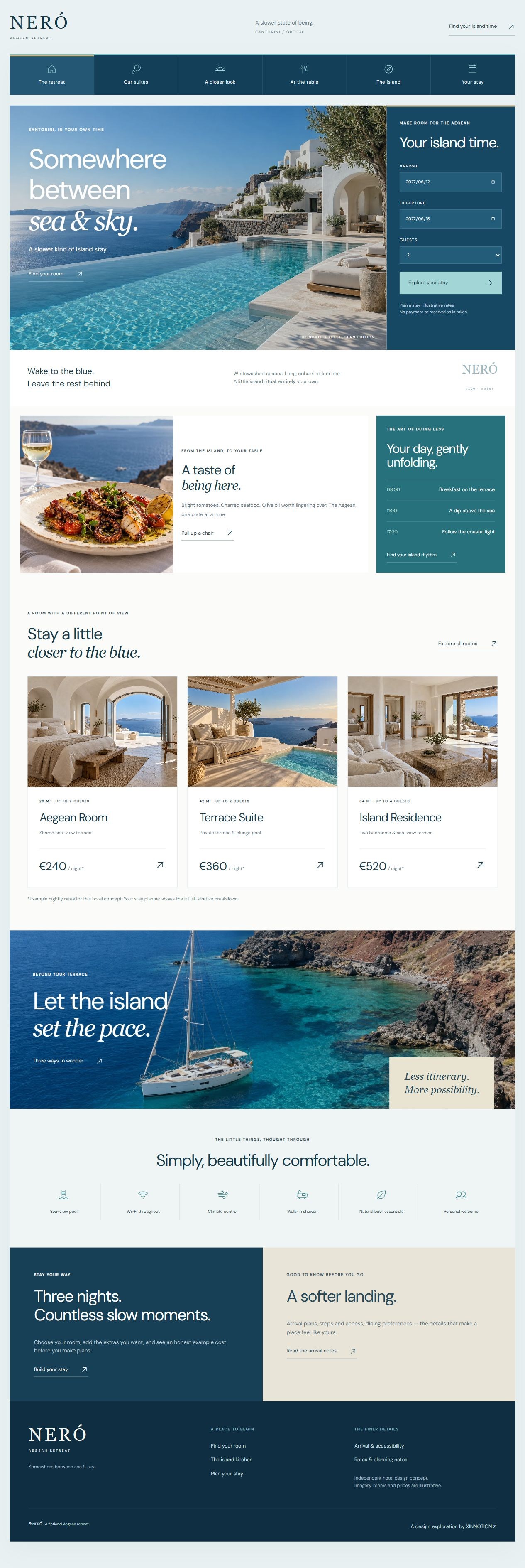
A six-page Greek island hotel concept combining an Aegean pool hero, deep-blue stay sidebar and warm Cycladic details. Room filters, a side-by-side comparison, seasonal menus and a downloadable stay plan connect island inspiration with practical planning.
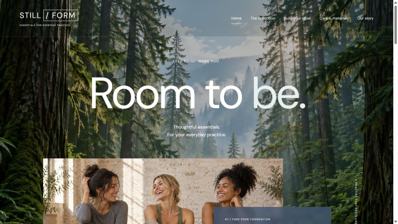
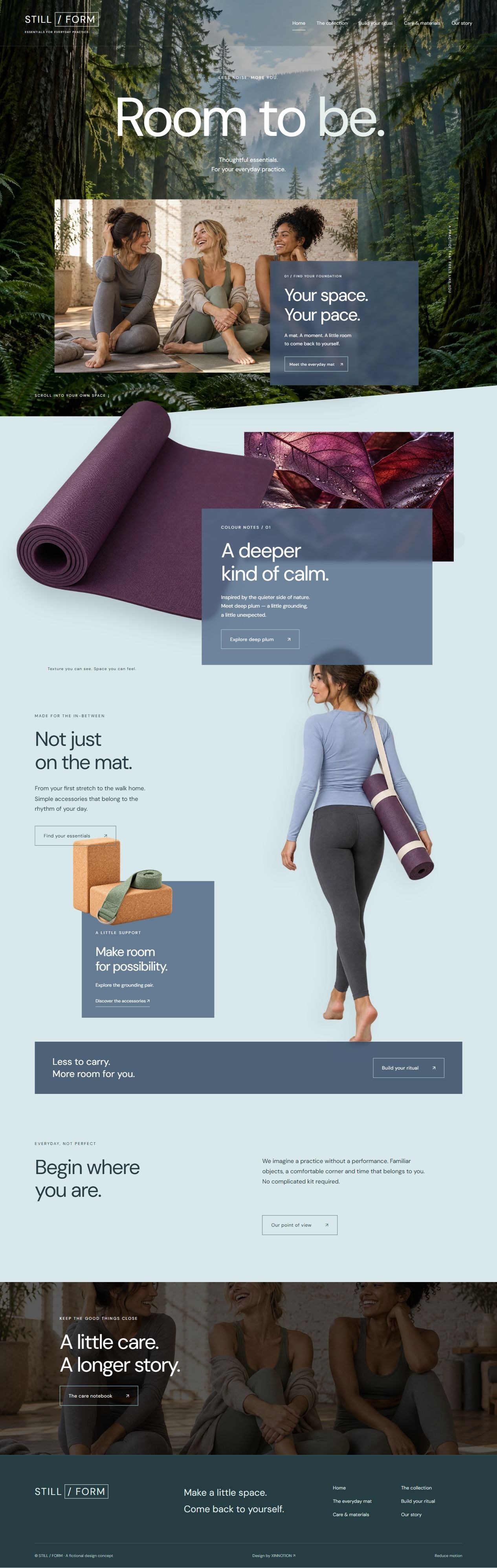
A six-page yoga accessories concept with an immersive forest, floating plum mat, realistic cutout figure and mist-blue translucent layers. Explore the collection, product sizes, personal kit builder, care notebook and brand story.
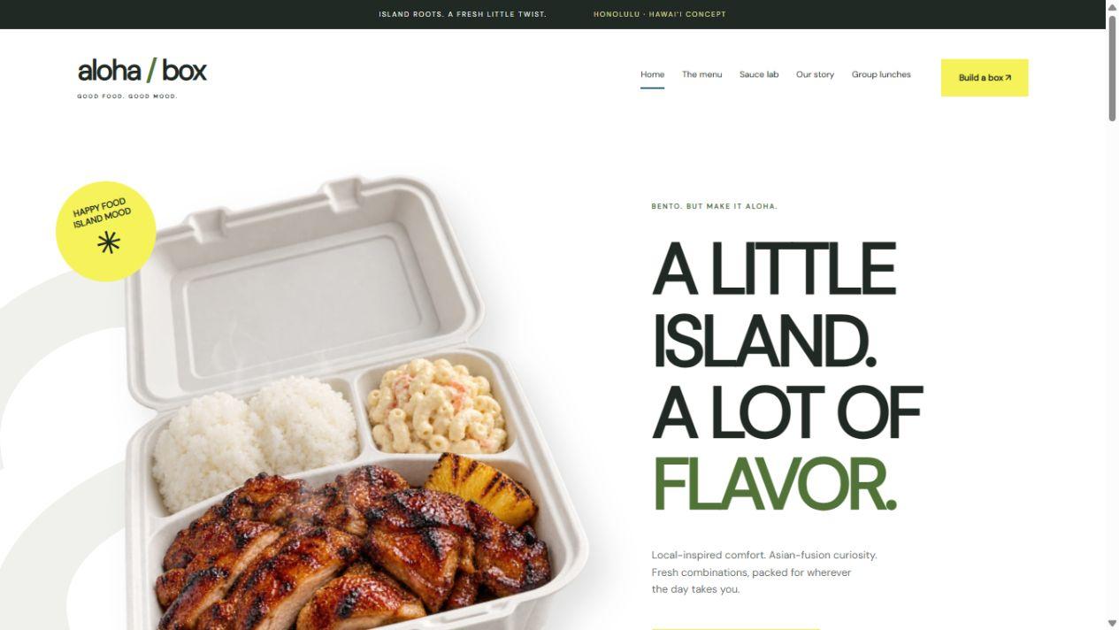
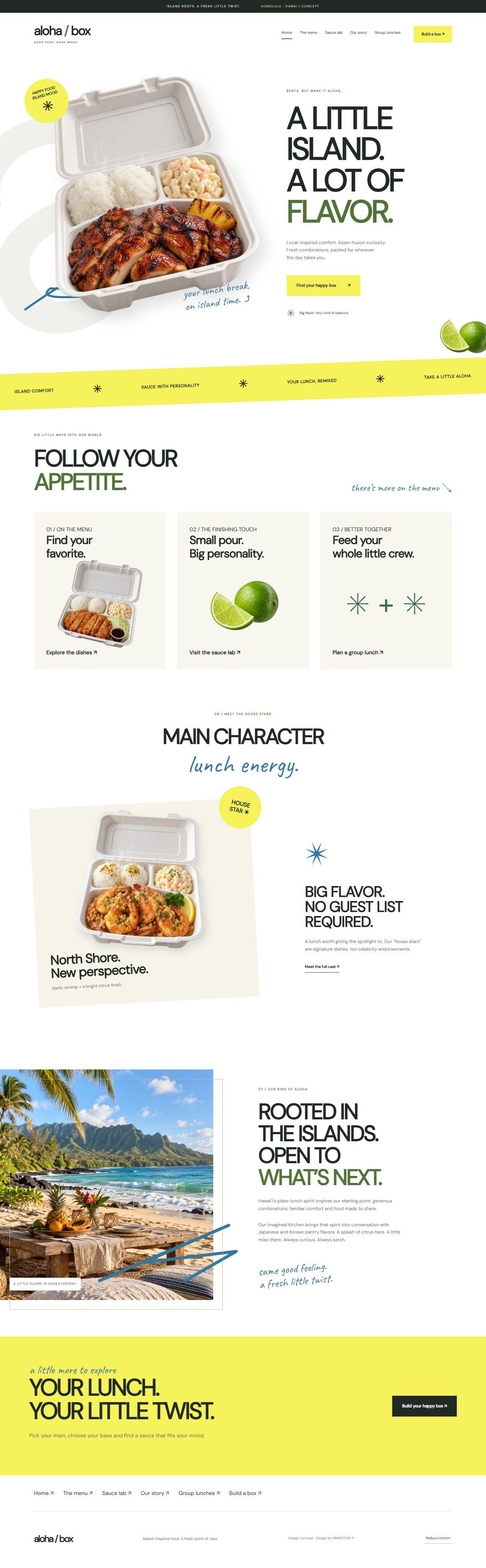
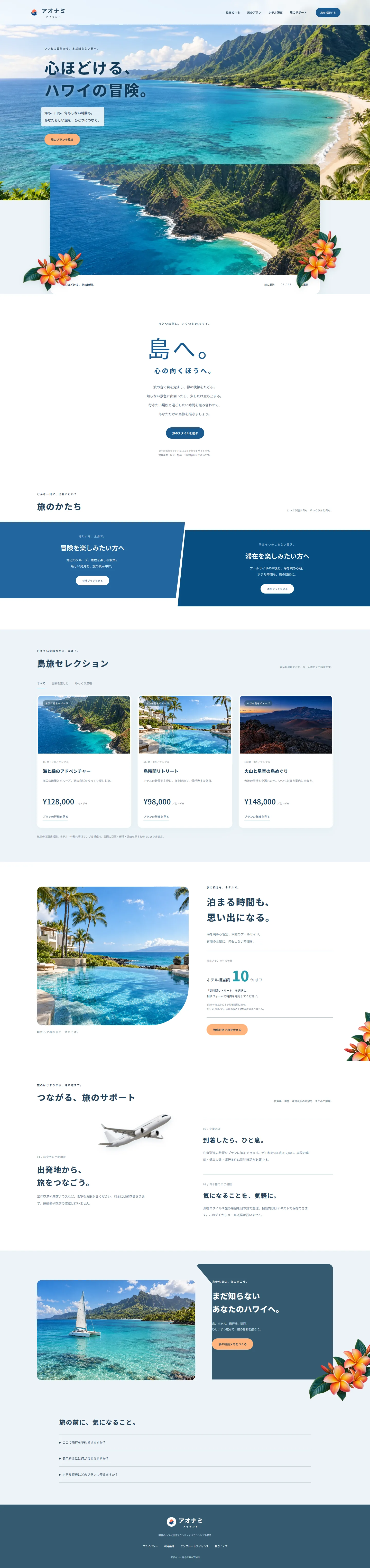
A Hawaiian bento and takeout concept with floating food cutouts, sunshine yellow, handwritten blue details and offset frames. Six independent pages connect island comfort food, Asian-fusion sauces, a personal box builder and group-budget planning.
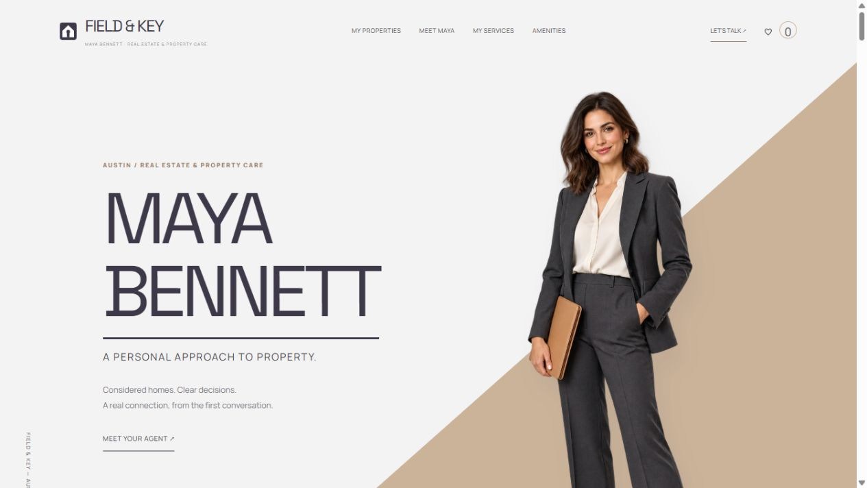
A complete geometric editorial redesign centered on female agent Maya Bennett. Full-length portrait cutouts, diagonal photography, white and sand fields, and charcoal service panels frame a ten-page property practice with mission, services, maps, amenities and cost tools.
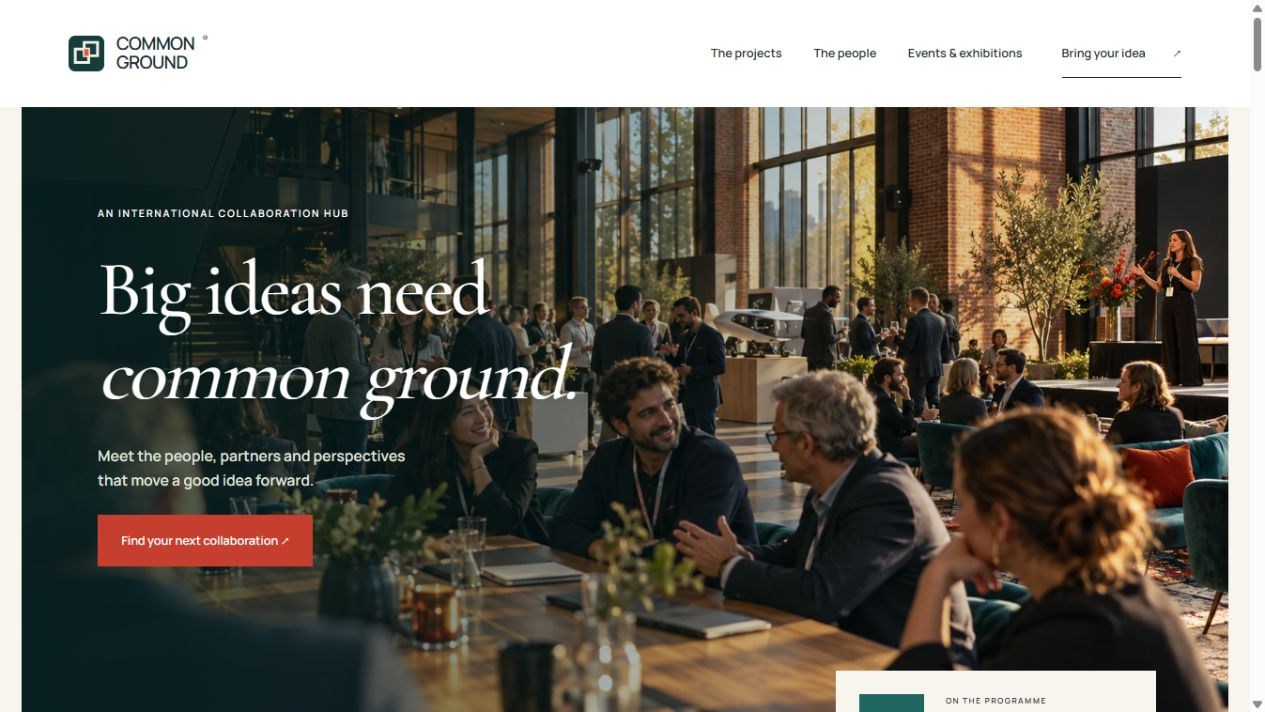
COMMON GROUND is an international collaboration hub concept for startups, associations and angel investors. Ivory, deep teal and vermilion frame conference imagery, a people mosaic, an editorial opportunity board and an overlapping exhibition panel. Fourteen homepage modules lead to interactive project, event and proposal pages.
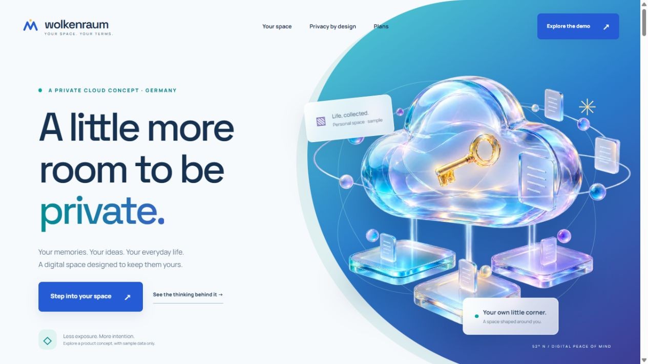
WOLKENRAUM is a German private-cloud concept with flowing teal, blue and violet fields, a translucent glass cloud and a golden key. Fourteen homepage modules connect radial capabilities, a floating workspace, a protection journey, sharing boundaries and recovery. Three supporting pages offer sample-file interactions, a security model and plan comparisons.
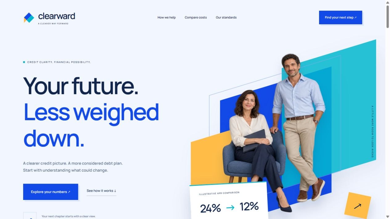
CLEARWARD is a U.S. credit education and debt-cost planning concept with cobalt, aqua and amber geometry, transparent people, floating frames and overlapping photography. Scroll-driven totals, bars and balance lines introduce a calculator that compares rates, terms, upfront fees, monthly payments and total cost.
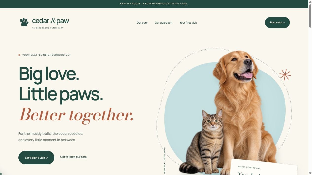
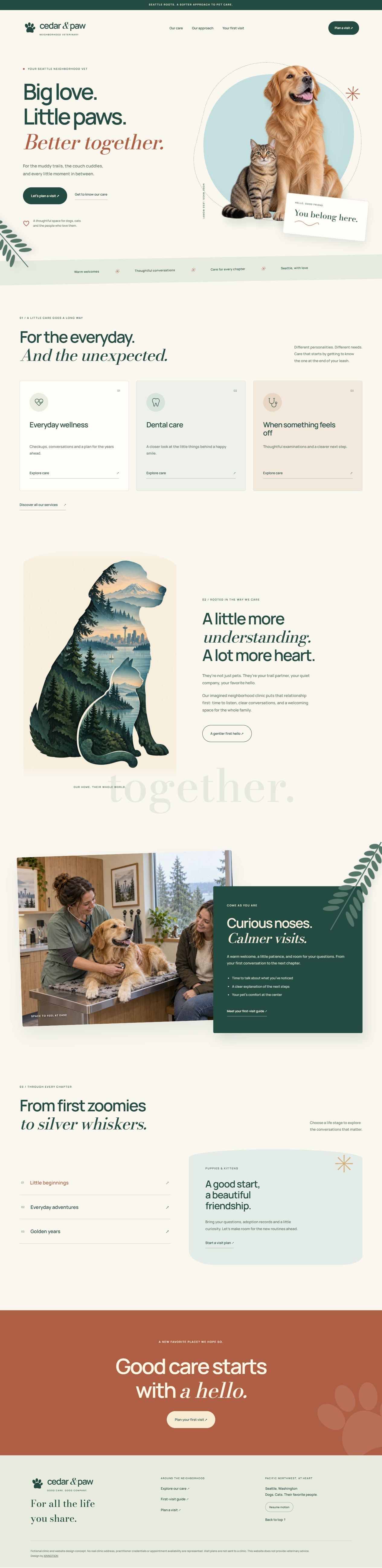
CEDAR & PAW is a Seattle neighborhood veterinary concept in cream, evergreen and terracotta. Original pet cutouts, a Pacific Northwest landscape inside animal silhouettes and warm consultation photography connect layered sections, care services, life-stage tabs and a personal visit planner.
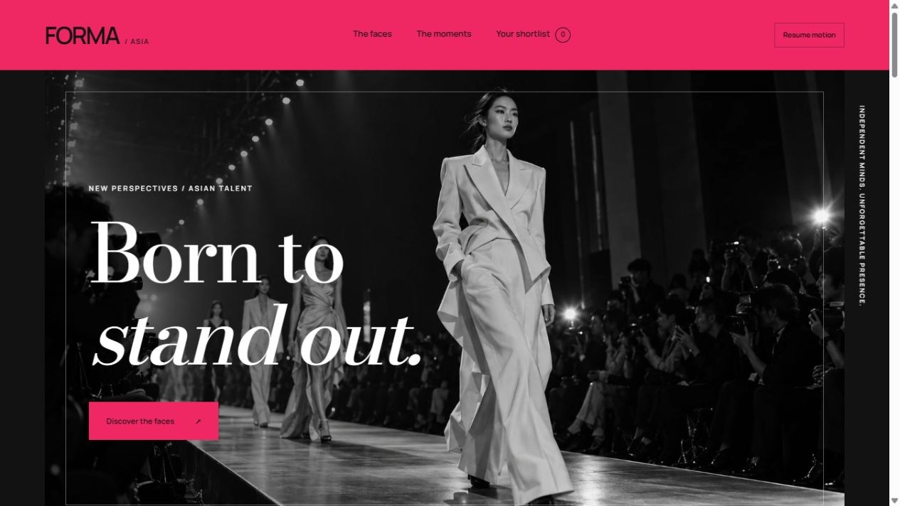
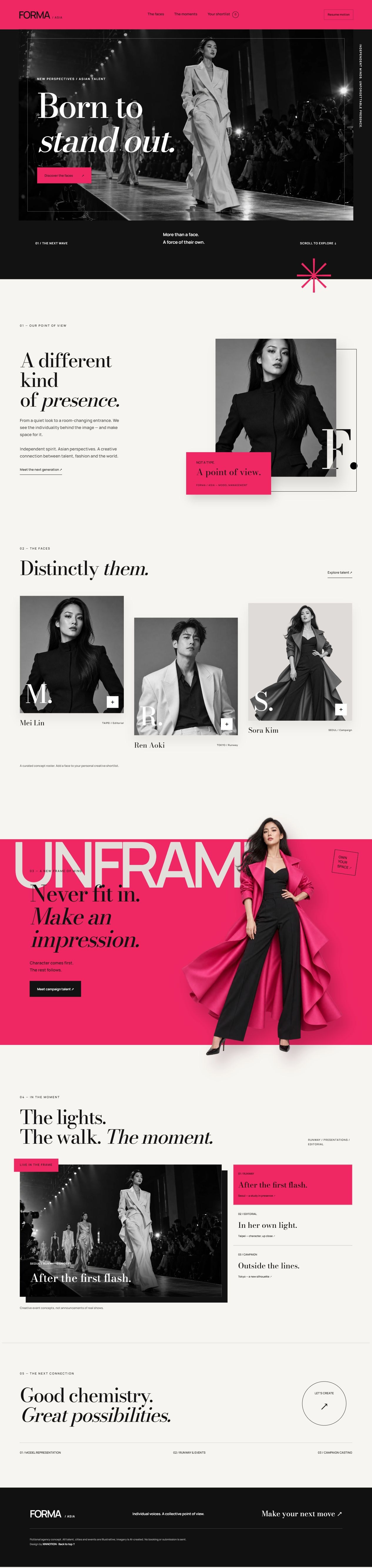
FORMA / ASIA pairs a diagonal monochrome runway with vivid pink, oversized serif type and independent Asian talent. Staggered portraits, floating frames and a full-length model cross section boundaries at different parallax depths.
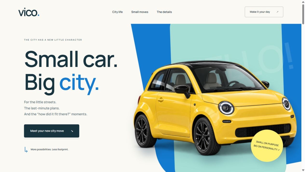
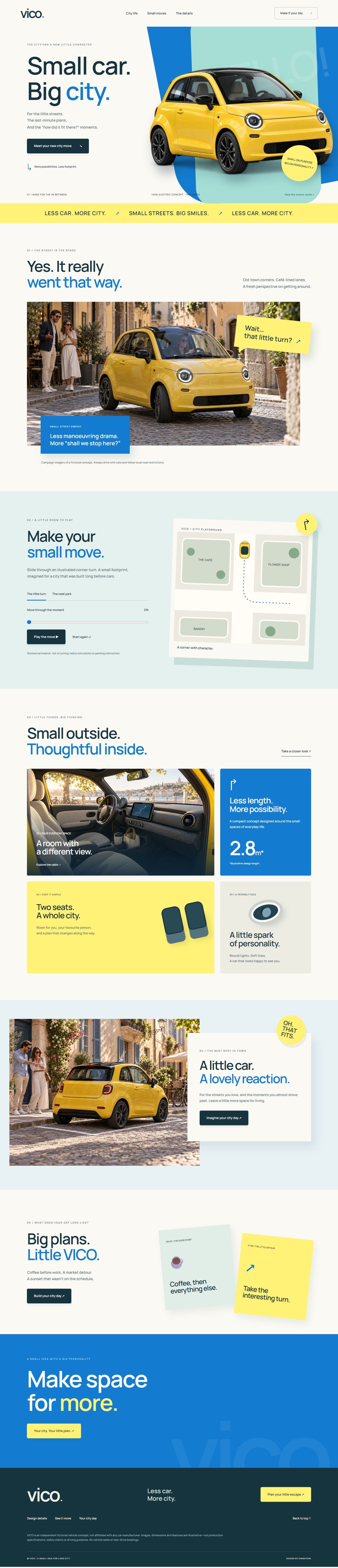
VICO imagines a compact electric companion for Europe’s little streets. A citrus-yellow car overlaps sky-blue and ivory shapes, with delighted street reactions, cabin details and a playable, scrubbable city-move illustration.
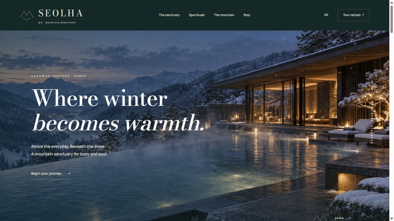
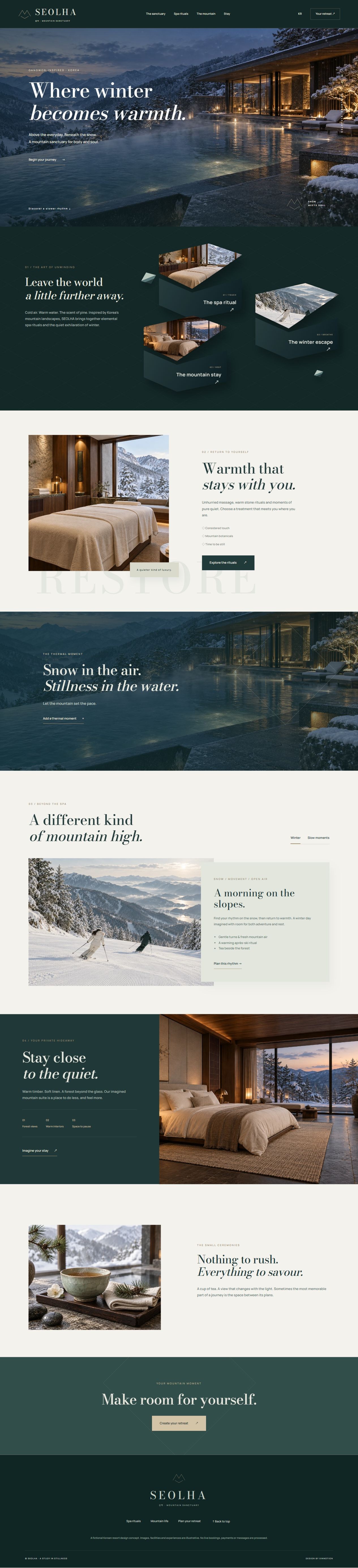
SEOLHA is a fictional Korean mountain spa and ski retreat. Midnight pine, snow ivory, pale jade and bronze frame angular raised photo panels, warm treatment spaces, a mountain pool and gentle scrolling layers.
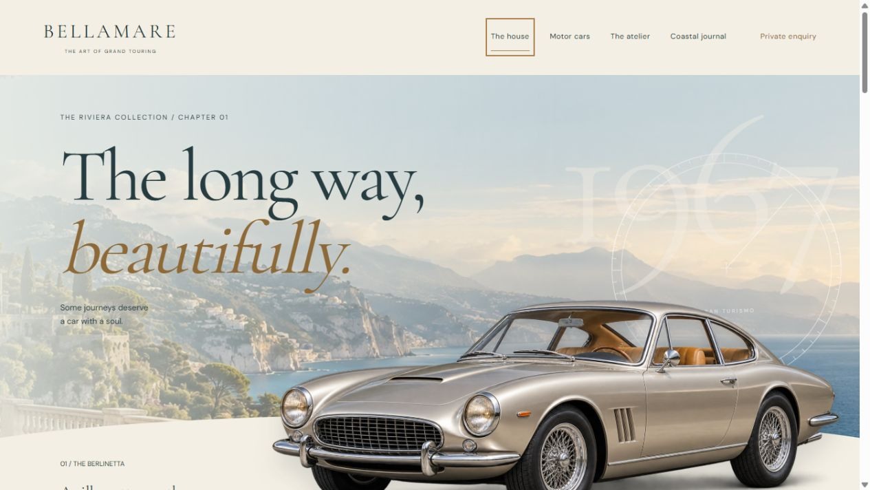
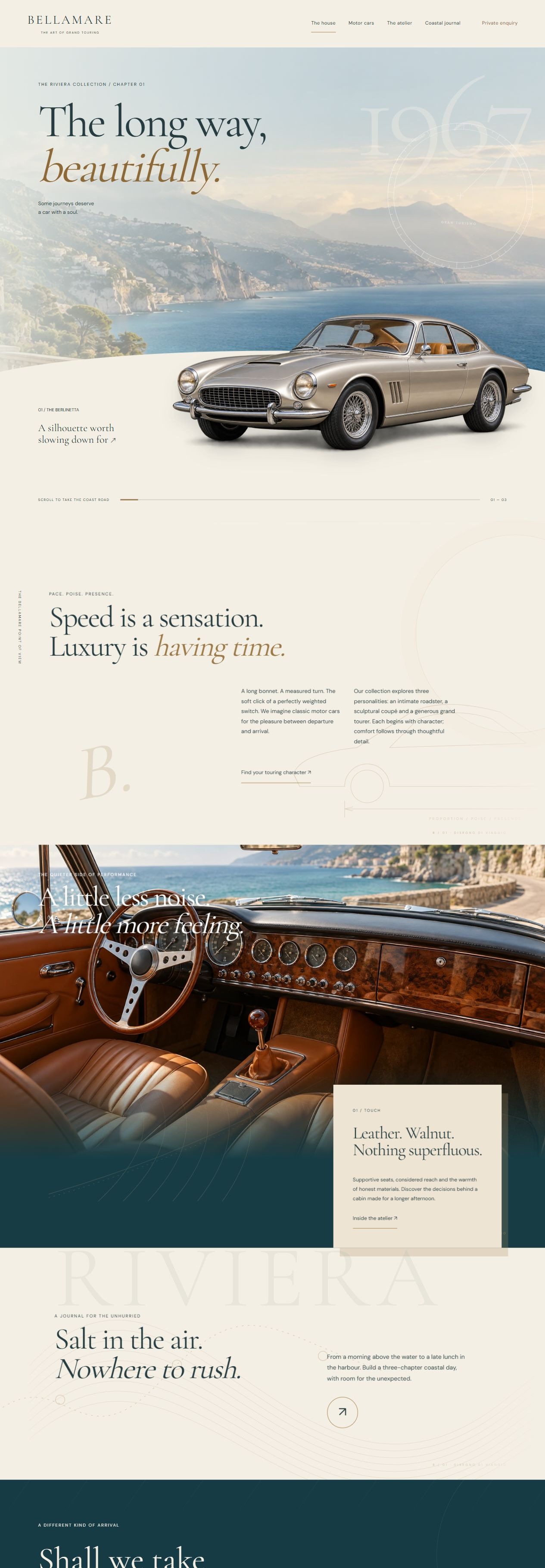
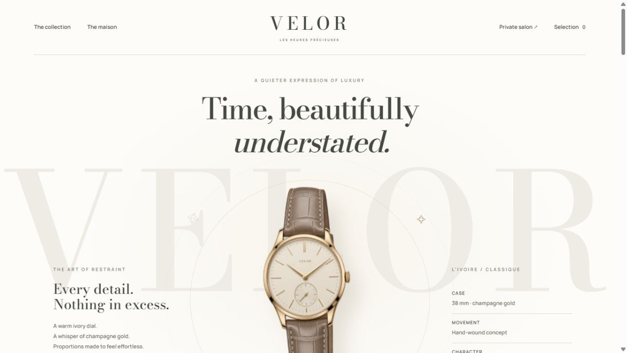
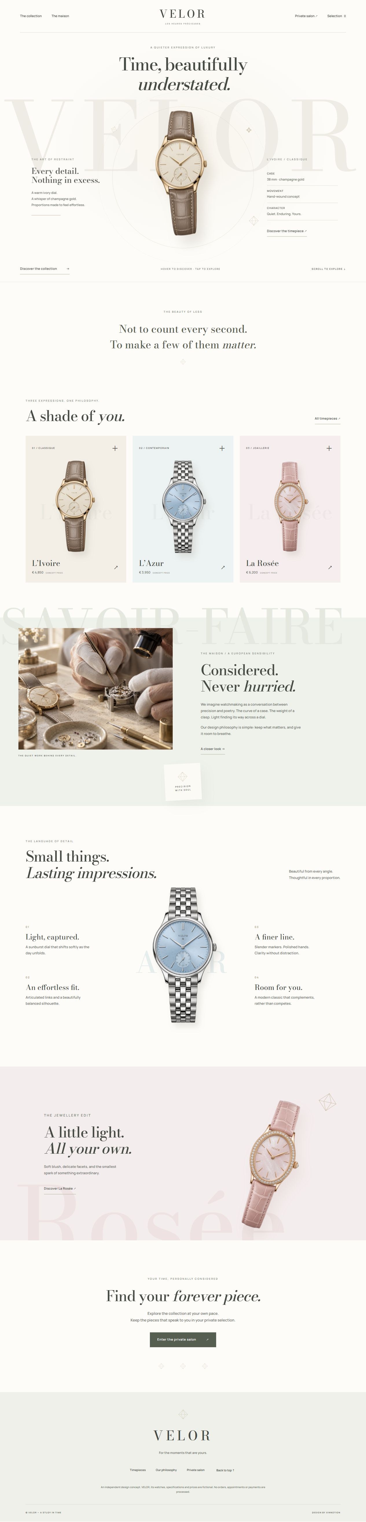
A three-page fictional European watch maison in ivory, ice blue and blush. Fine jewellery accents, oversized tonal lettering, a rotating hero watch and sliding information panels create a restrained luxury presentation.
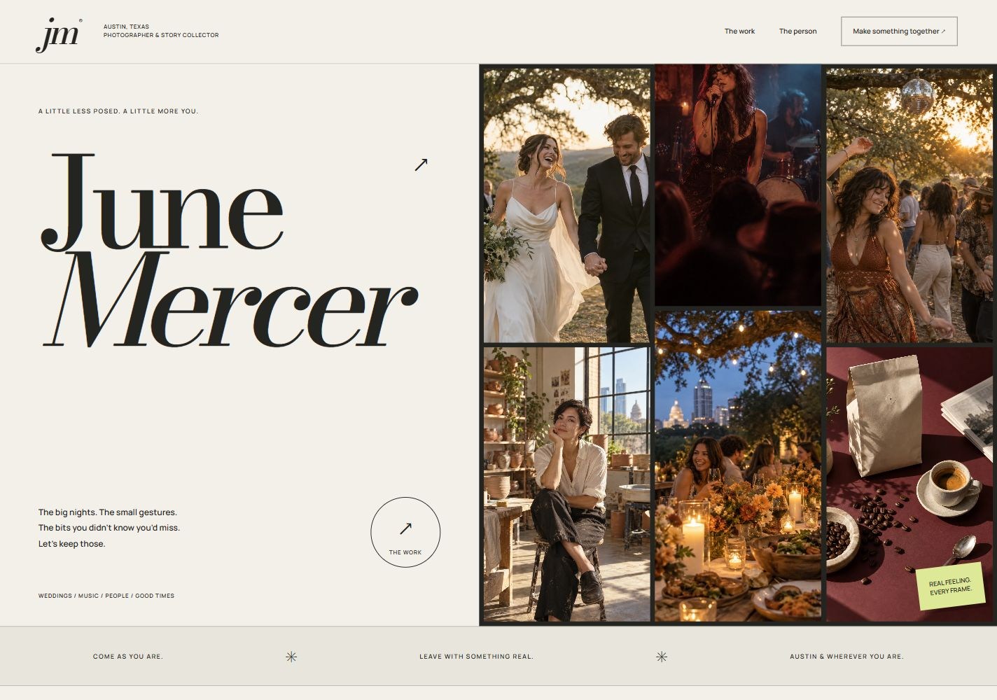
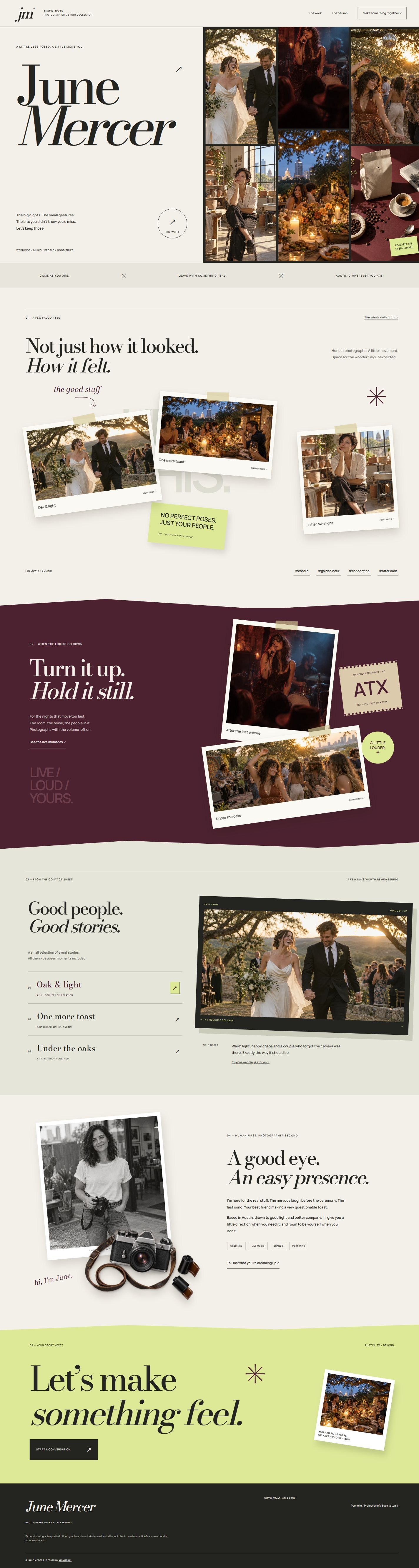
A three-page Austin, Texas photographer concept with an oversized editorial wordmark, photographic strips, scattered print flat lays and a wine-red concert collage. Each section has its own scroll-linked composition, with tag search, saved references and a local project brief.
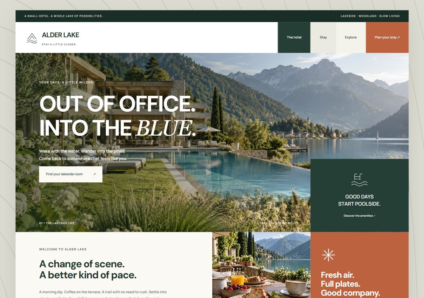
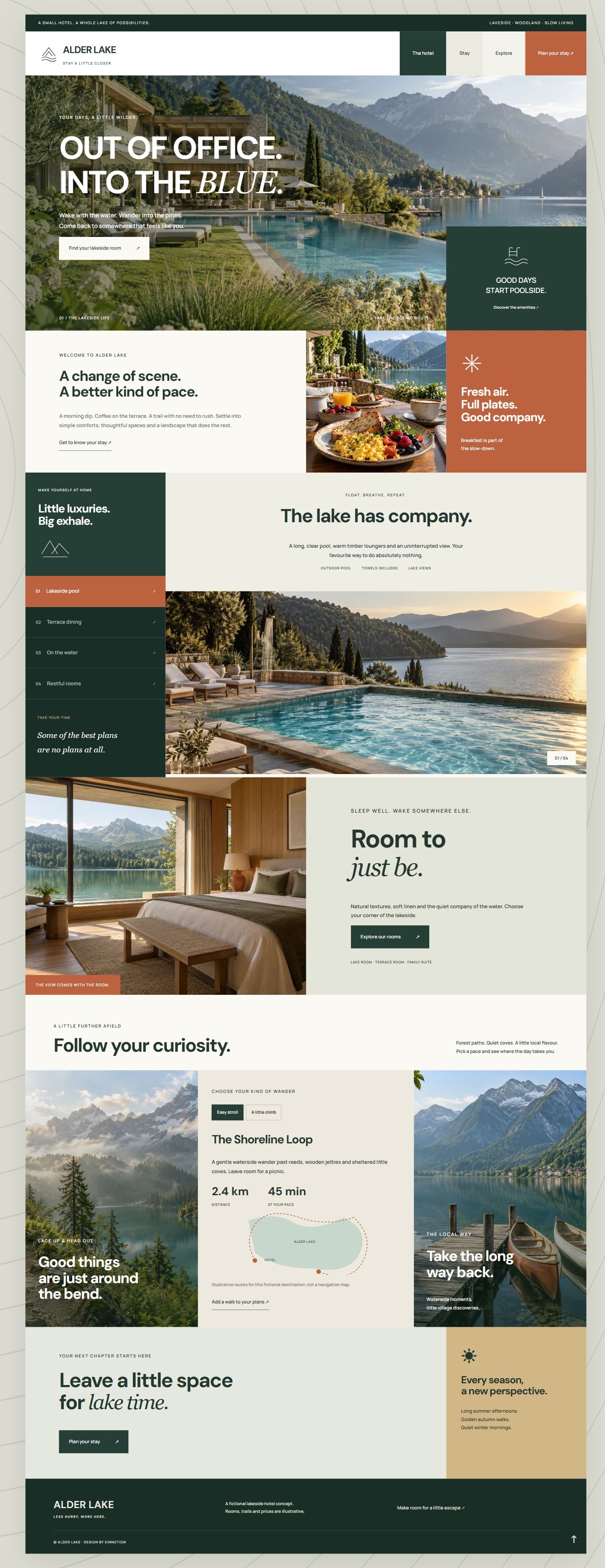
A three-page lakeside hotel concept in pine green, warm sand and terracotta. Architectural mosaic blocks combine six original photographs of rooms, pool, terrace breakfast, hiking trails and local scenery with interactive amenities and a local stay planner.
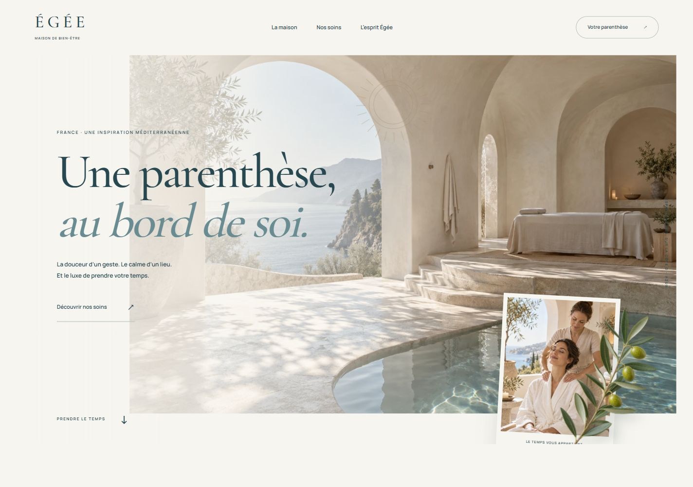
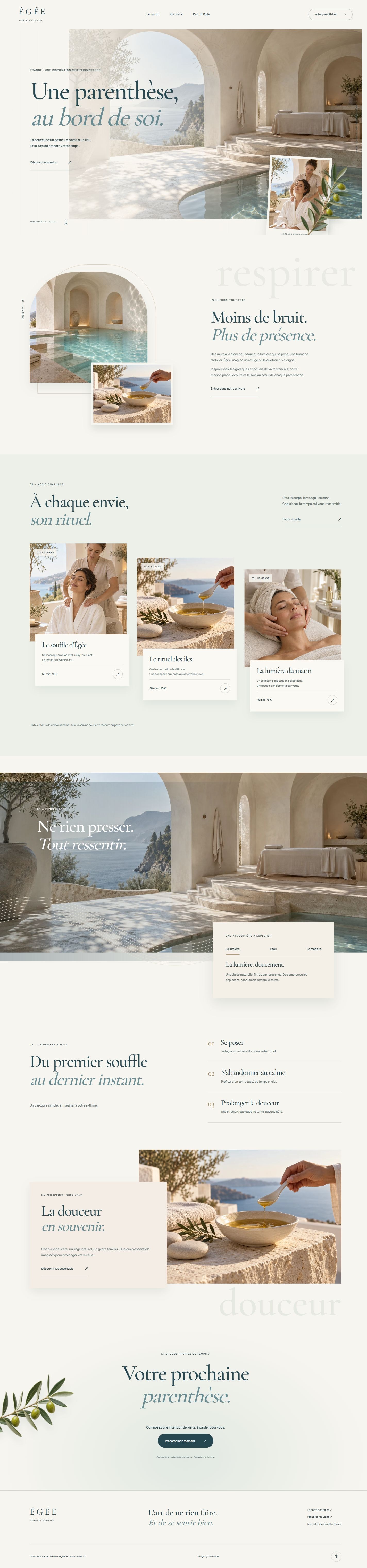
A three-page French spa and massage concept with Greek arches, limestone white, mist blue and olive foliage. Offset photographs, soft shadows and layered scroll parallax frame a service-first experience; products remain a quiet afterthought.
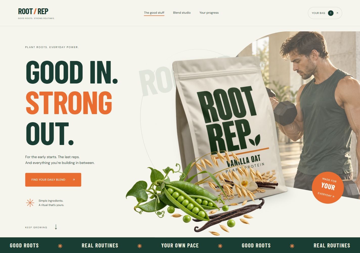
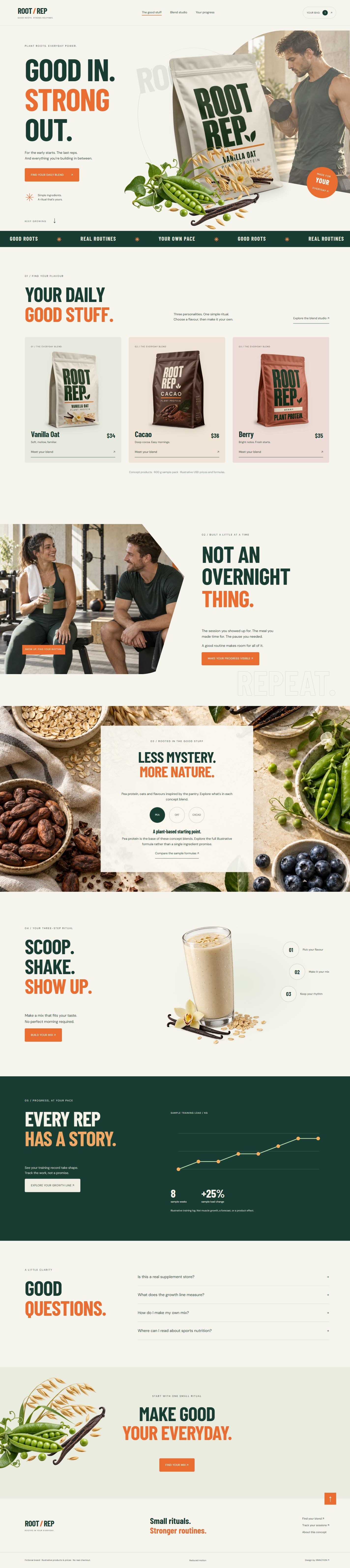
A three-page English sports protein concept. Oversized pouches, botanical foregrounds and curved gym photography meet cream, forest green and orange. A custom blend studio and editable training progress line make everyday routines tangible.
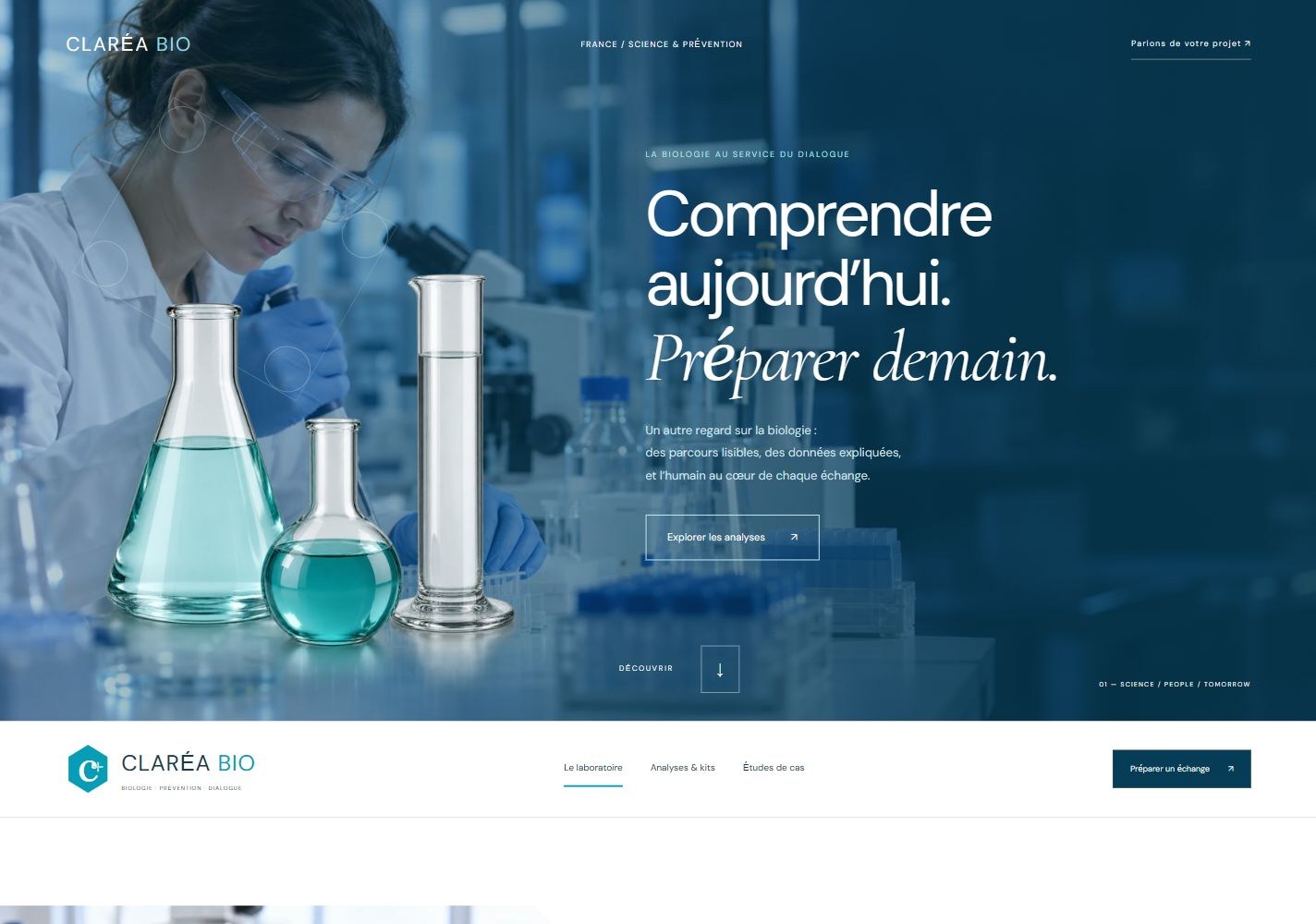
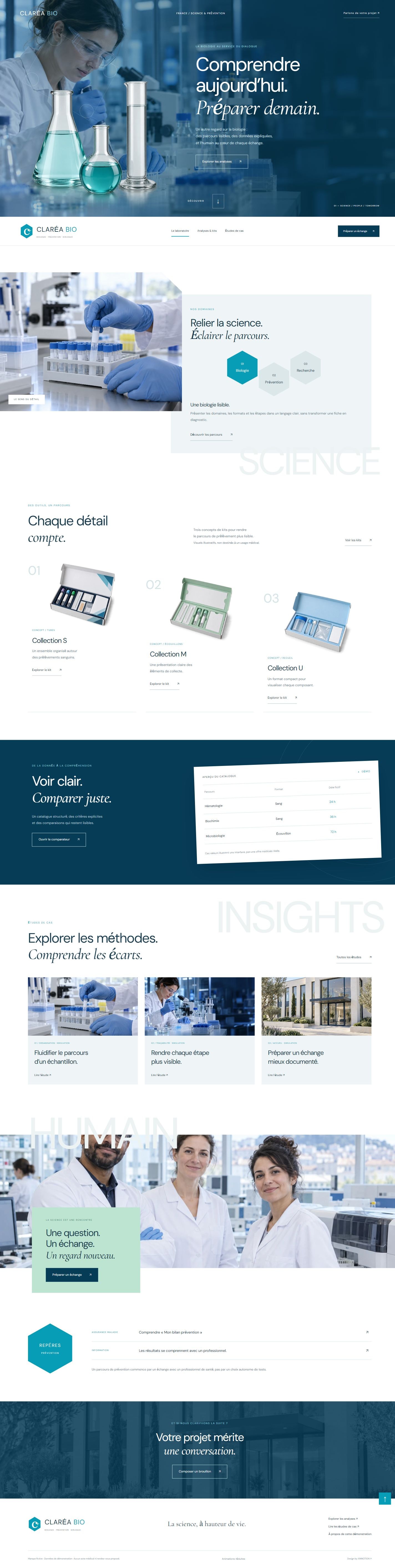
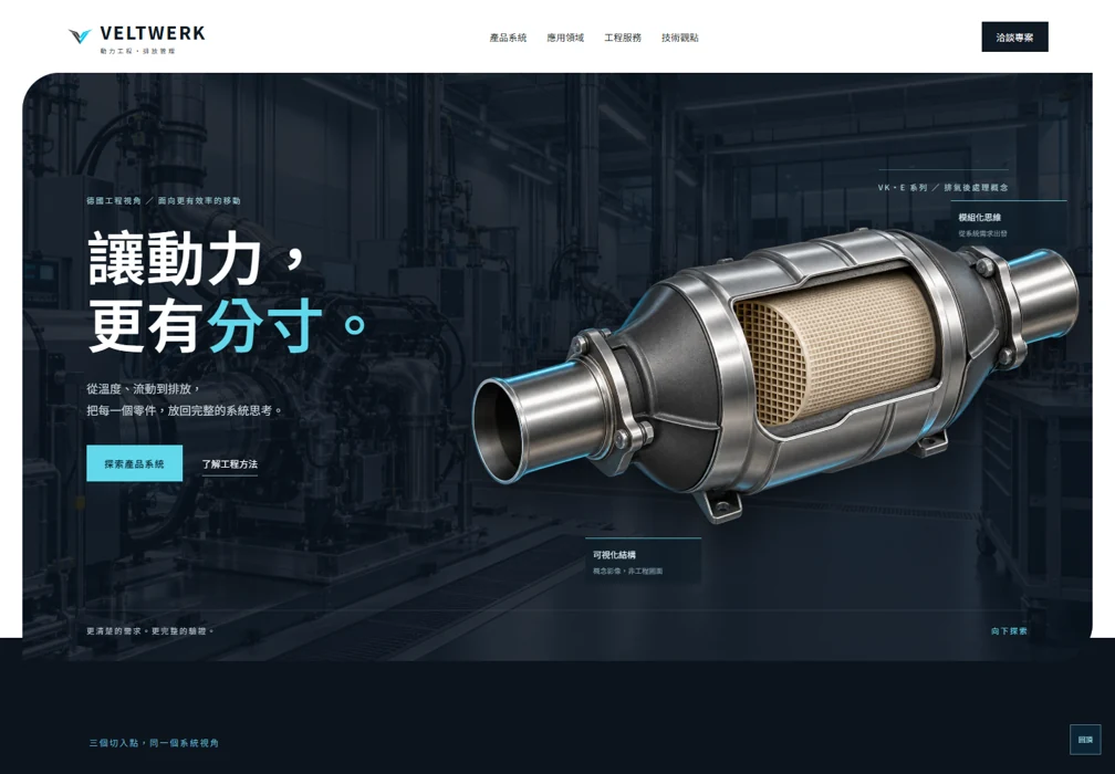
A three-page French biomedical laboratory concept. Blue laboratory imagery, isolated glassware, hexagonal navigation and staggered kit displays connect a searchable catalogue, three-item comparison and transparent synthetic case-study data.
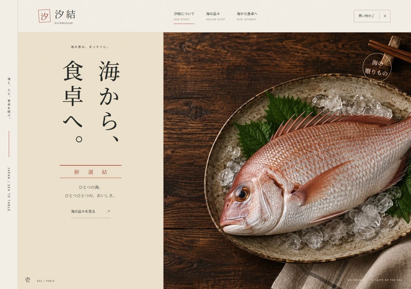
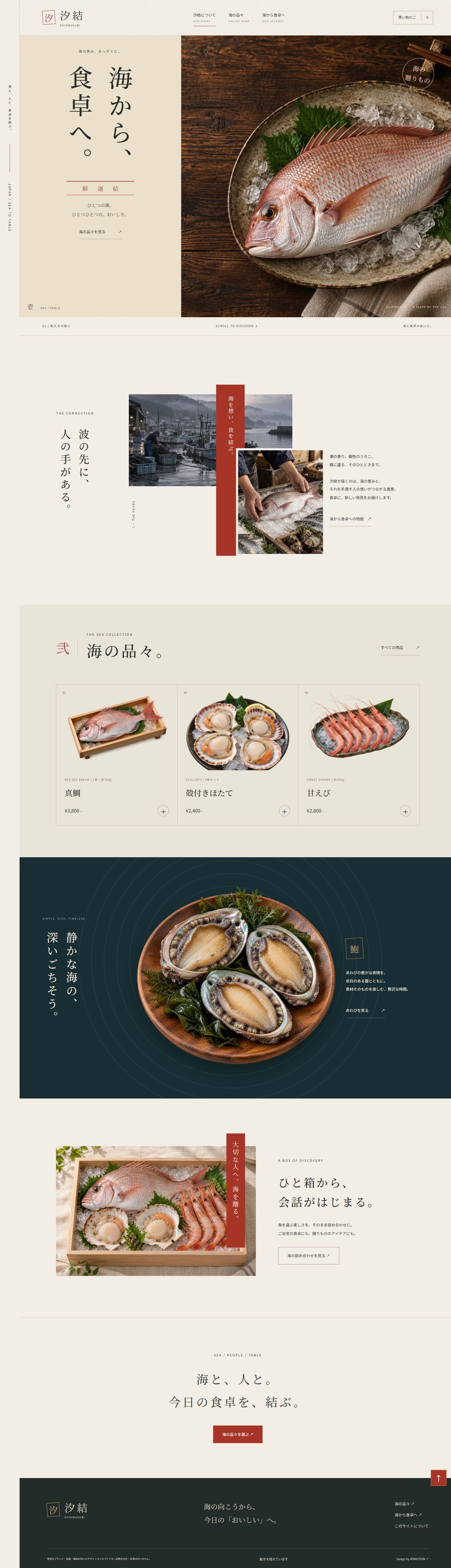
A three-page Japanese seafood supplier and shop concept. Linen, cedar, vermilion seals and vertical Mincho typography meet layered harbor photography and an indigo product stage. Scroll-linked character reveals reverse naturally when scrolling upward.
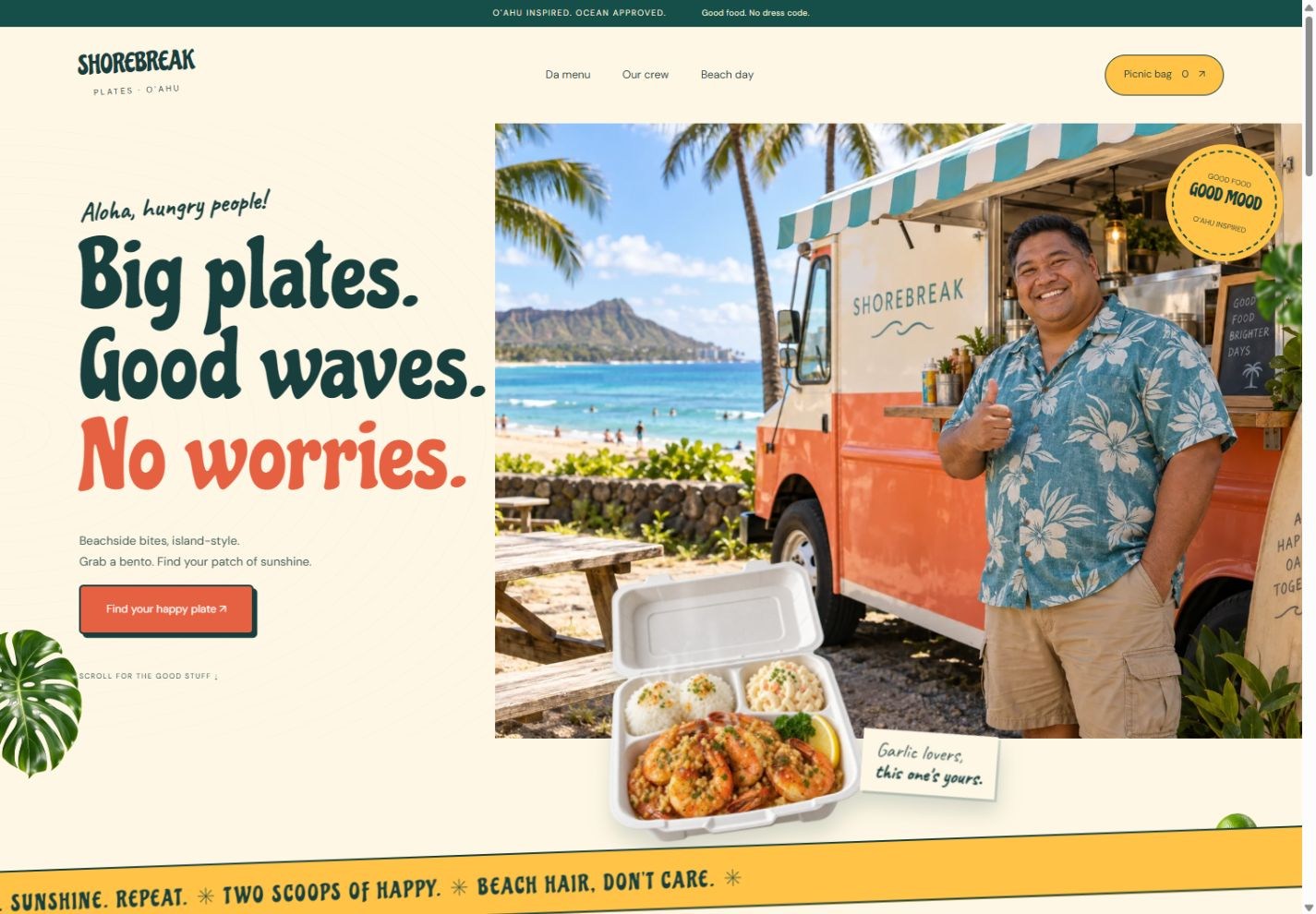
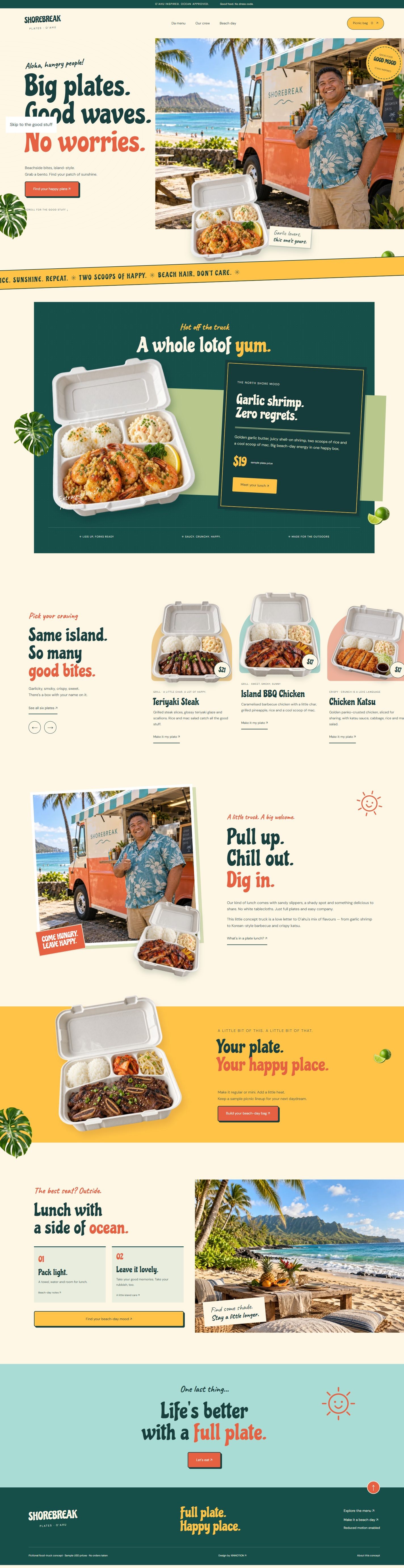
A three-page English Oahu-inspired food-truck concept grounded in local menu research. Six open bento plates, a welcoming thumbs-up truck owner, chunky retro typography and floating ingredients create a relaxed island lunch experience.
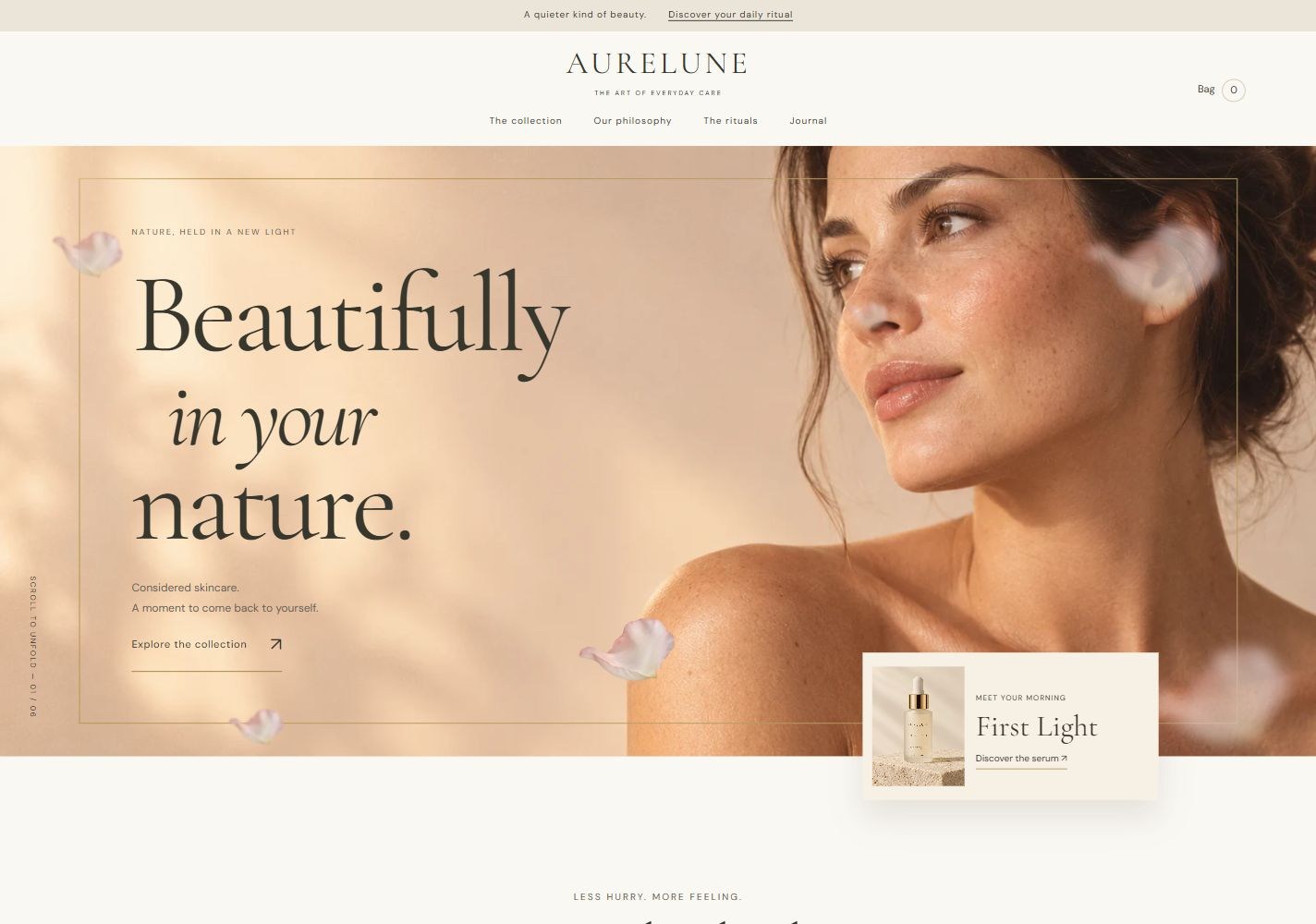
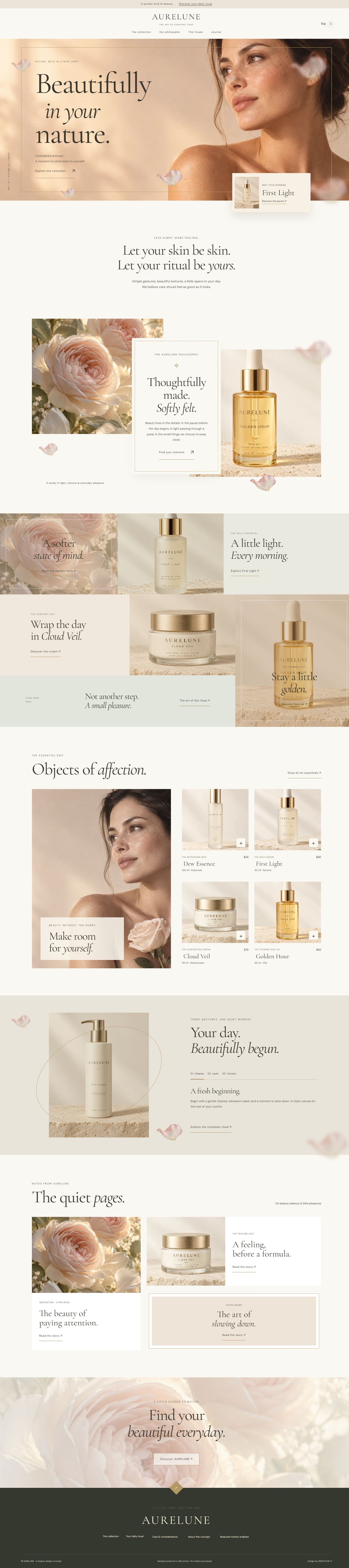
A three-page English skincare concept with champagne-gold light frames, depth-layered petals and original product photography. A centred overlapping story card, shared-edge editorial mosaic and tall campaign/product split bring quiet daily rituals to life.
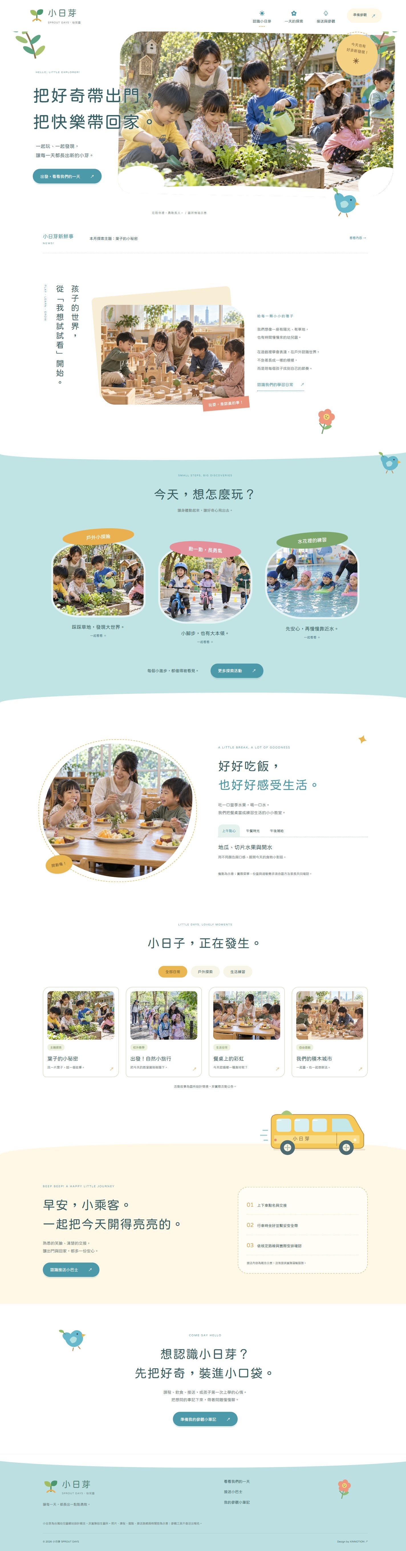
A three-page Traditional Chinese kindergarten concept for Taiwan. Natural photography, a cheerful illustrated bus, vertical typography, organic photo frames and selective overlapping layers connect outdoor discovery, movement, swimming, meals and pickup routines.
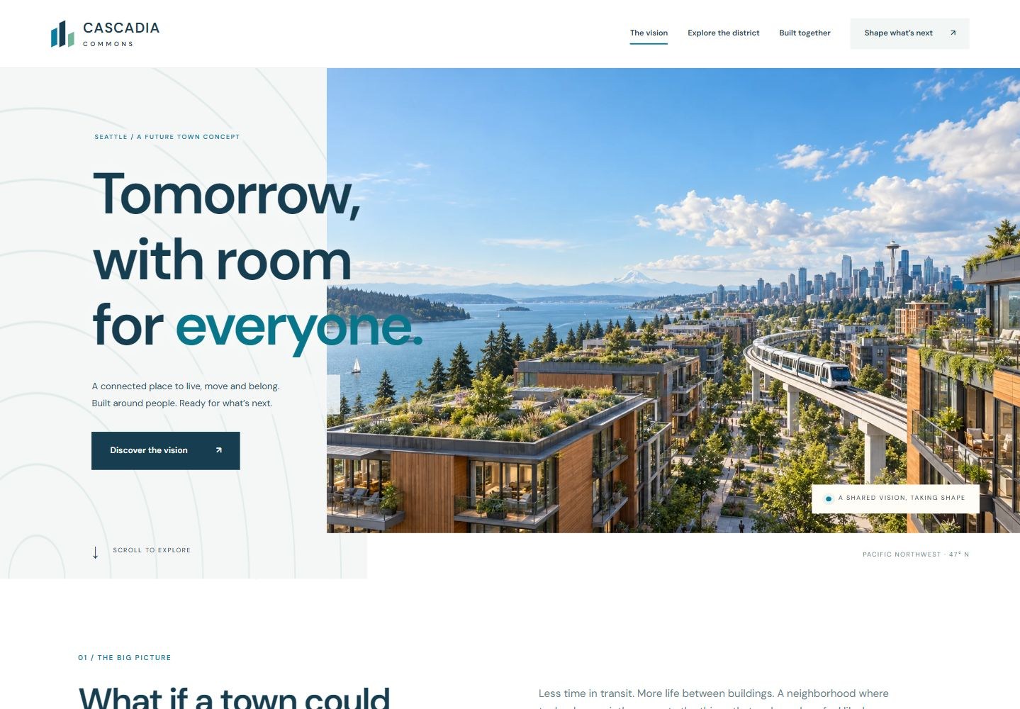
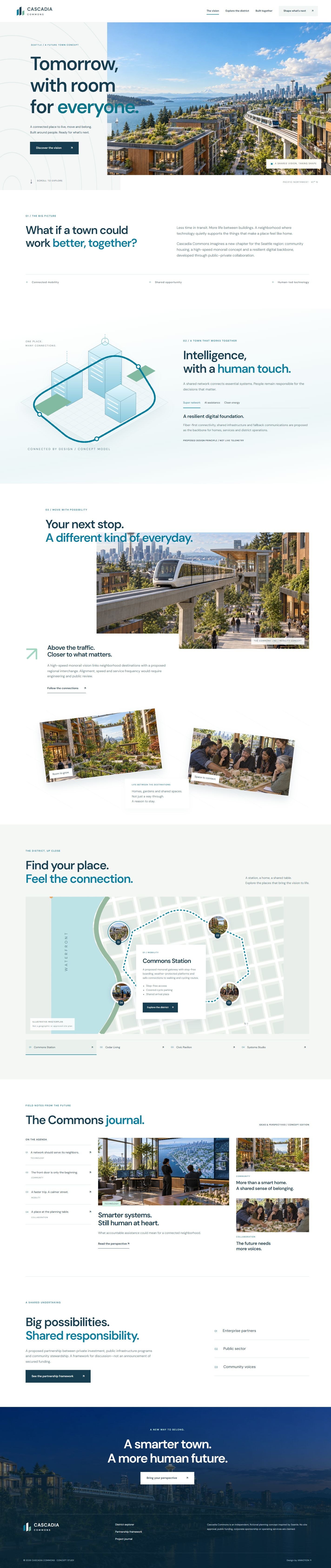
A three-page English concept for a future Seattle smart town. A split panoramic hero, interactive isometric systems, offset monorail imagery, circular photographic map pins and an unequal-column journal connect housing, mobility, technology and public–private collaboration.
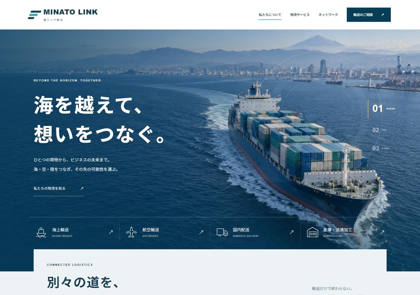
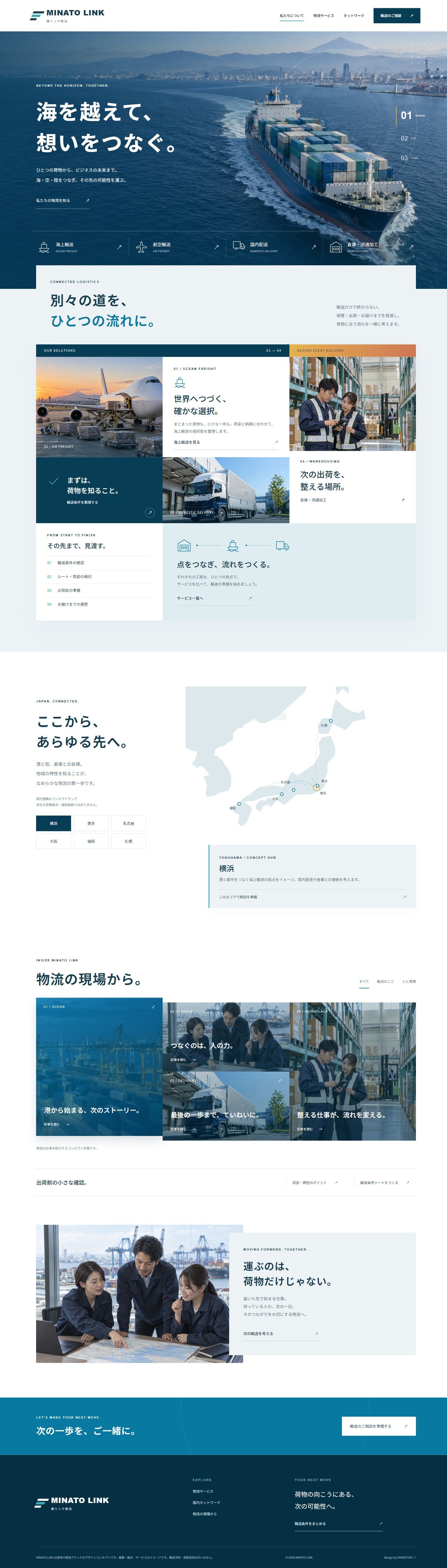
A three-page Japanese logistics concept. An ocean hero with orbital graphics leads into overlapping shared-edge service modules and an unequal-height editorial mosaic. Six concept hubs, service tabs and a local shipping brief support exploration, with image zoom, icon movement and animated rules.
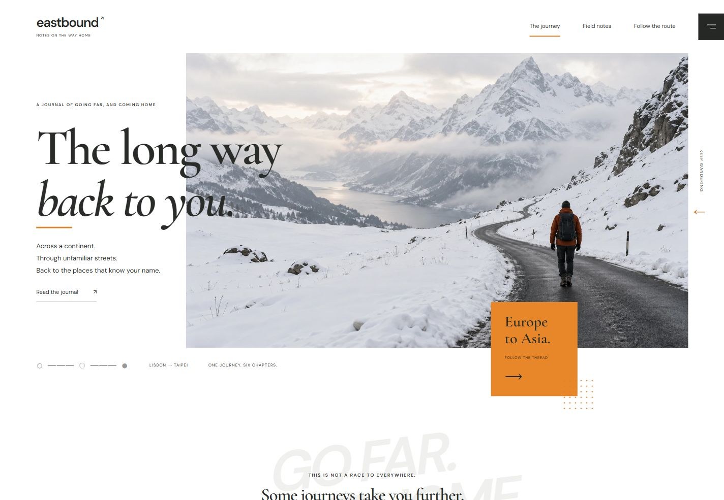
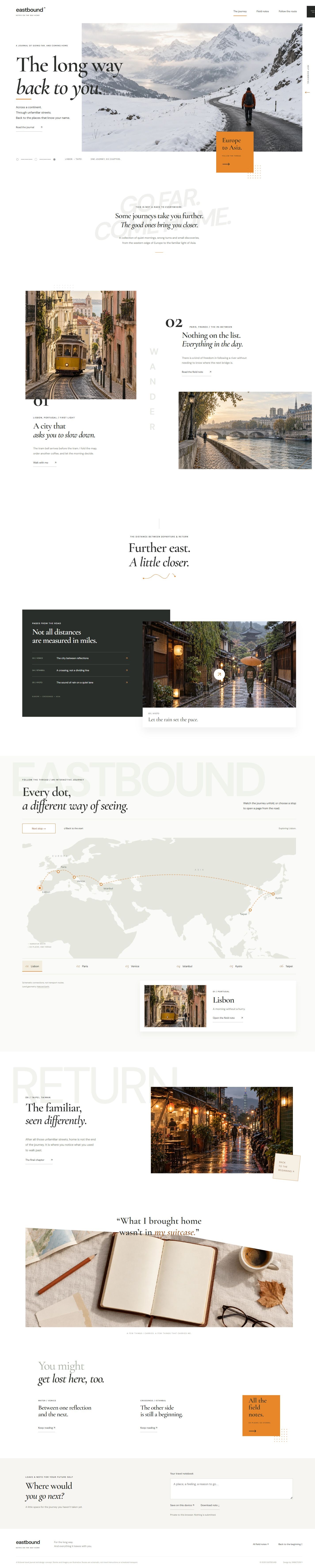
A three-page English travel journal from Europe back to Asia. Staggered numbered photographs, oversized background typography and floating orange invitations create an editorial journey. An animated Eurasia route connects six city stories, with archive filters, saved reading lists and a private travel notebook.
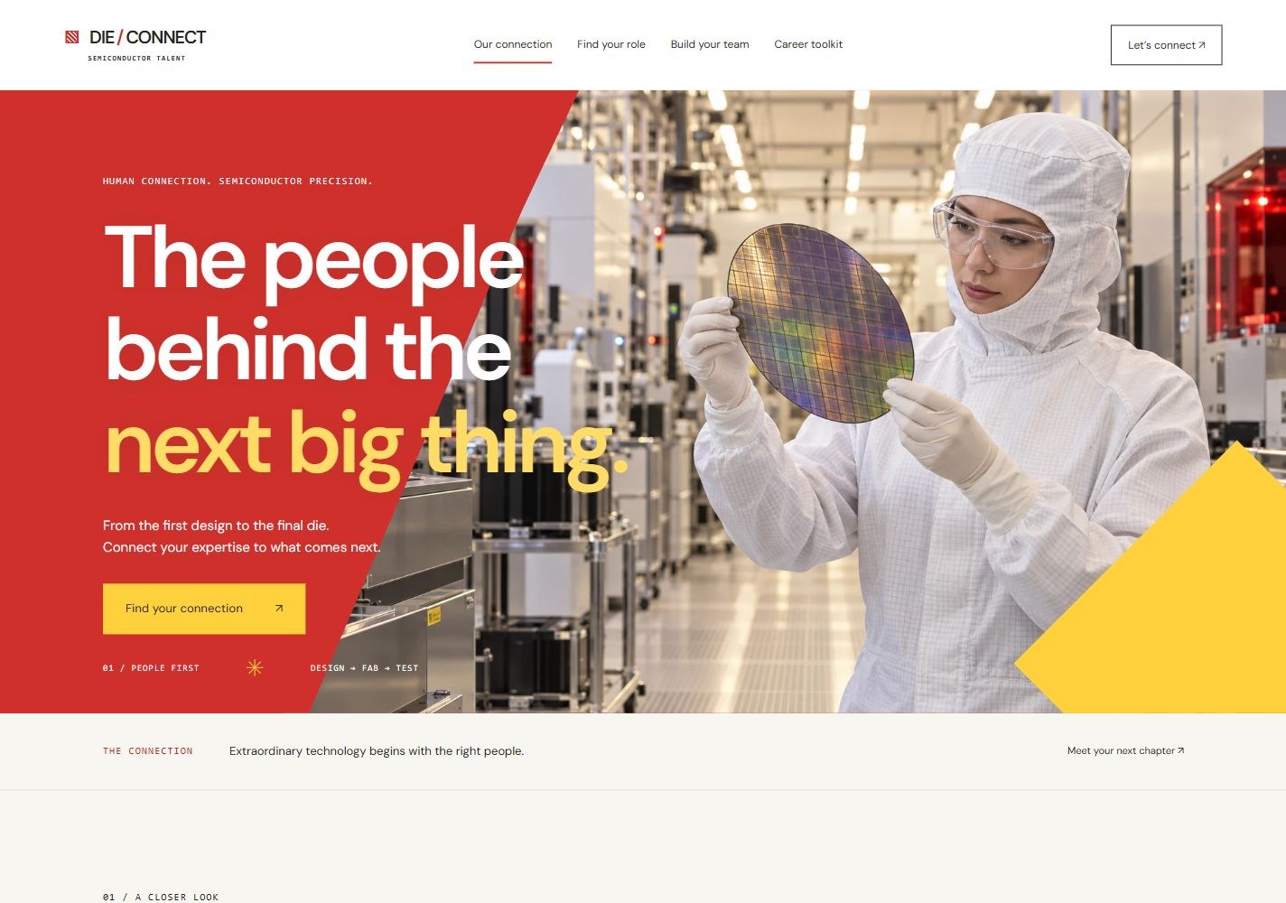
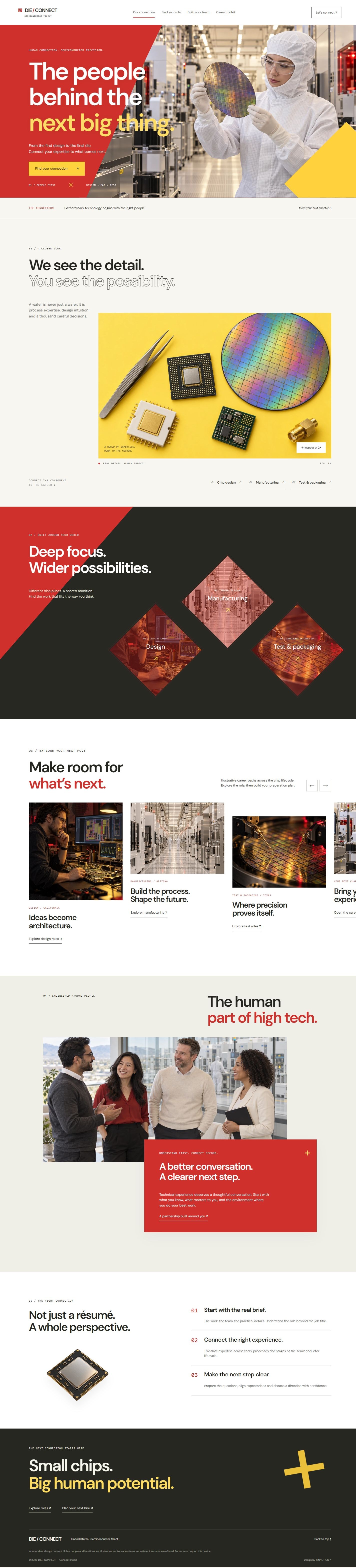
A four-page English US semiconductor recruitment concept. Red and yellow diagonal planes, a component flatlay magnifier, diamond discipline links and an unequal-height career belt meet an overlapping team panel. Includes example-role filters, saved roles, local hiring briefs and candidate preparation tools.
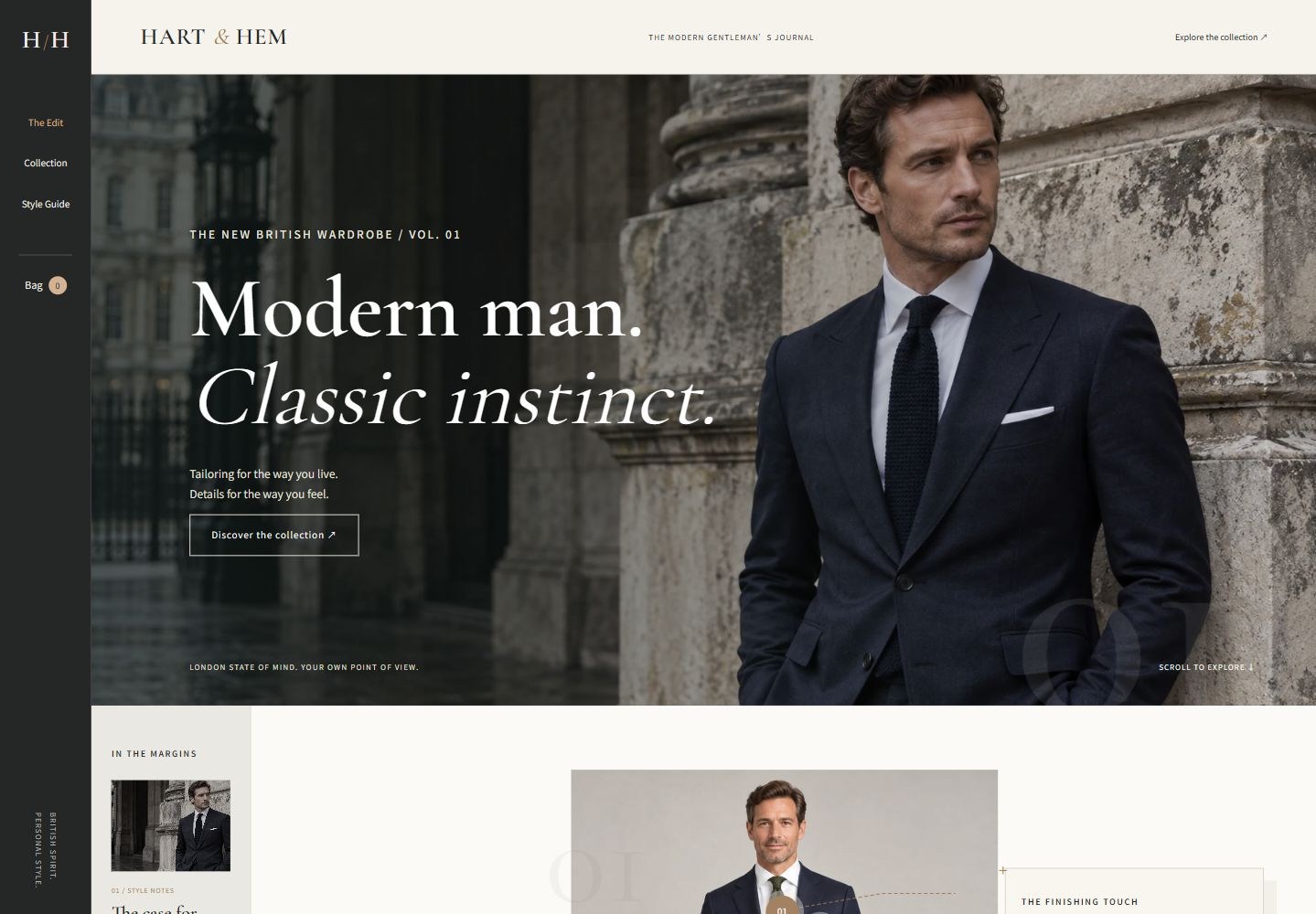
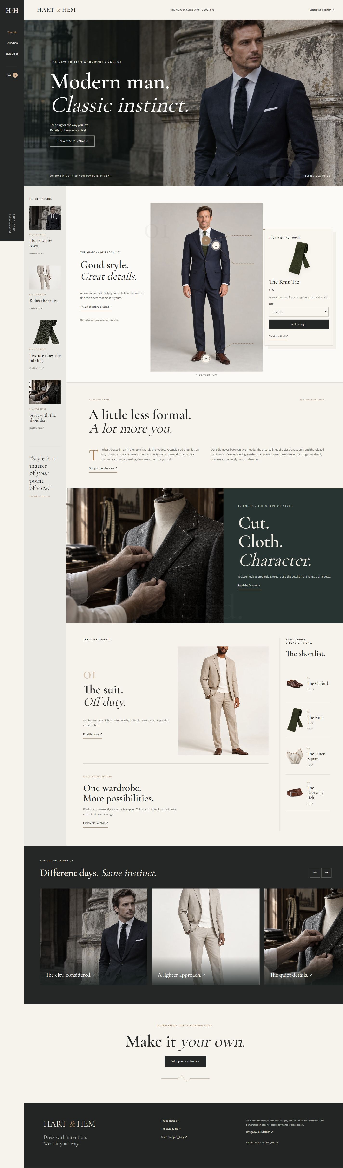
A three-page English menswear concept for the UK. A slim dark navigation rail, editorial sidebar, photographic cover and asymmetric magazine compositions connect classic and modern tailoring. Outfit annotation points reveal accessory cards with size selection and a persistent local shopping bag.
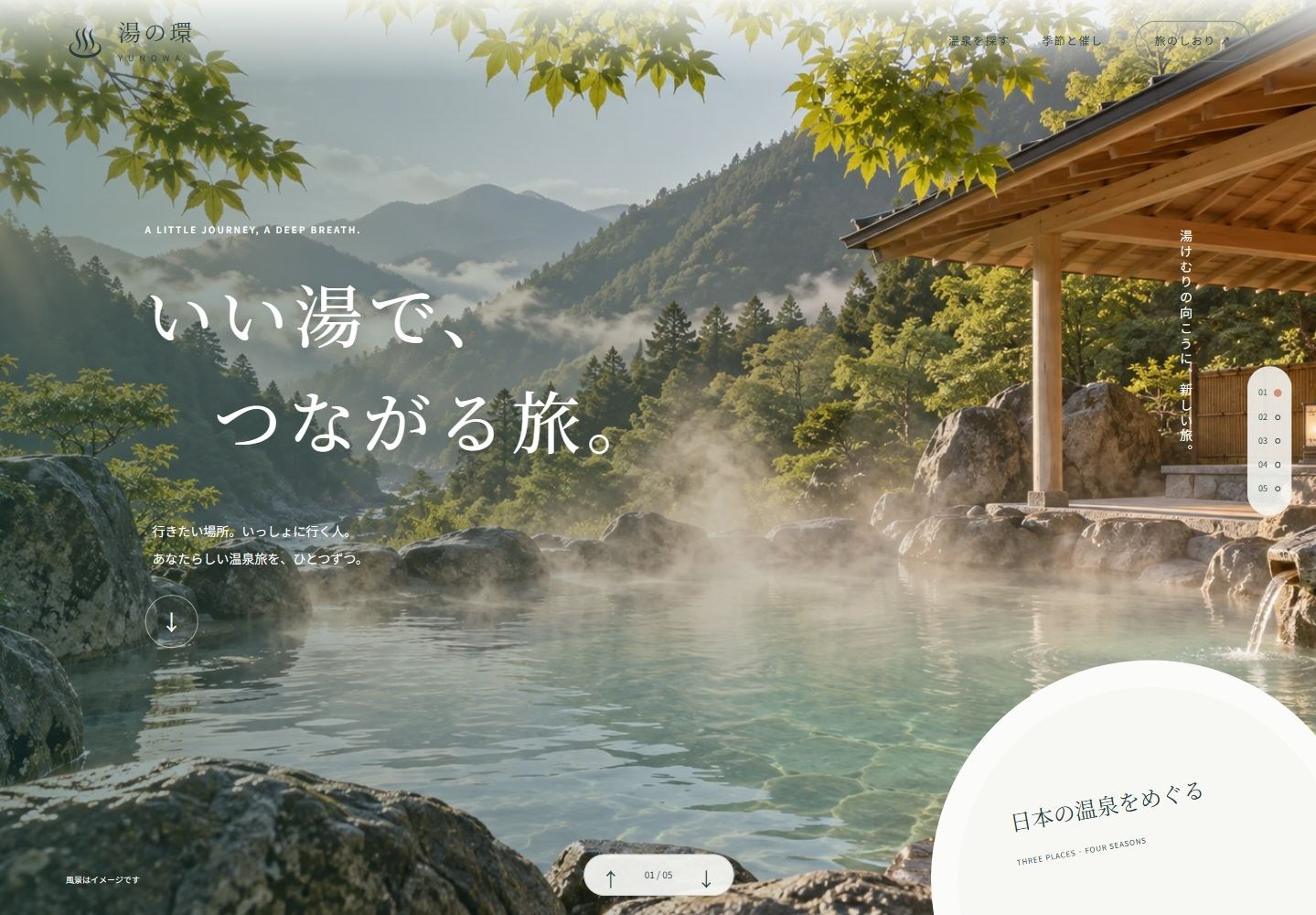
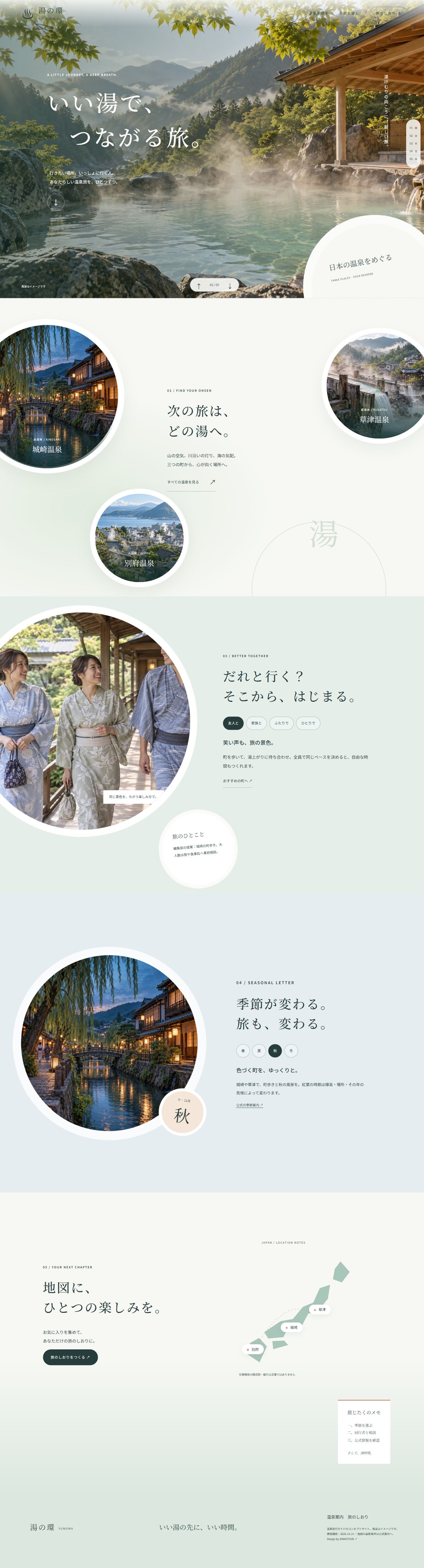
A seven-page Japanese hot spring travel guide. Five full-window chapters connect Kinosaki, Kusatsu and Beppu through circular imagery, generous space and mineral-blue tones, with companion guidance, seasonal switching, destination favorites and local travel notes.
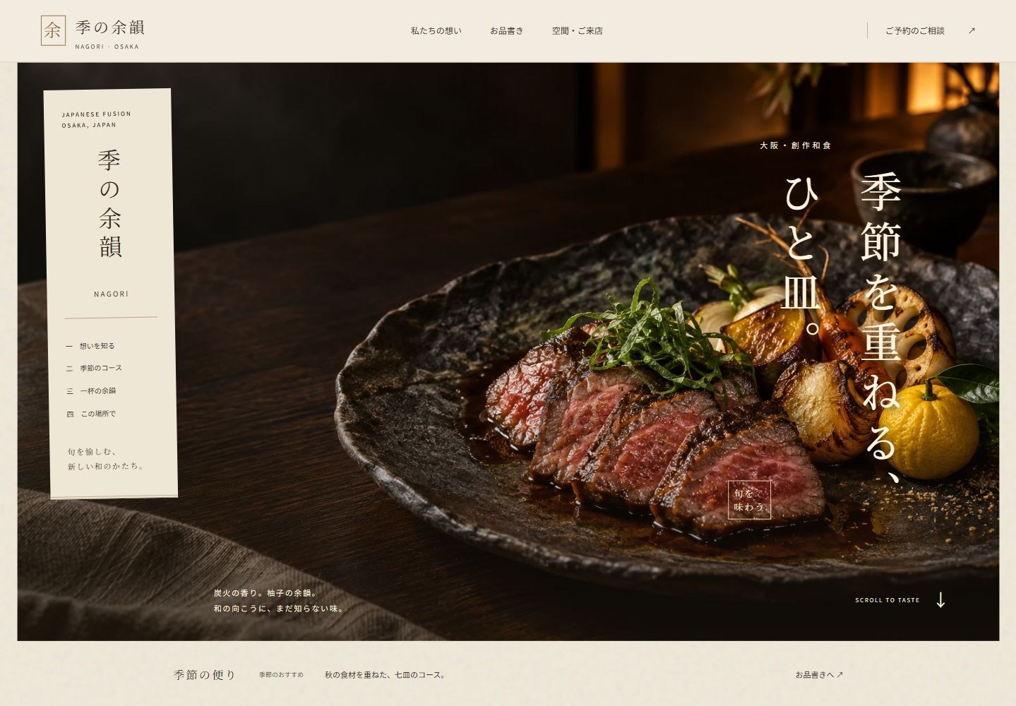
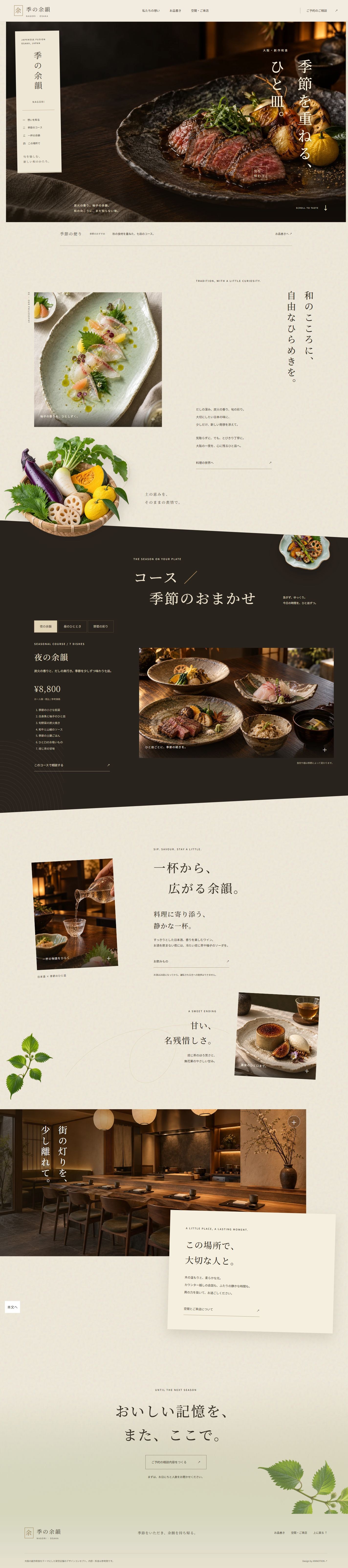
A three-page Japanese restaurant concept for Osaka. Floating paper navigation, vertical Japanese typography, charcoal-grilled dishes, a diagonal dark course chapter and floating ingredients form an editorial food story. Nine bespoke images support a dish album, photo reveals, drink filters and a locally saved visit-planning note.
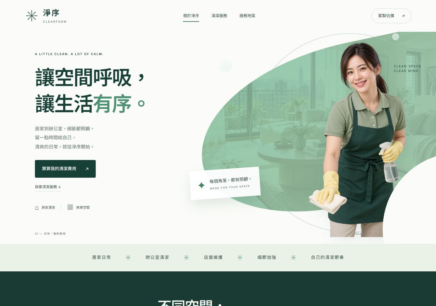
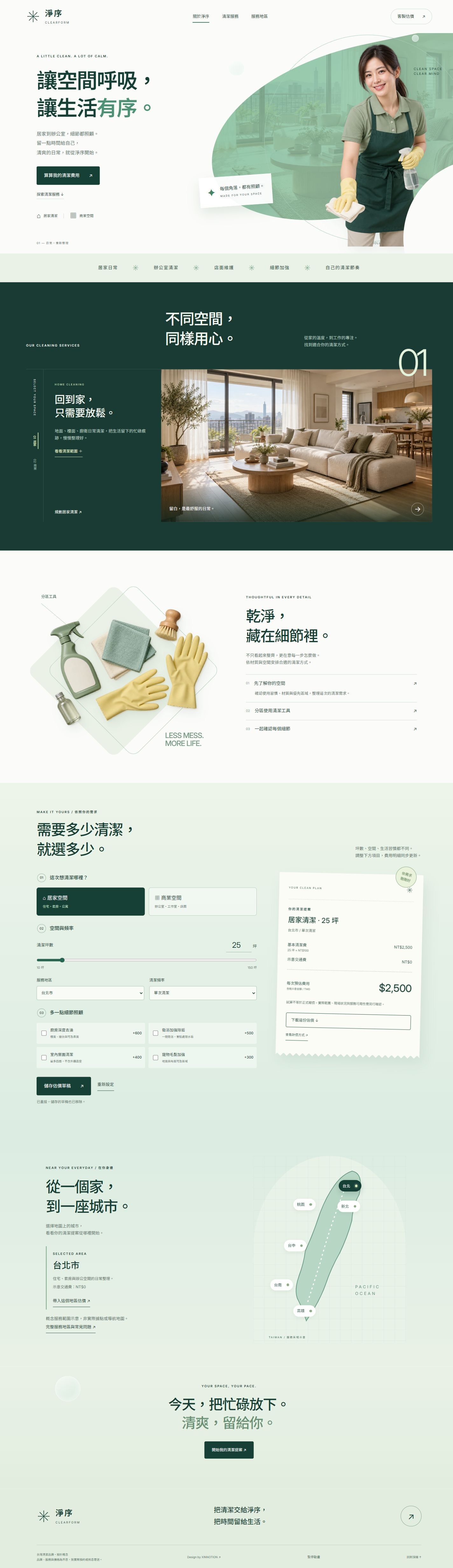
A three-page Traditional Chinese cleaning brand concept for Taiwan. A curved portrait opening, dark numbered service theatre, diamond tool layers and a receipt-style estimator create a distinct progression. Switch home and commercial scenes, adjust area, extras, frequency and city costs, then save or download a local quote draft.
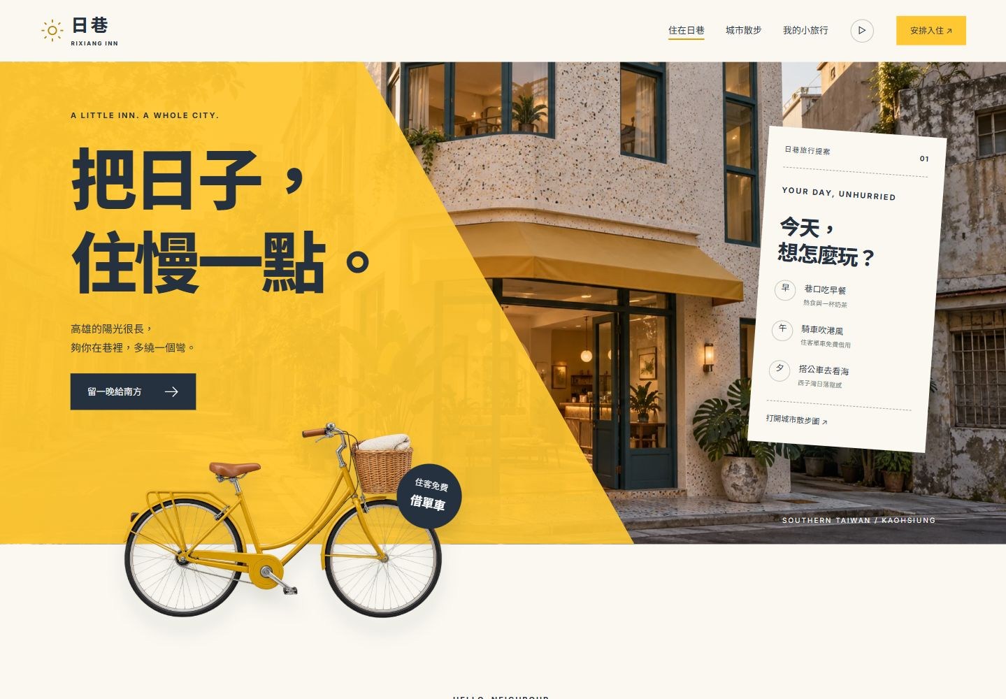
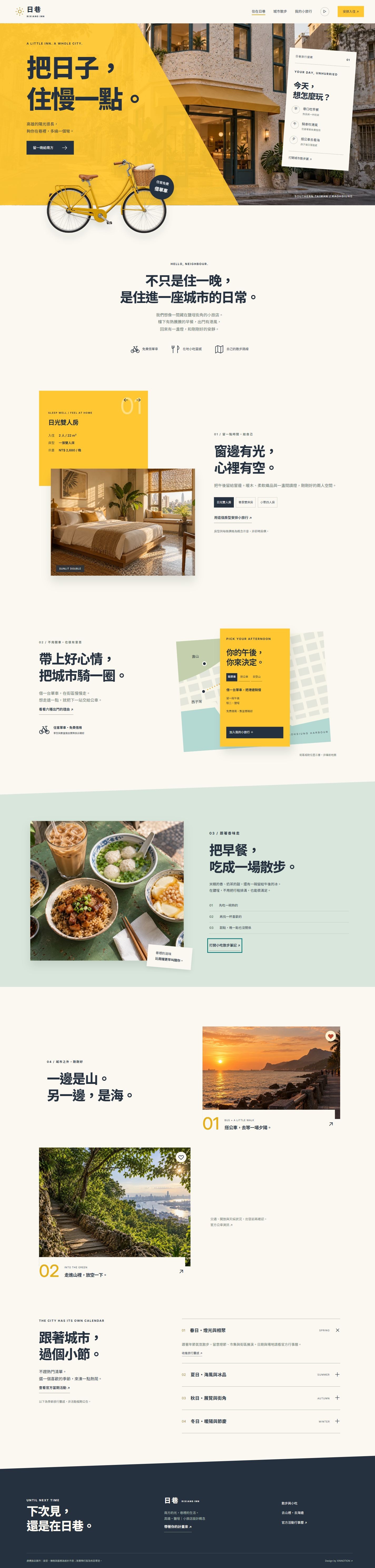
A Traditional Chinese boutique inn concept inspired by Yancheng, Kaohsiung. An angled mango-yellow opening, overlapping bicycle, offset room imagery and floating route ticket lead into food, coastal bus outings, forest walks and seasonal inspiration across three pages.
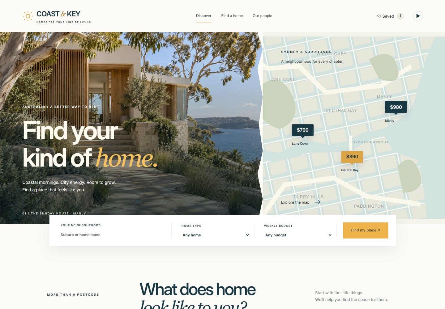
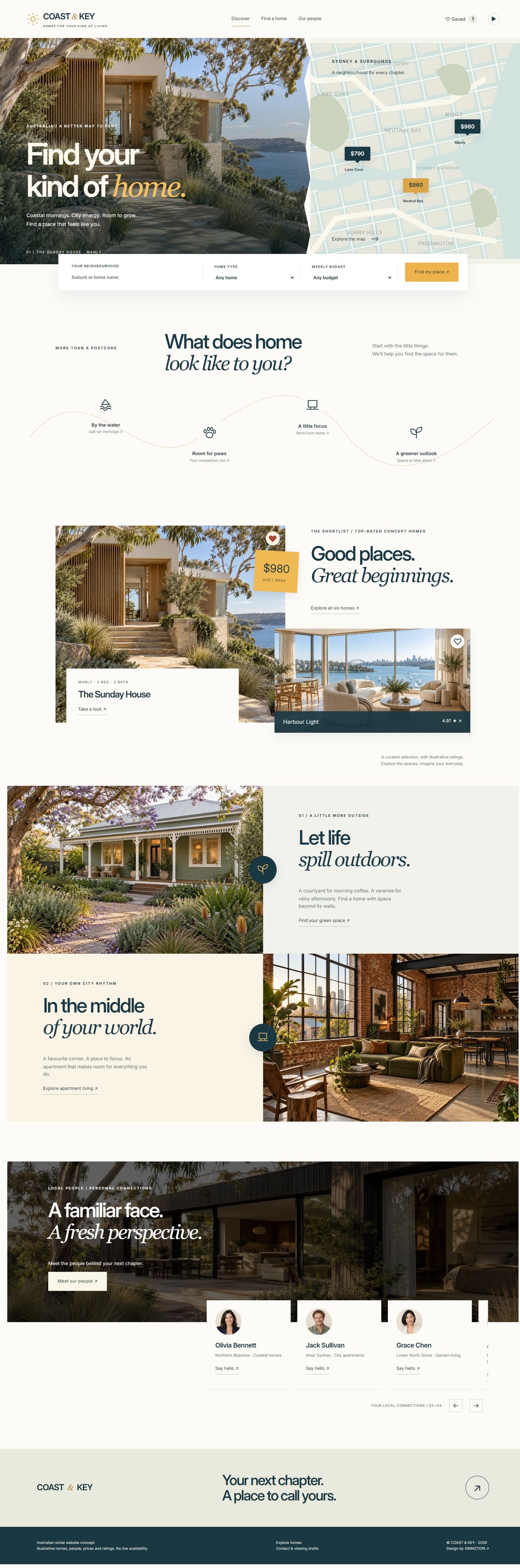
A three-page Australian rental concept combining a photo/map opening, overlapping search strip, winding lifestyle route and circular badges at image seams. Interactive map bounds, property previews, table comparison and local viewing/contact drafts make the design usable.
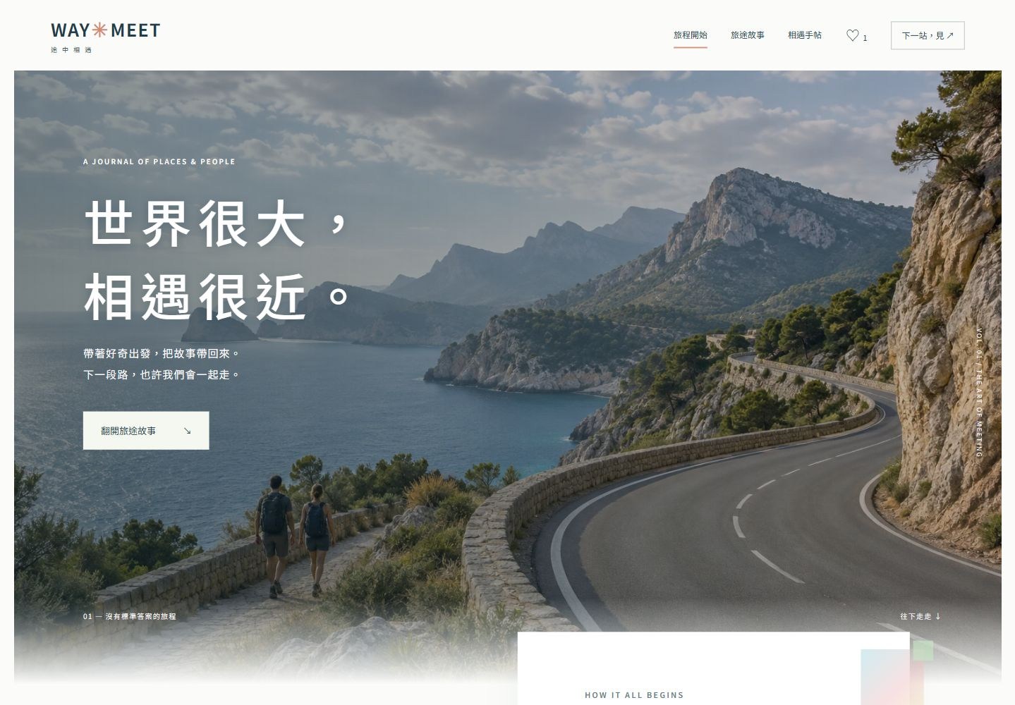
A three-page Traditional Chinese travel journal about meeting people around the world. Uncommon reference compositions lead the design: scattered circular portraits, alternating numbered stories and overlapping editorial panels, followed by soft image blending, article reading, saved stories and a personal meeting notebook.
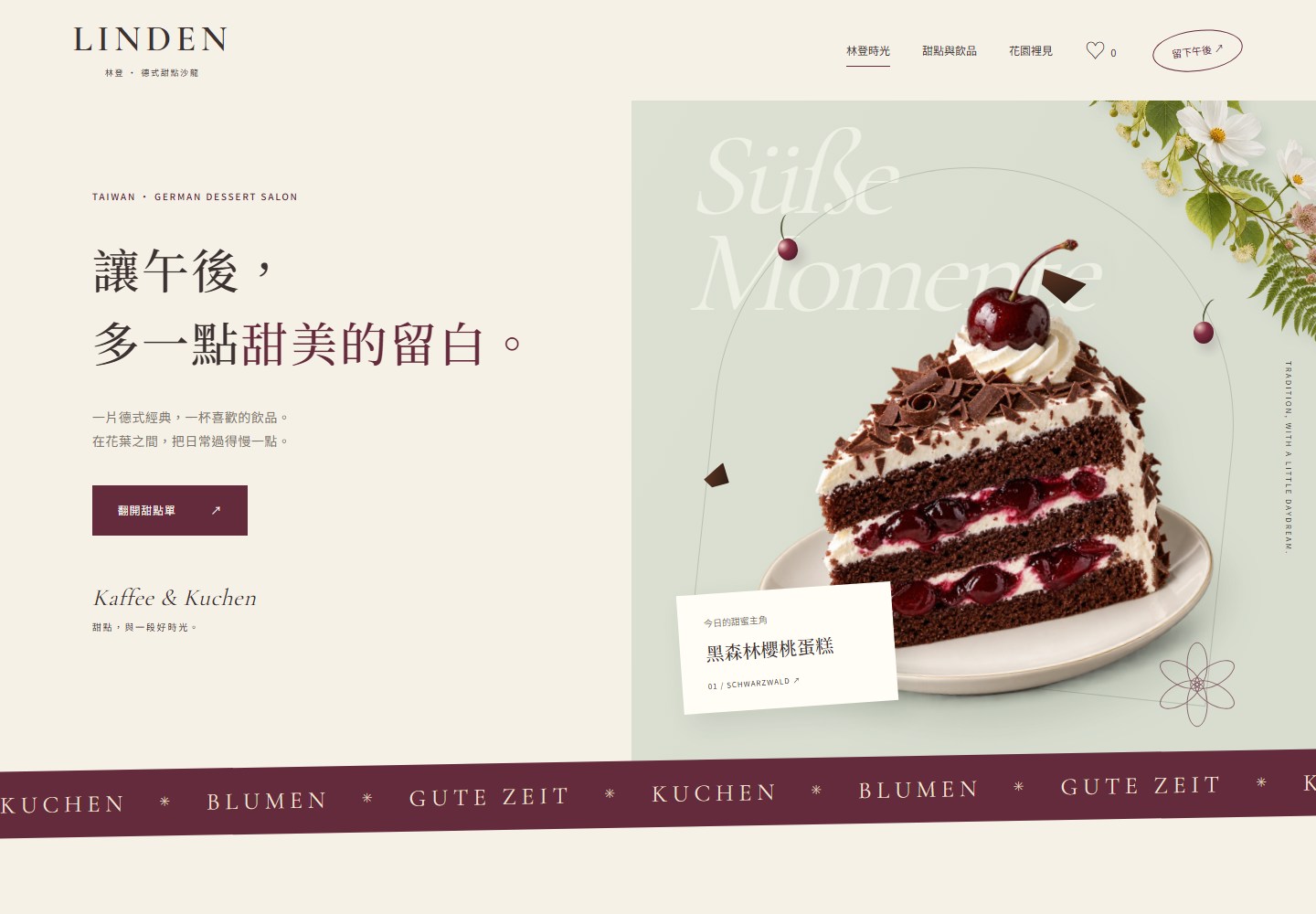
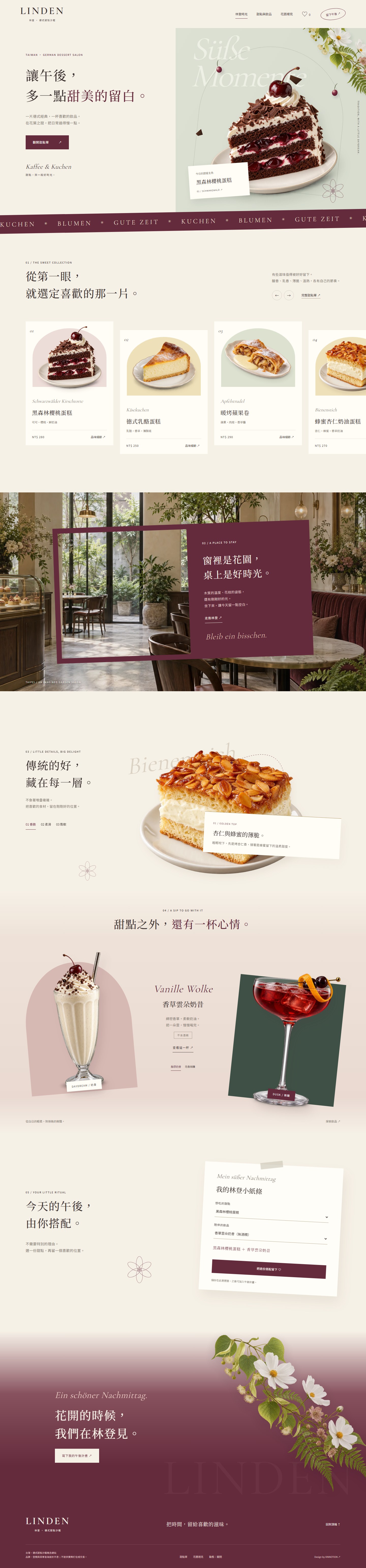
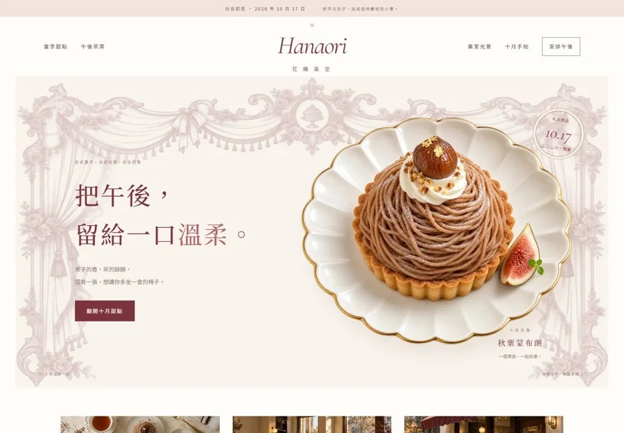
A refined German dessert salon concept in Taiwan. Three Traditional Chinese pages combine a floating Black Forest cake, botanical interiors, open viewfinder frames and offset drink displays, leading from classic pastries to a saved personal afternoon plan.
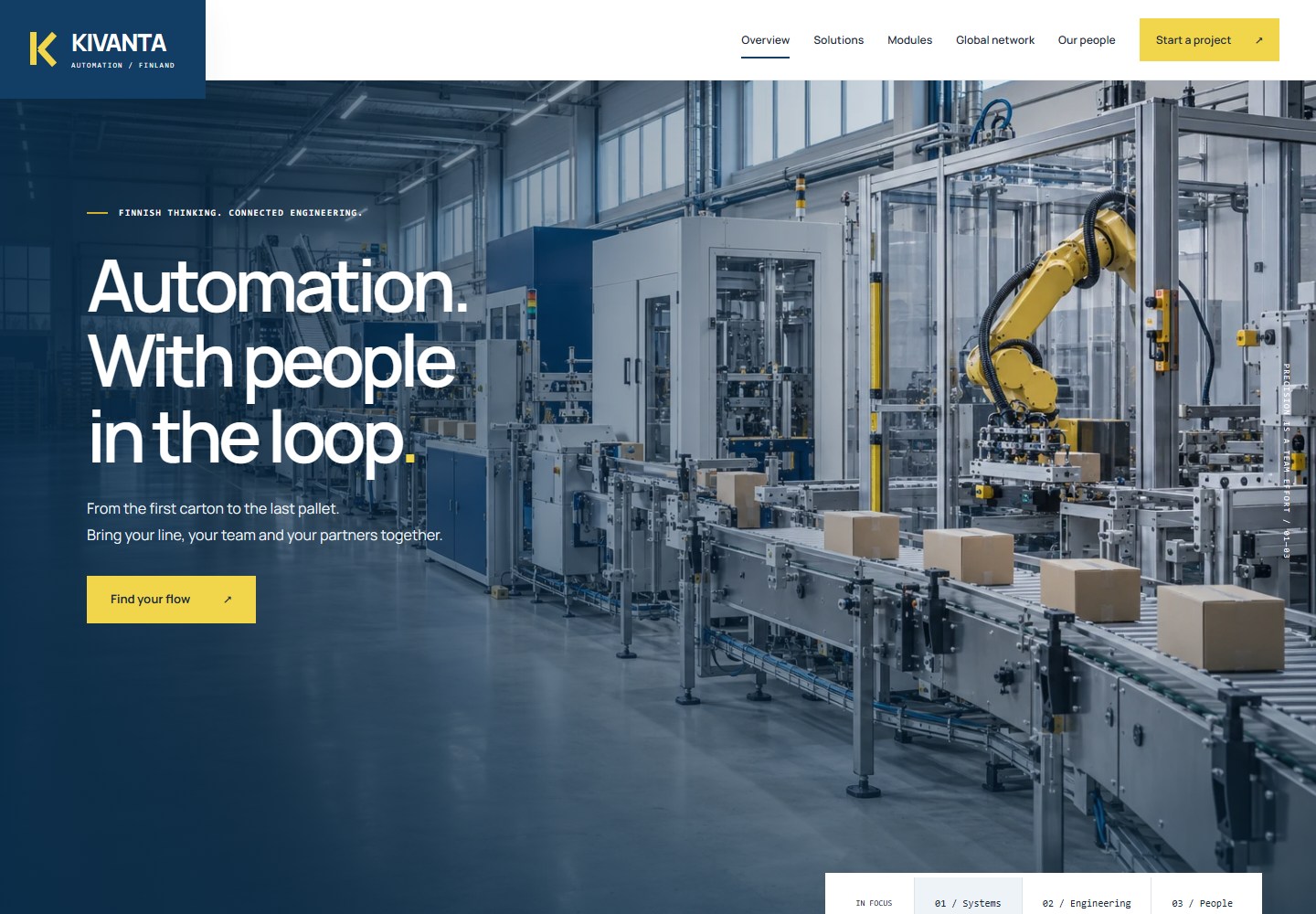
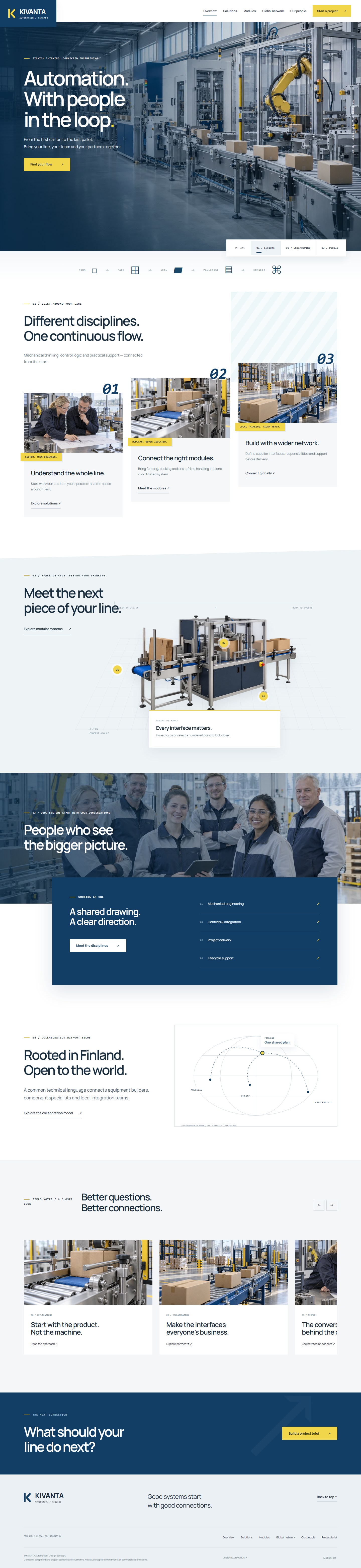
A six-page English concept for a Finnish packaging automation company. Factory-scale imagery, stepped service cards, floating equipment hotspots and an overlapping engineering board lead into global supplier collaboration, team disciplines and a downloadable project brief.
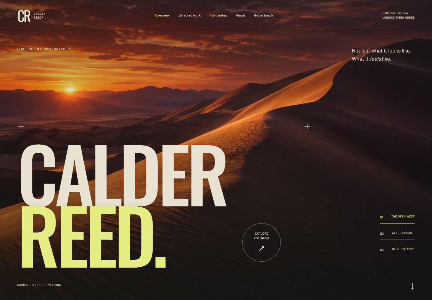
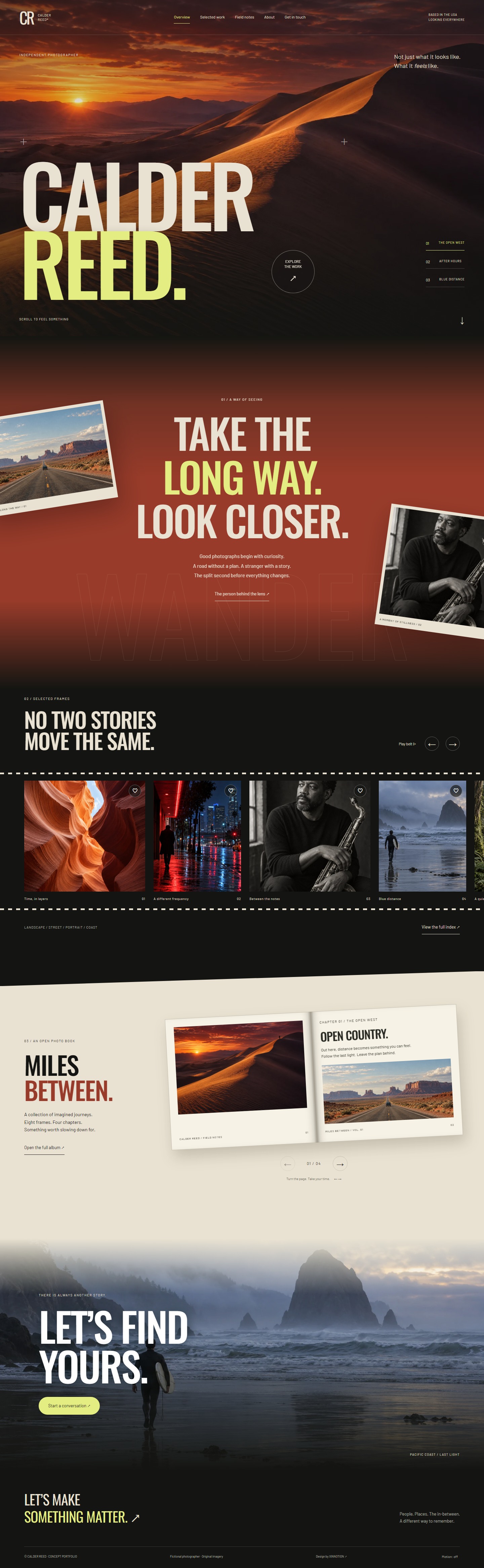
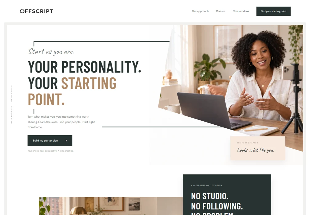
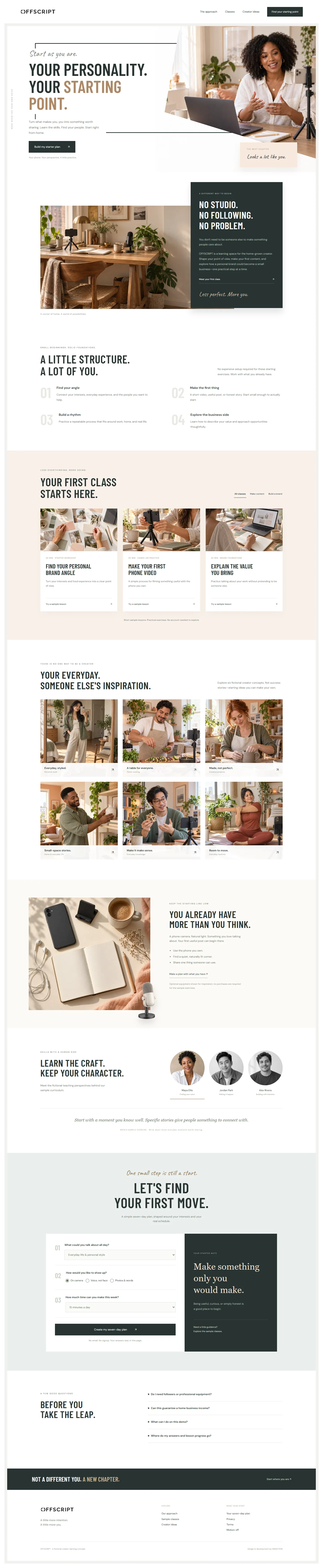
A five-page English portfolio for a fictional American male photographer. Expansive desert imagery, monumental condensed type and rust-to-Pacific transitions unfold through moving prints, a film belt, a turning photo book and vertical scenes.
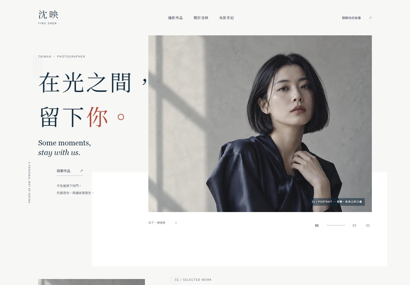
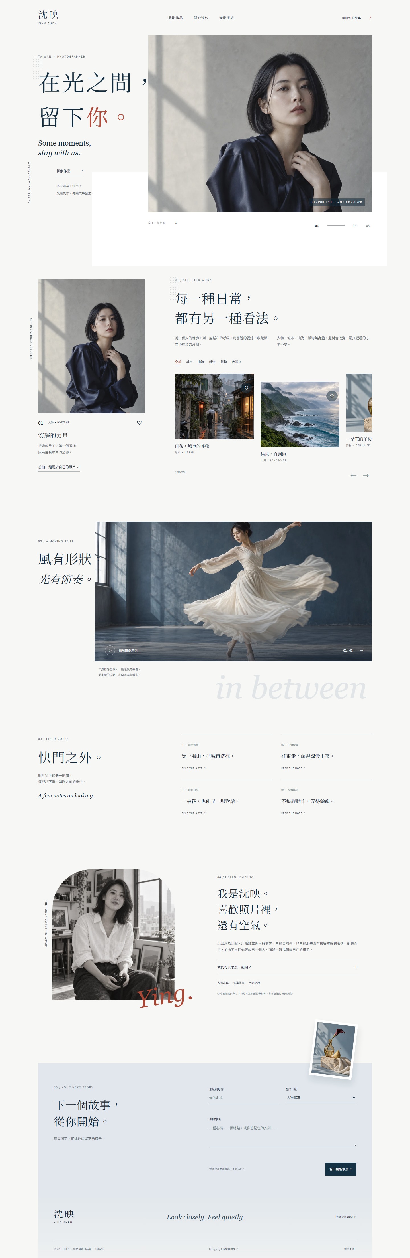
A conceptual portfolio for a Taiwanese female photographer. Editorial white space, overlapping titles and offset imagery introduce diverse subjects. Morphing masks, a horizontal filmstrip, revealing notes and a local creative brief turn viewing into a measured exploration.
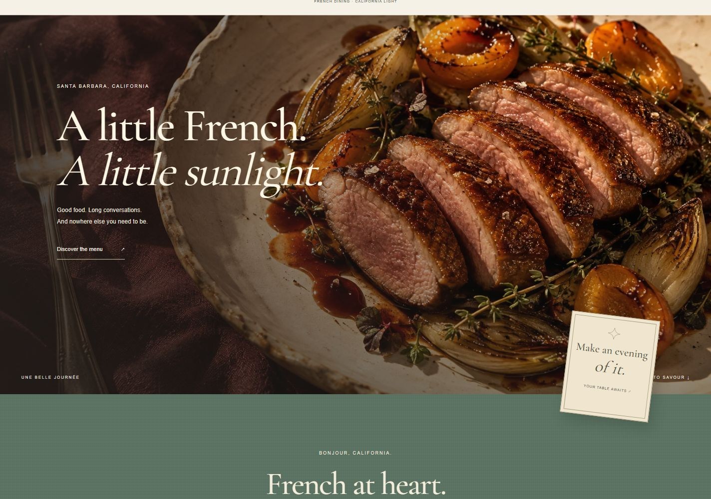
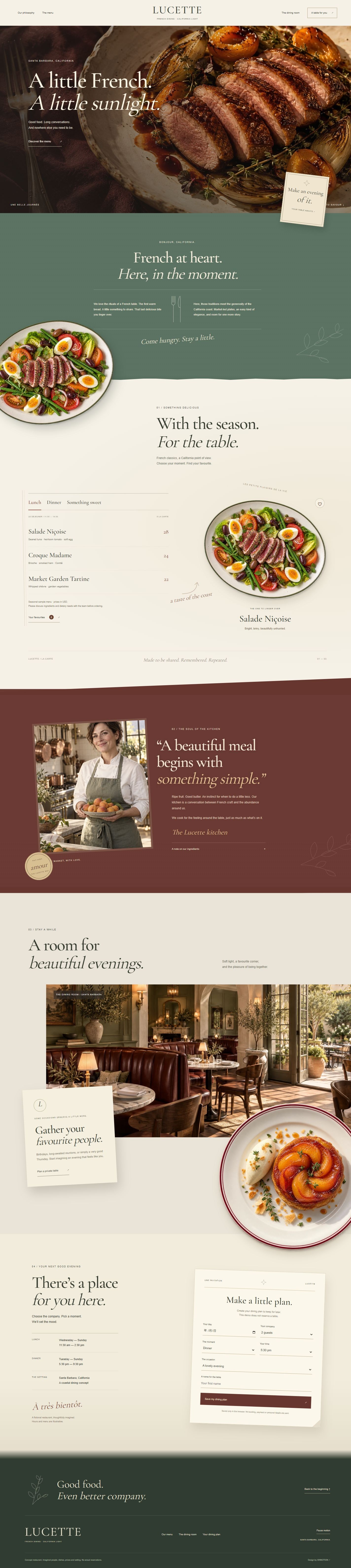
A relaxed, refined French restaurant concept in coastal California. Large food photography, sage textiles, overlapping plates, angled burgundy chapters and private invitations carry the story from lunch into dinner.
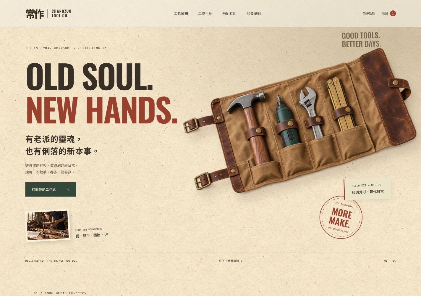
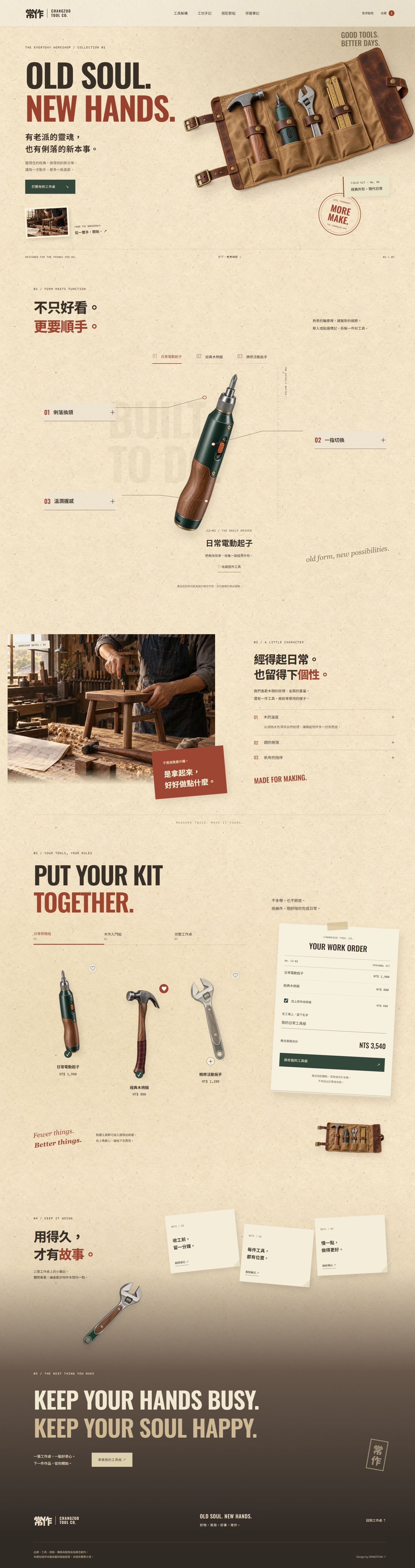
A heritage-inspired tool concept combining classic forms with modern efficiency. Aged paper, oxblood, forest green, wood and steel frame flatlay tools, animated callouts, offset photography and a customizable work order.
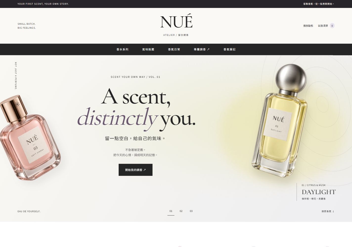
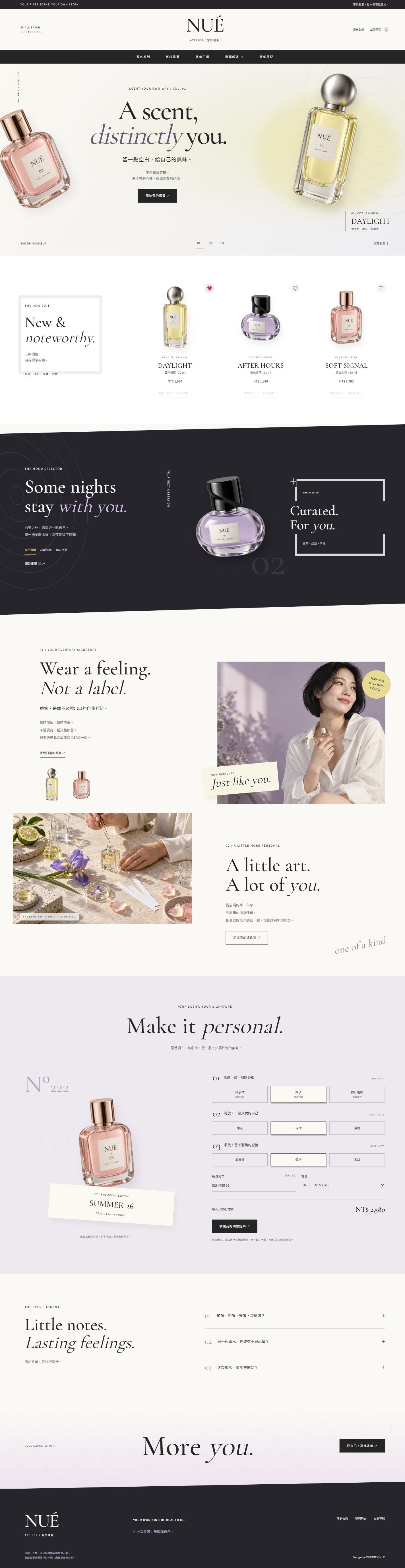
A custom perfume concept for young adults. Cream, lilac and citron surround original bottle imagery, with angled charcoal recommendations, alternating editorial photography and a personal fragrance studio.
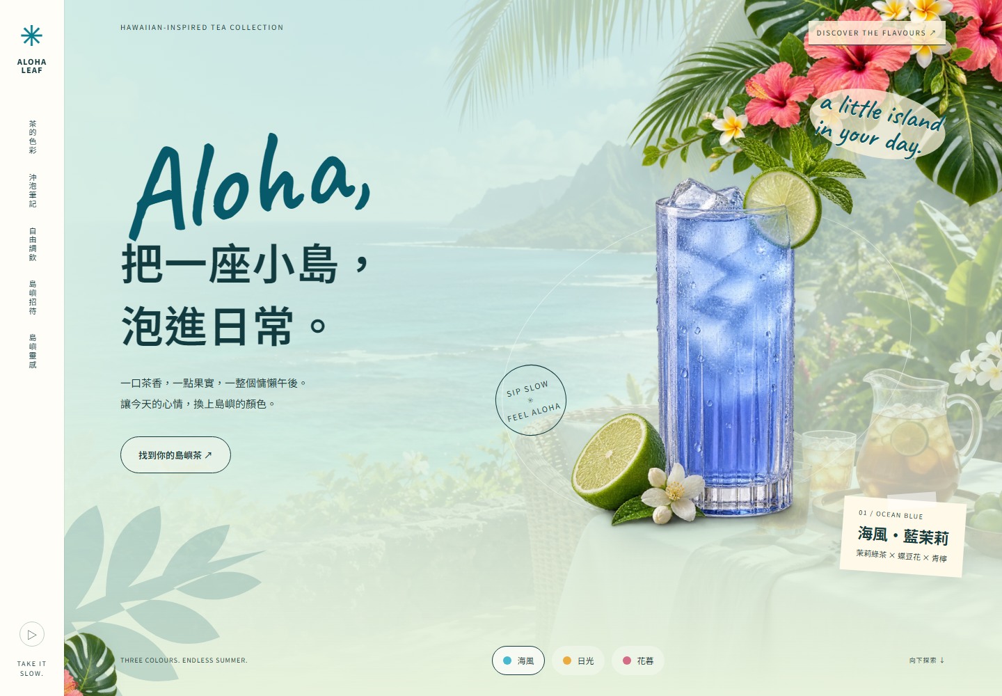
A Hawaiian-inspired tea concept with hibiscus, plumeria, tropical foliage and a transparent fictional host: a three-tone hero, open product exhibition, softly blended flavour chapter, dark brewing journey, central mixing counter and immersive ocean editorial.
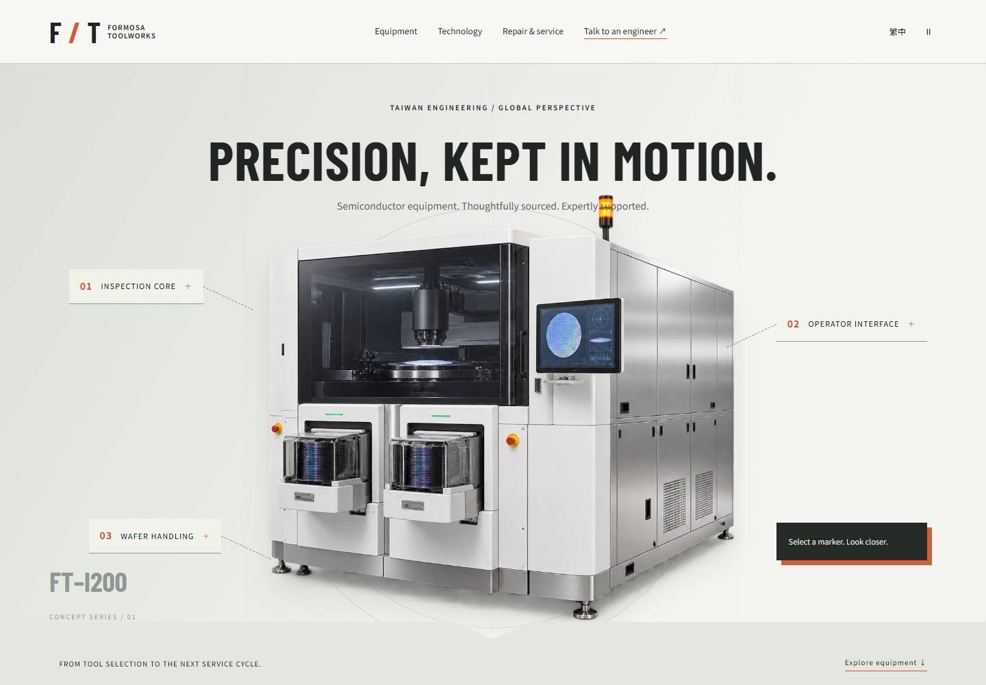
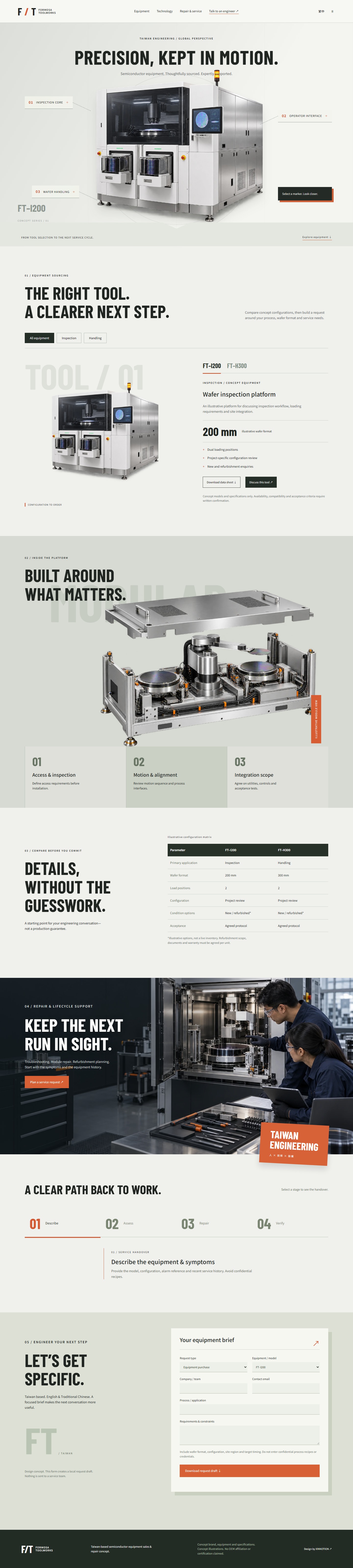
A Taiwan-based semiconductor equipment sales and repair concept. Oversized equipment, selectable annotations, a module illustration and specification matrix connect sourcing with service planning.
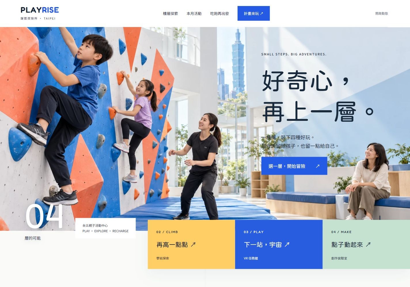
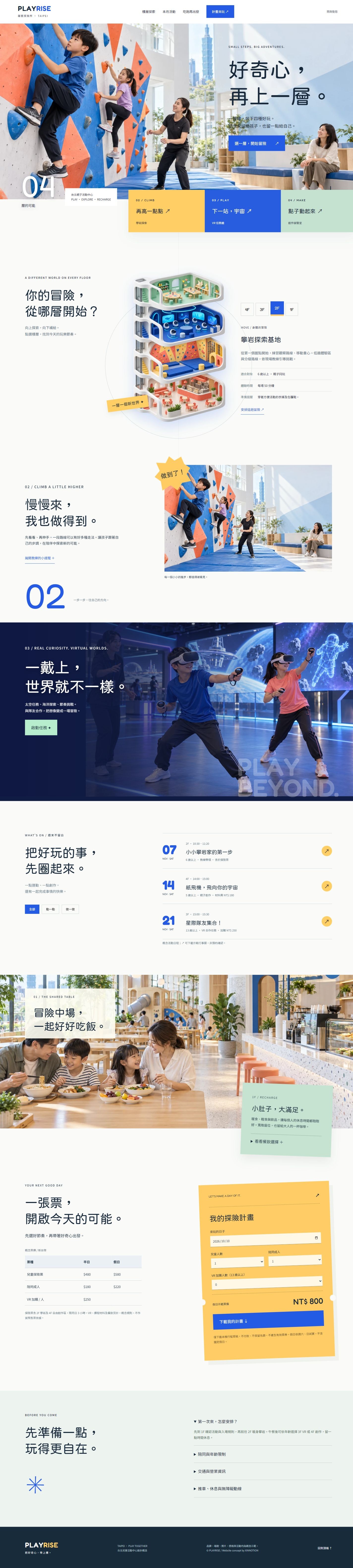
A Taipei family activity center concept. Architectural spacing, an overlapping activity belt and a four-floor cutaway connect climbing, VR, creative workshops and shared dining.
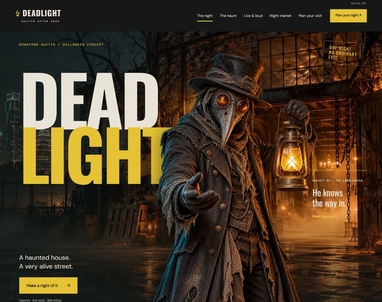
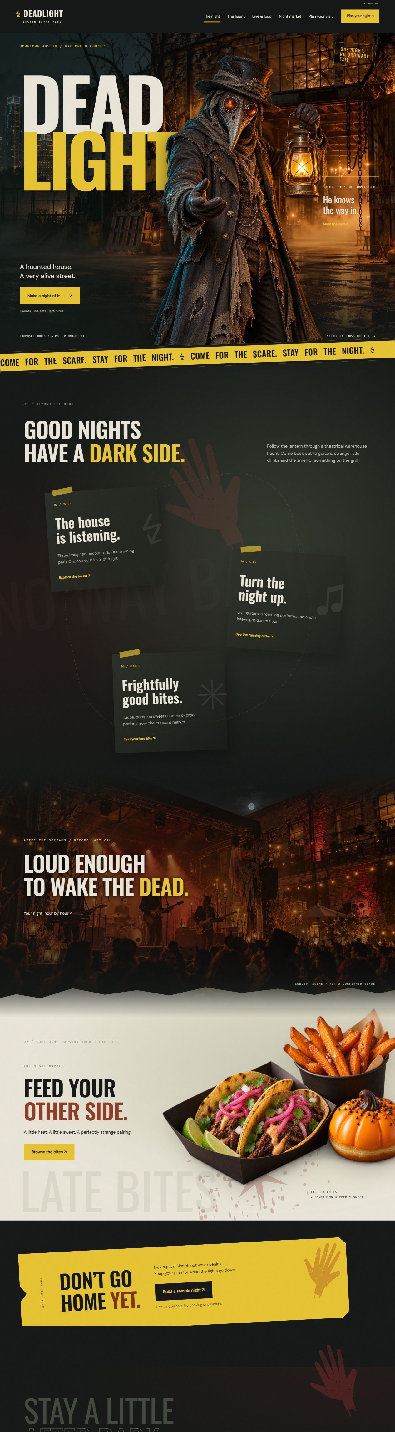
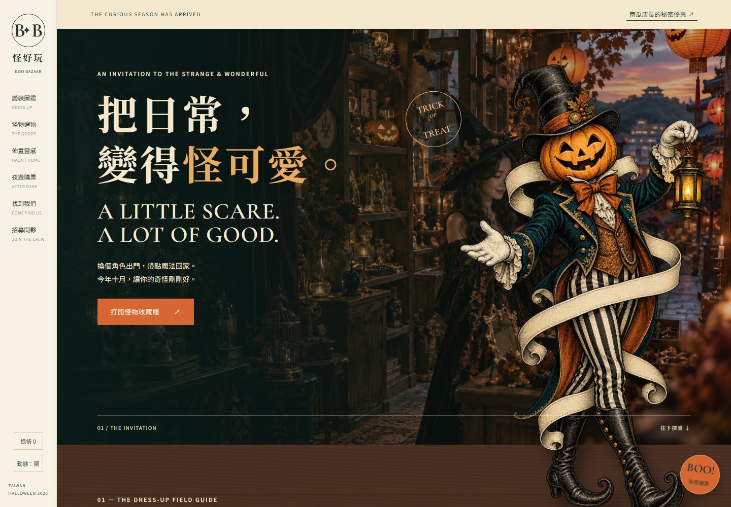
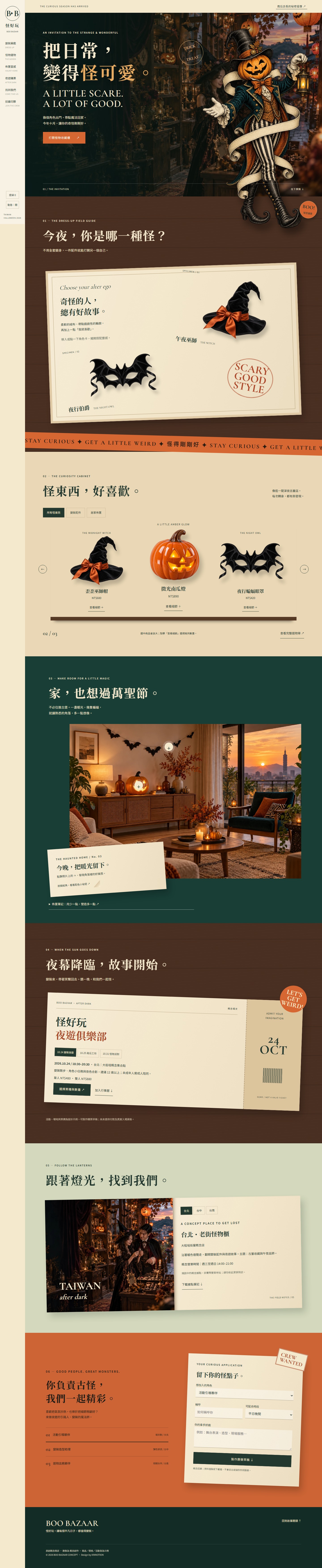
A Halloween accessories and home-decor concept shop. A fixed rail, engraved pumpkin host, angled paper cards and warm shop photography combine timed offers, a saved product bag and night-time events.
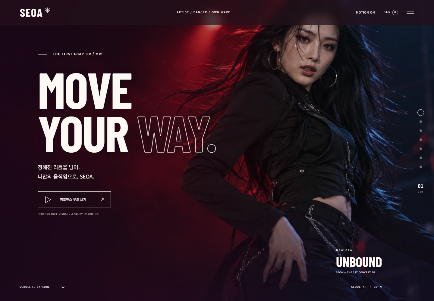
A Korean-language concept for a fictional singer and dancer. Seven full-height color scenes, editorial portraits, offset typography, a peelable album sleeve and floating fan merchandise create a distinctive stage narrative.
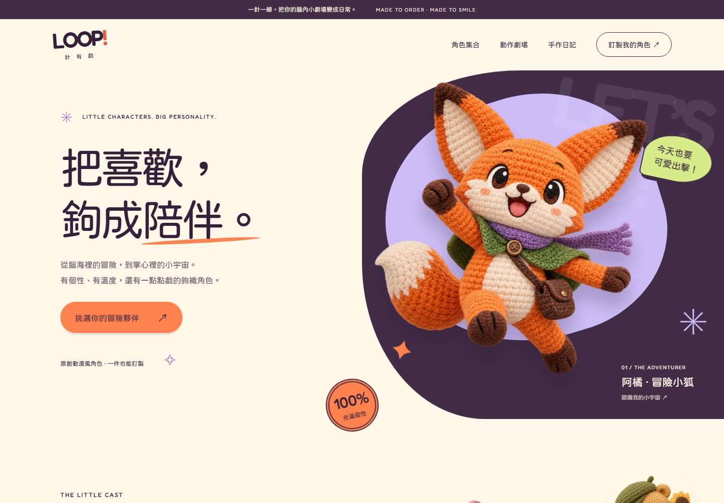
A Traditional Chinese crochet character shop concept. Cream, plum and tangerine frame organic curves, a tilted character strip, comic callouts and layered handmade storytelling.
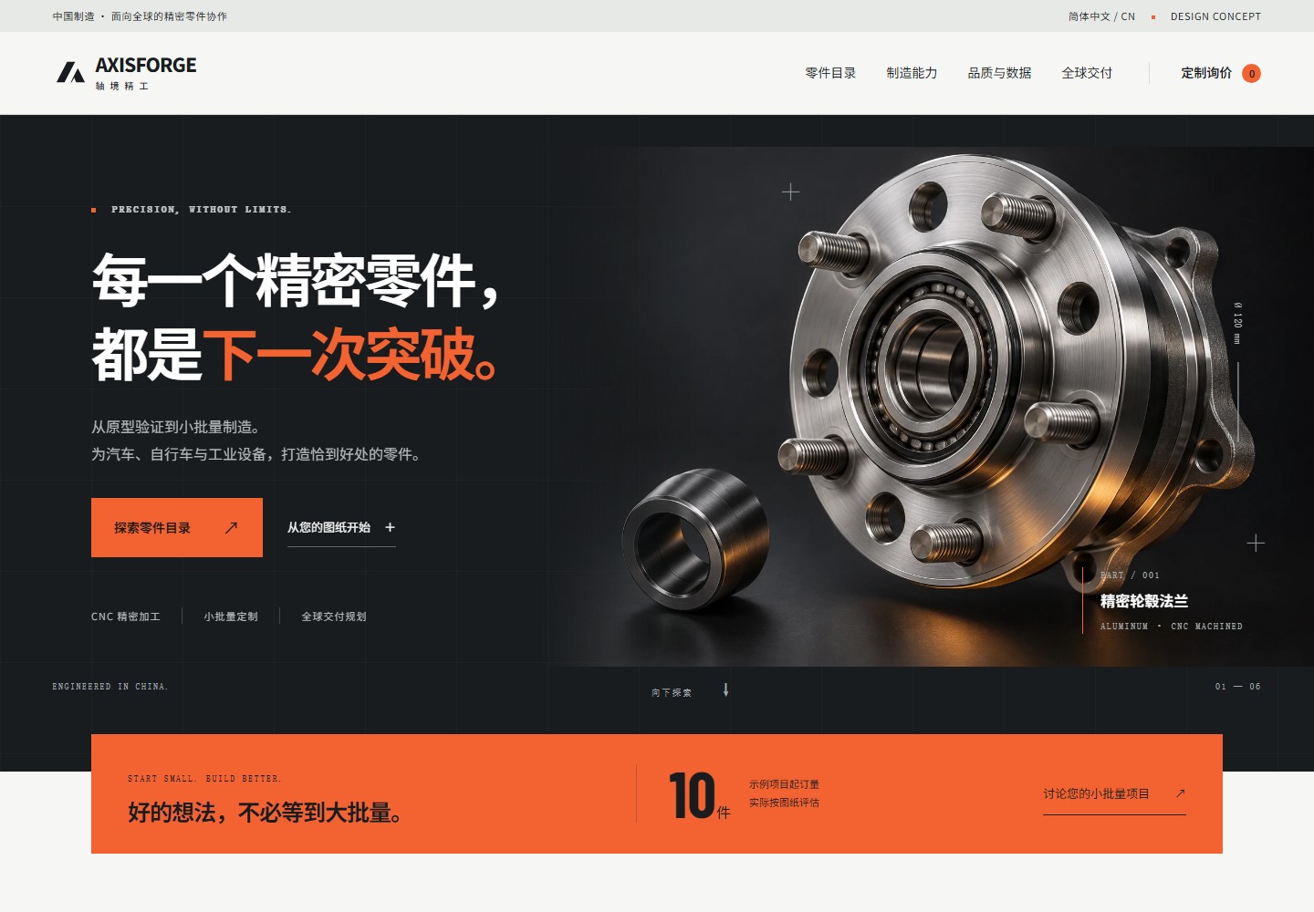
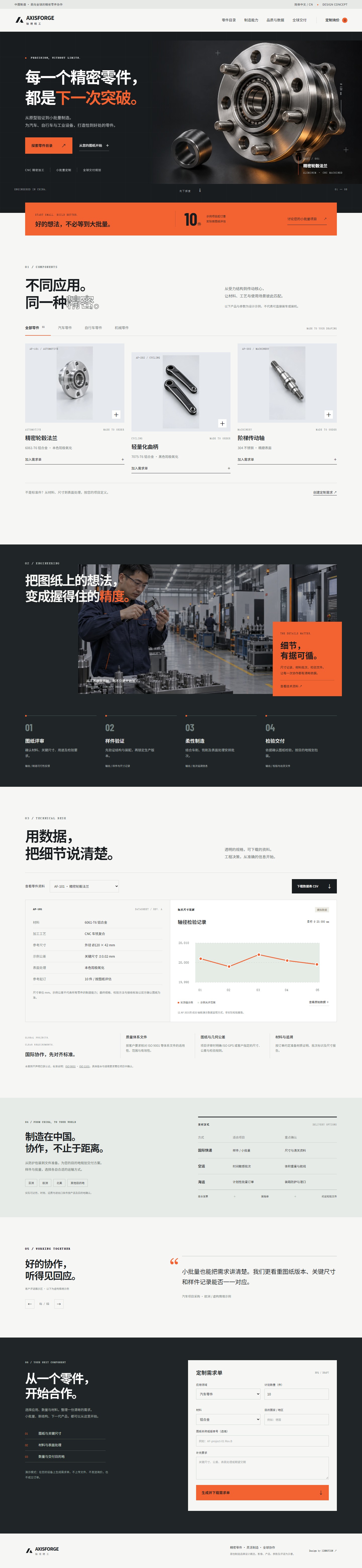
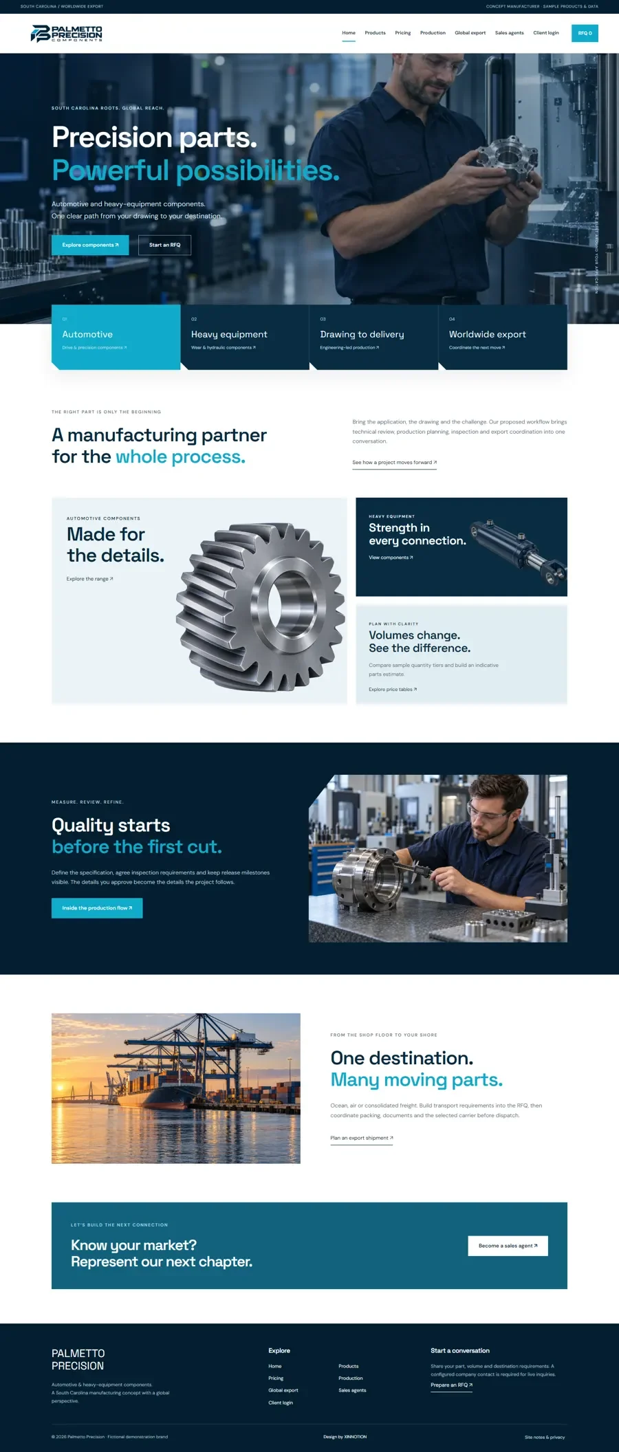
A Simplified Chinese precision-manufacturing concept for global procurement. Graphite, signal orange, metal component imagery, offset layouts and technical data present low-volume custom production and delivery planning.
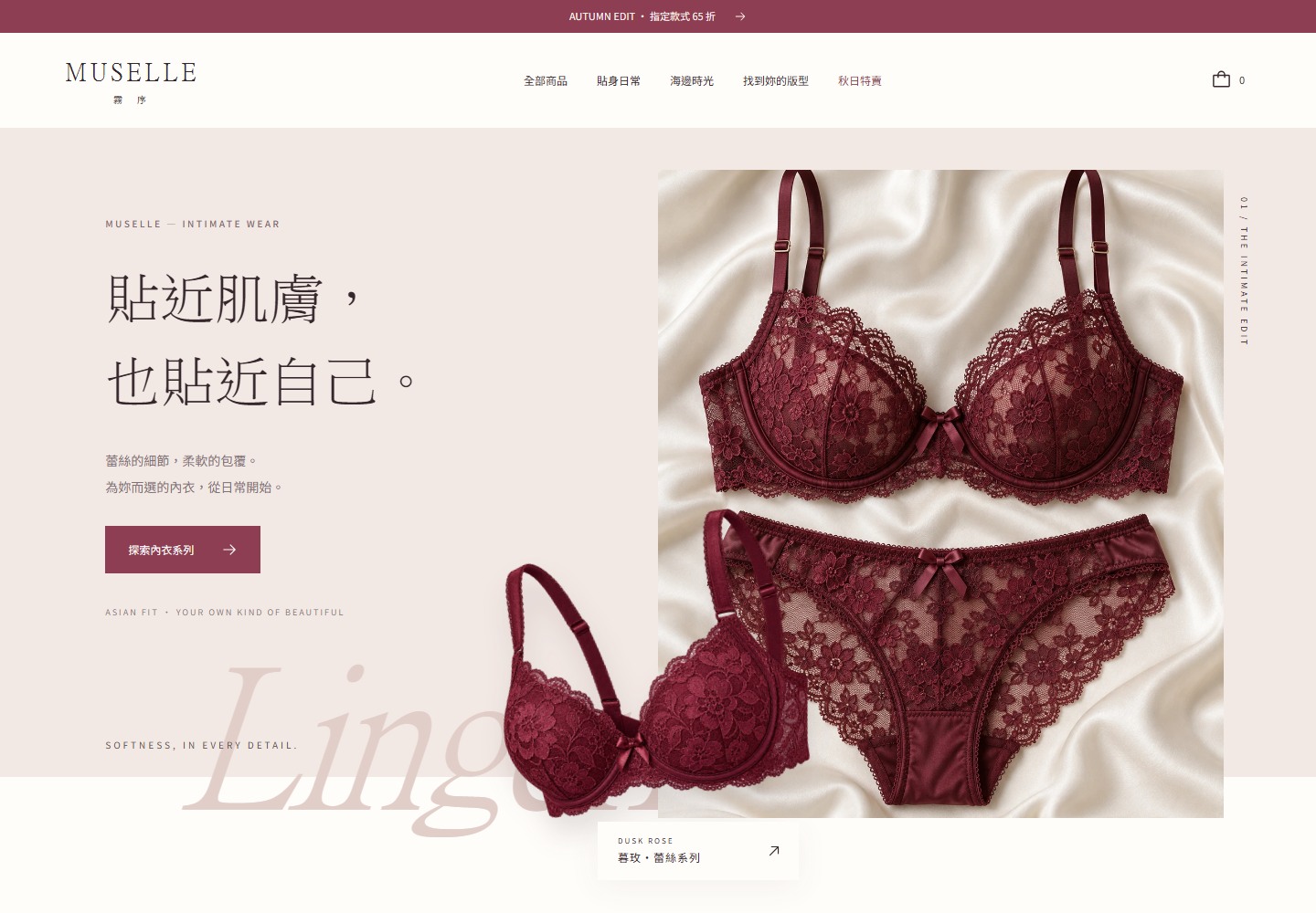
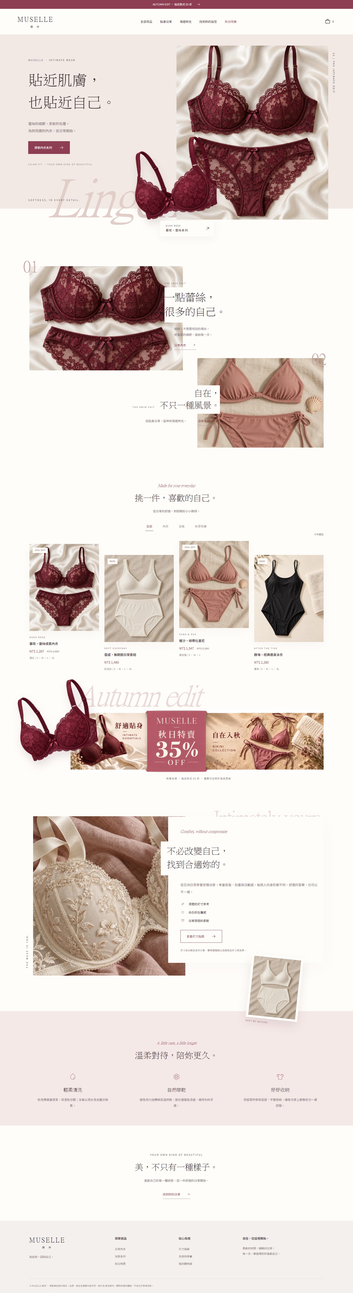
A modern intimate-wear and swimwear storefront concept with asymmetric editorial layouts, overlapping product cutouts, staggered catalogue cards and a folded autumn offer banner.
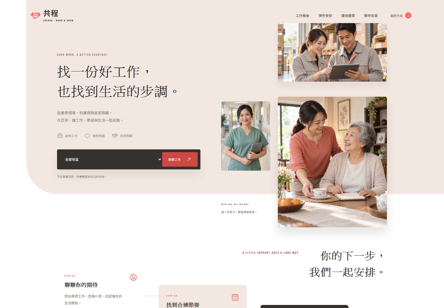
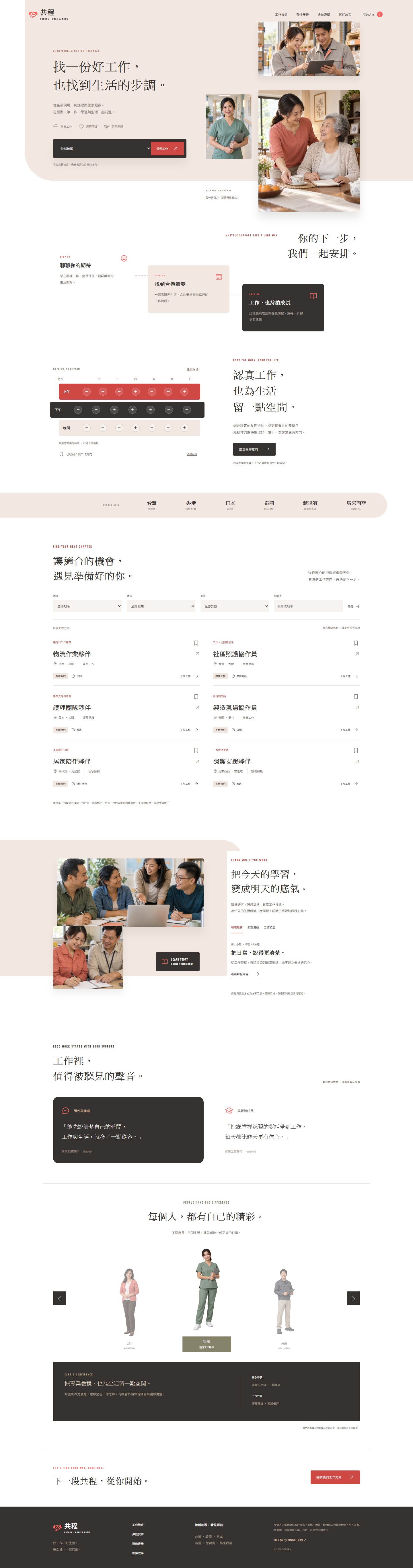
An original Asia workforce service concept, combining warm people collages, stepped process panels, flexible schedule rows and a full-body people carousel with work and sponsored learning.
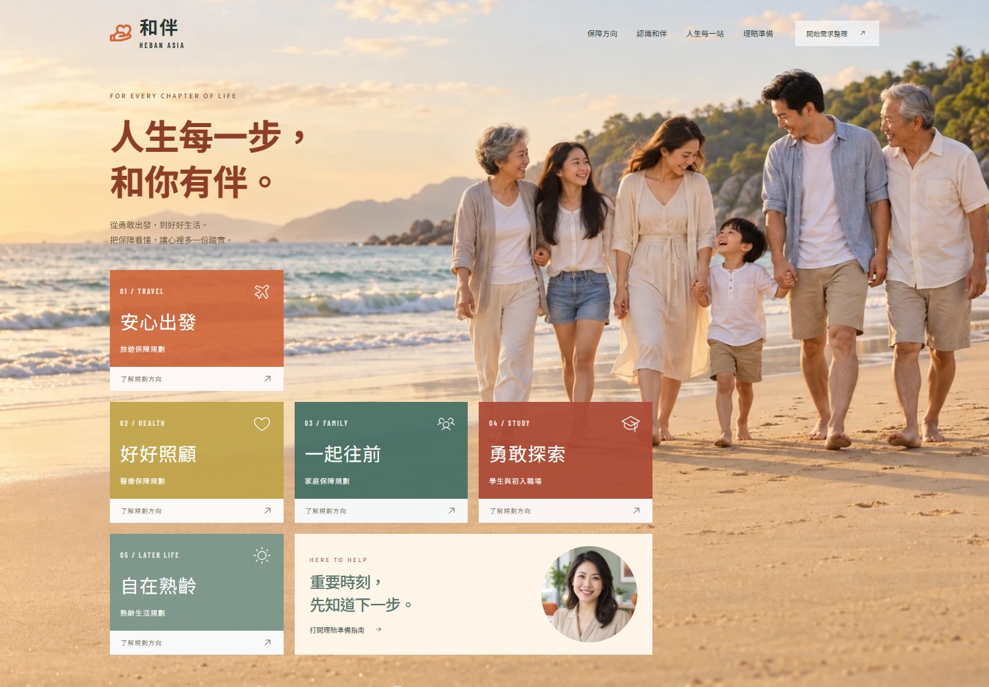
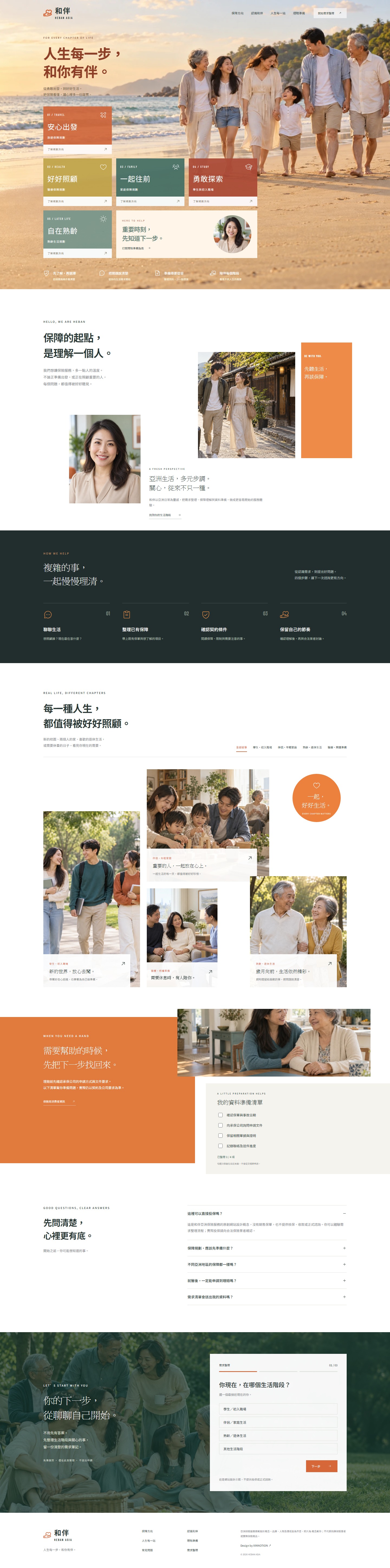
An original Asia insurance service concept combining a warm family beach hero, stepped coverage tiles, portraits across life stages and a guided planning flow.
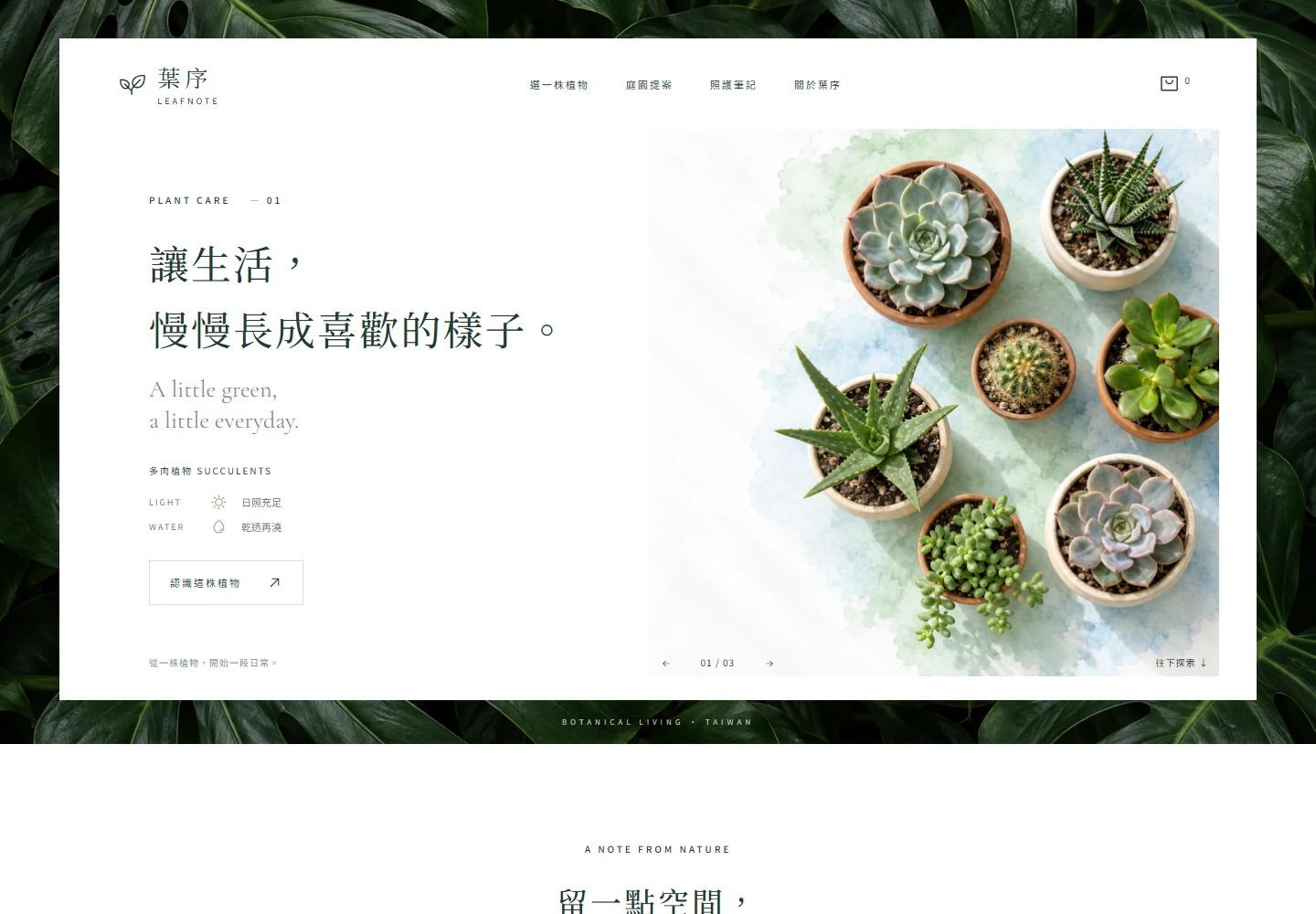
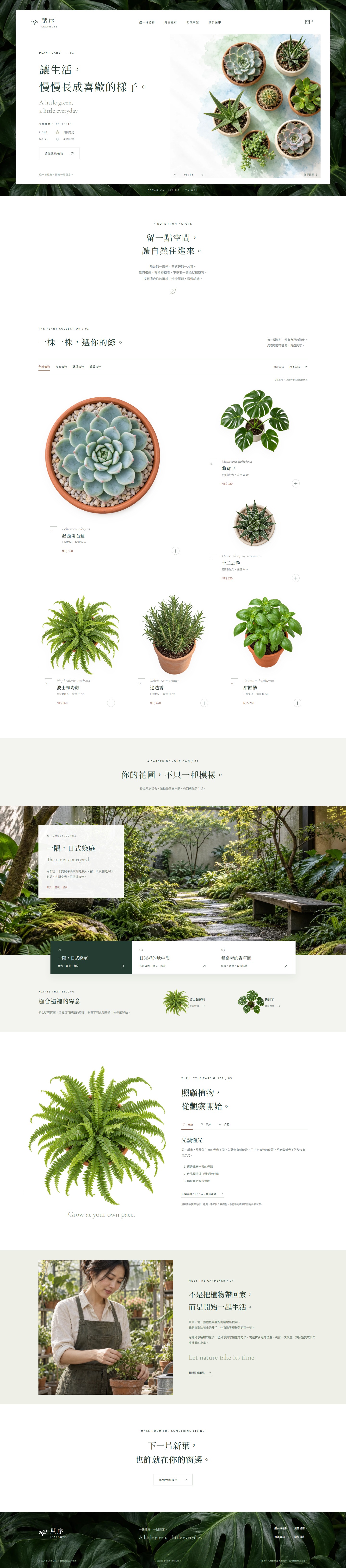
An original botanical shop concept. A leafy frame surrounds an airy overhead-plant hero, with an asymmetric flatlay catalogue, three garden styles and matching plants, and practical care notes.
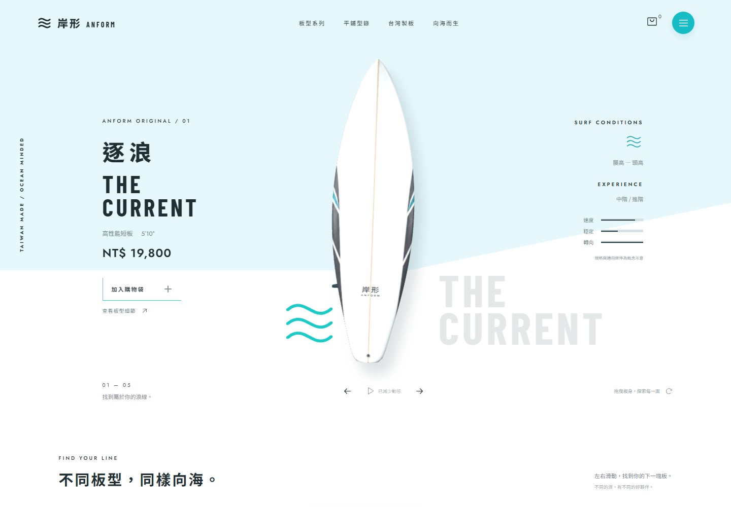
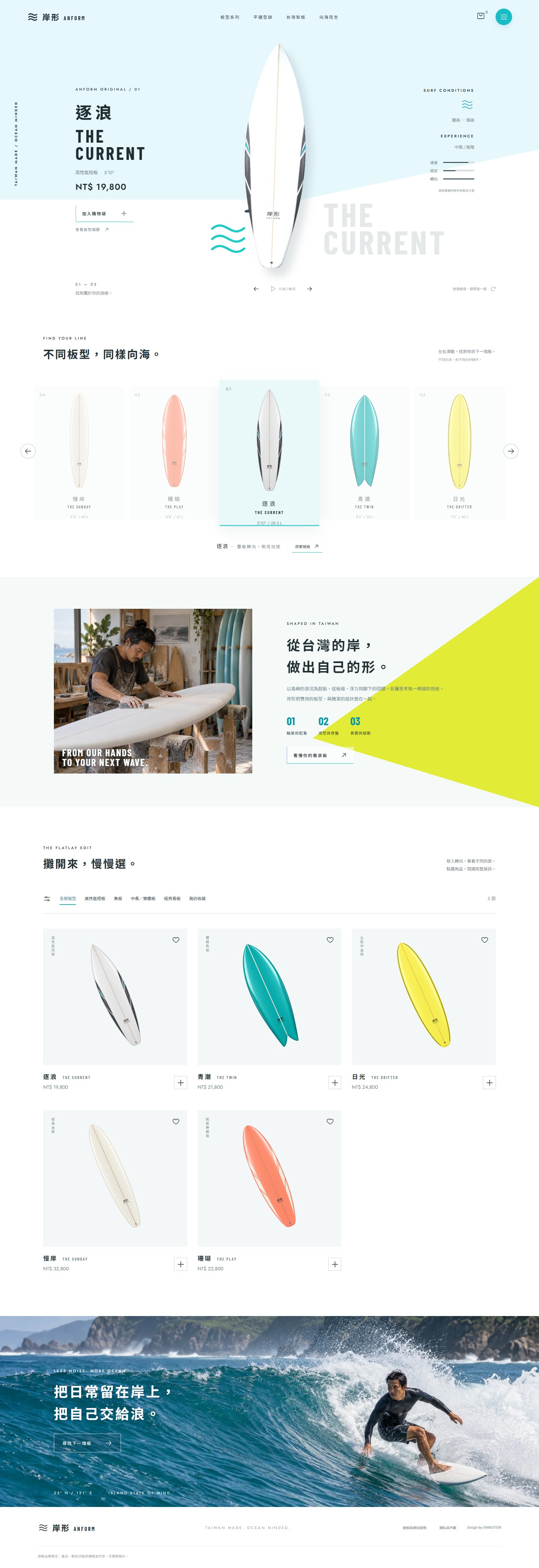
An original Taiwan-made surfboard shop concept. A centered 3D board, ice-blue whitespace and angular color panels combine slow rotation, scroll-driven angles, a five-board belt and an interactive flatlay catalogue.
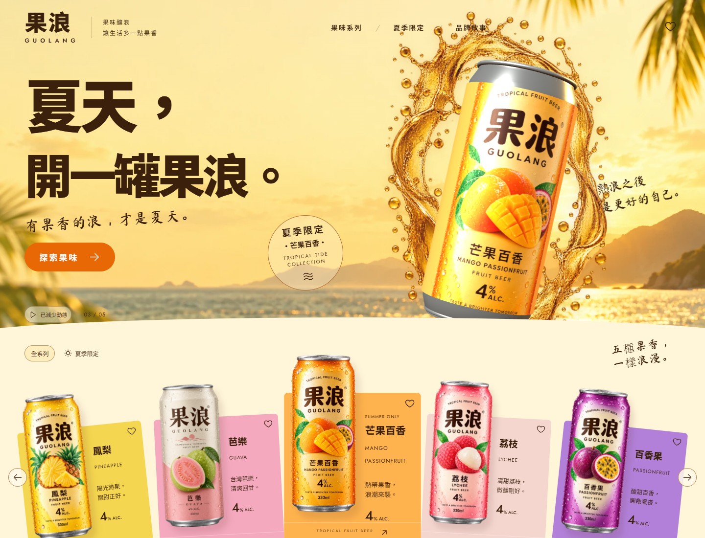
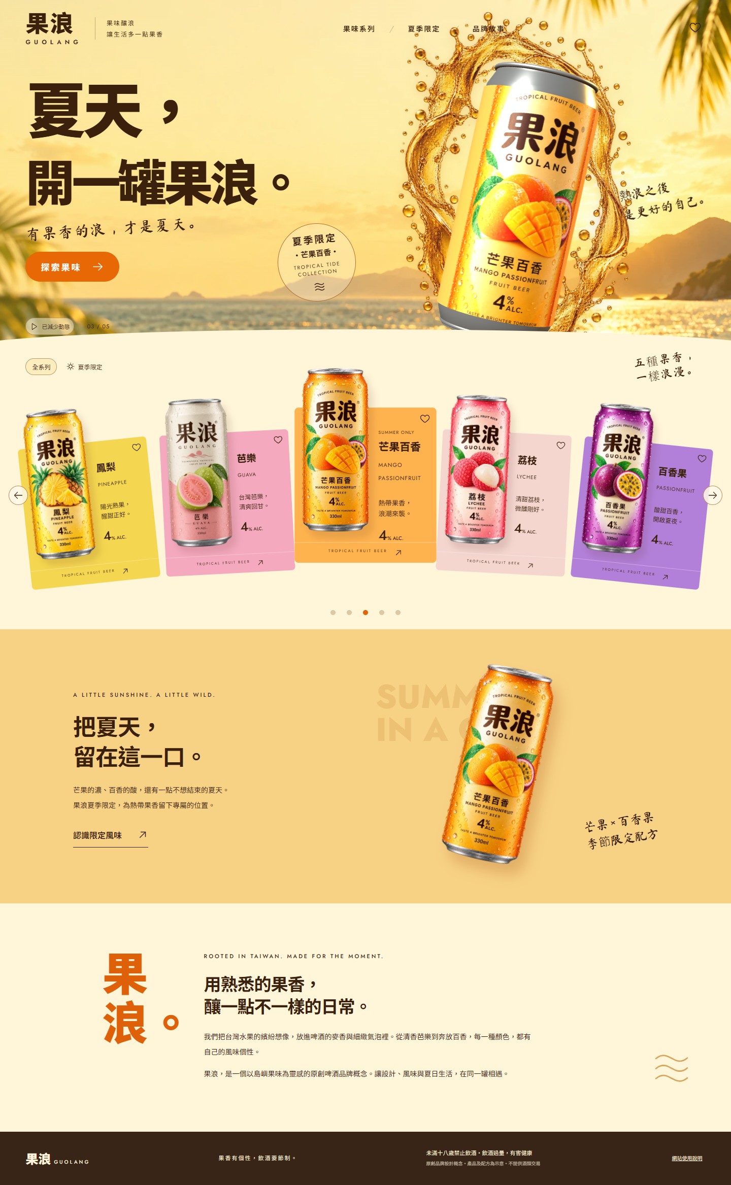
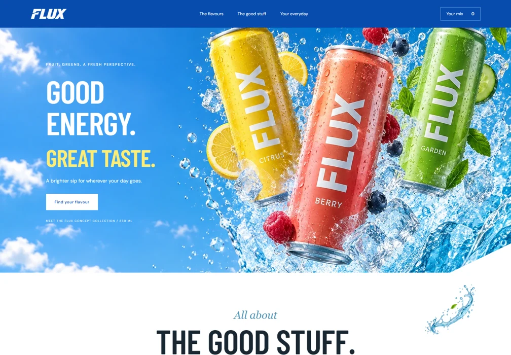
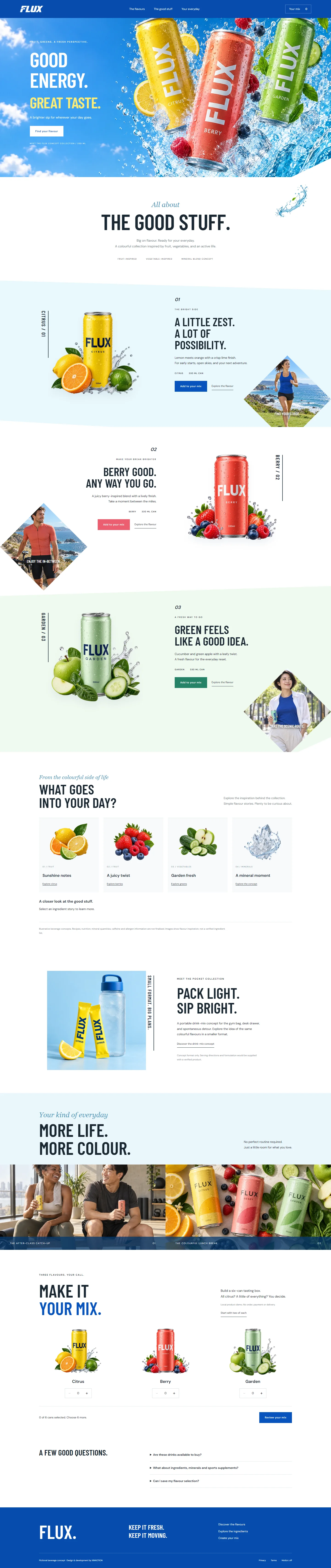
An original Taiwan fruit beer concept. Warm coastal imagery and a golden splash meet a genuinely rotating 3D can, blended flavor labels, a five-color curved collection and a summer edition.
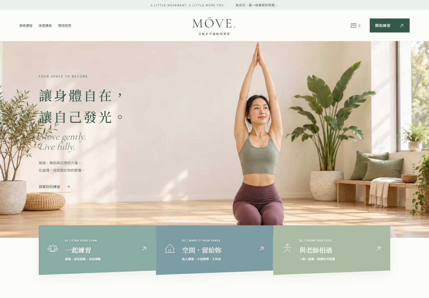
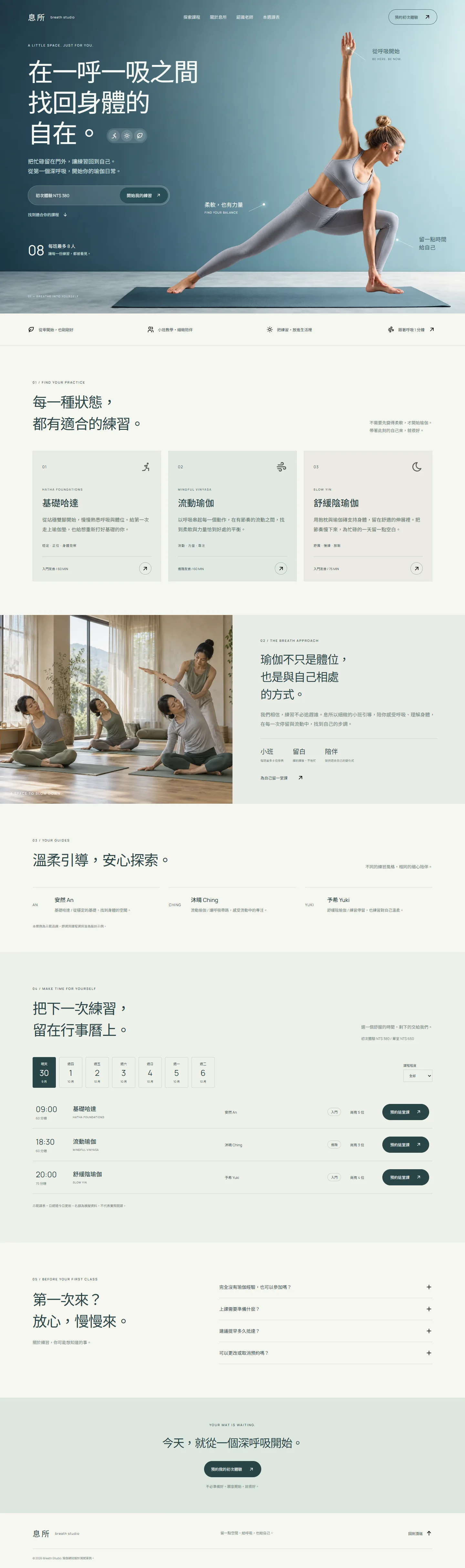
An original women movement club concept. Sunlit yoga imagery, slanted service panels and peach editorial overlaps support filtered classes, room rental, instructor applications and a 3D equipment shop.
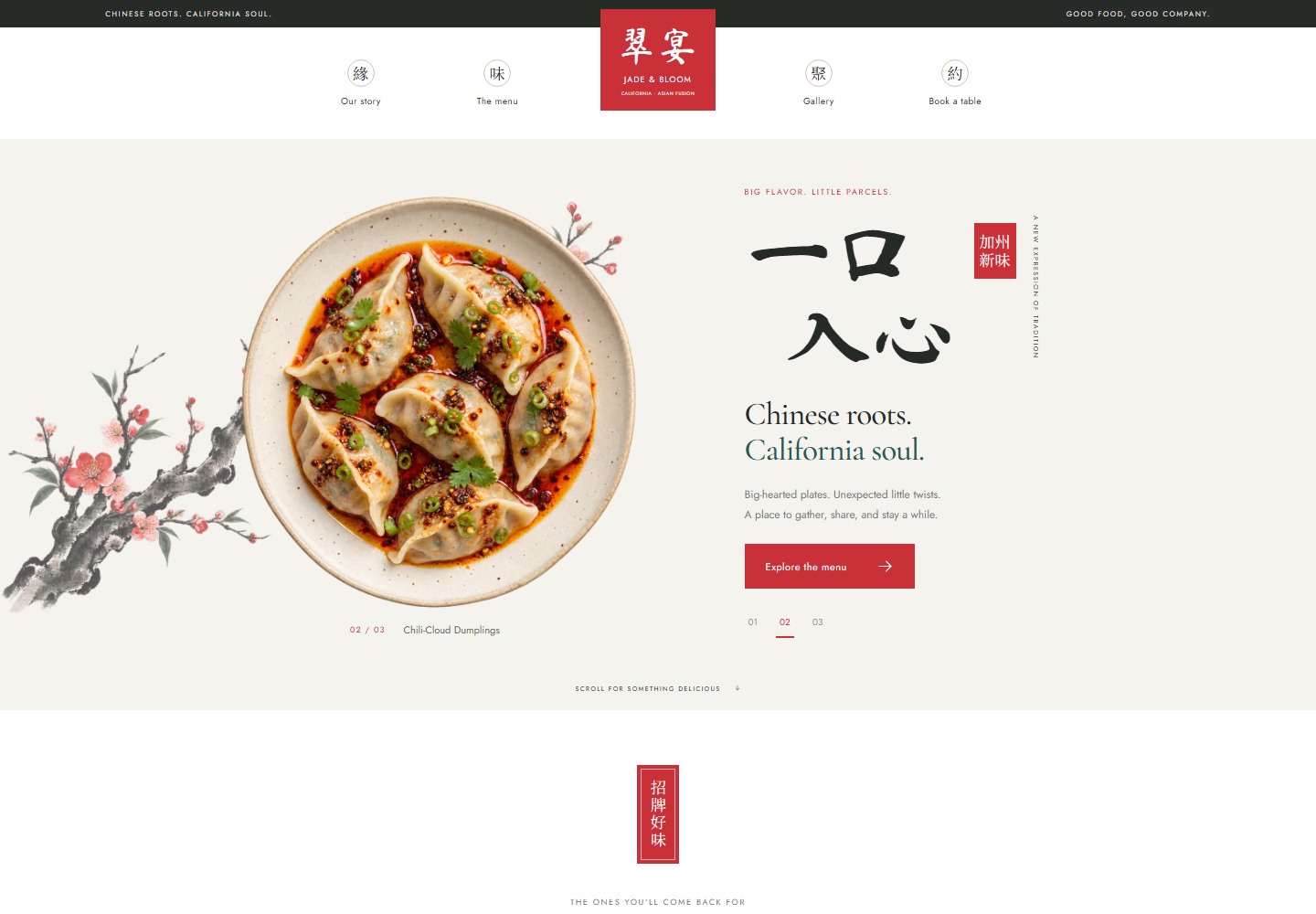
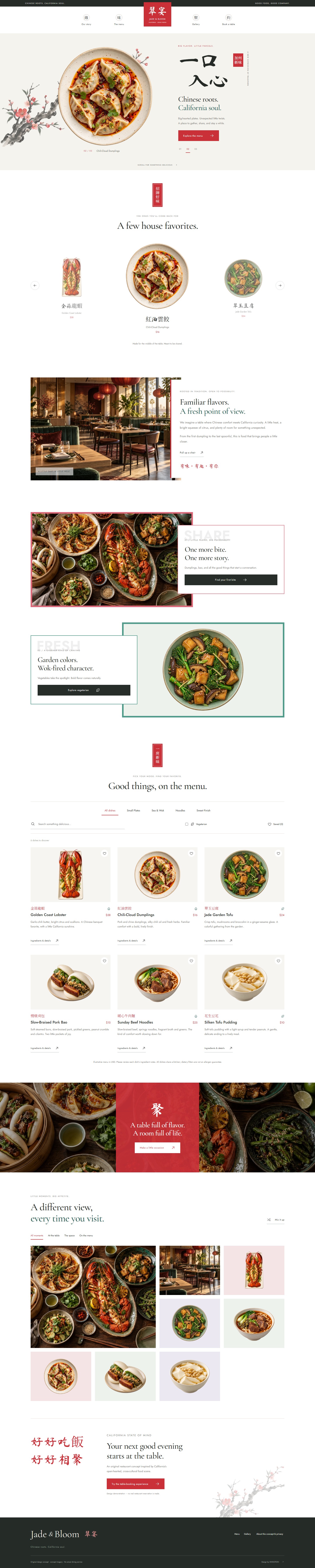
An original California Chinese-fusion restaurant concept. Vermilion seals, brush-style Chinese and isolated dishes meet jade-and-rose editorial layouts, a filterable menu and a shuffled gallery.
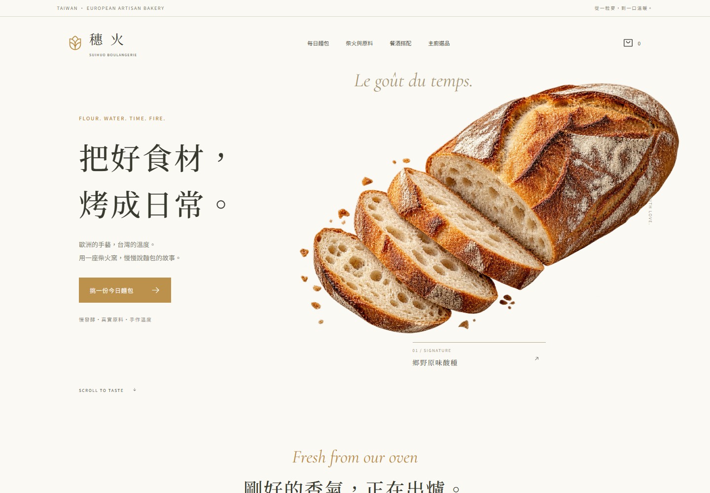
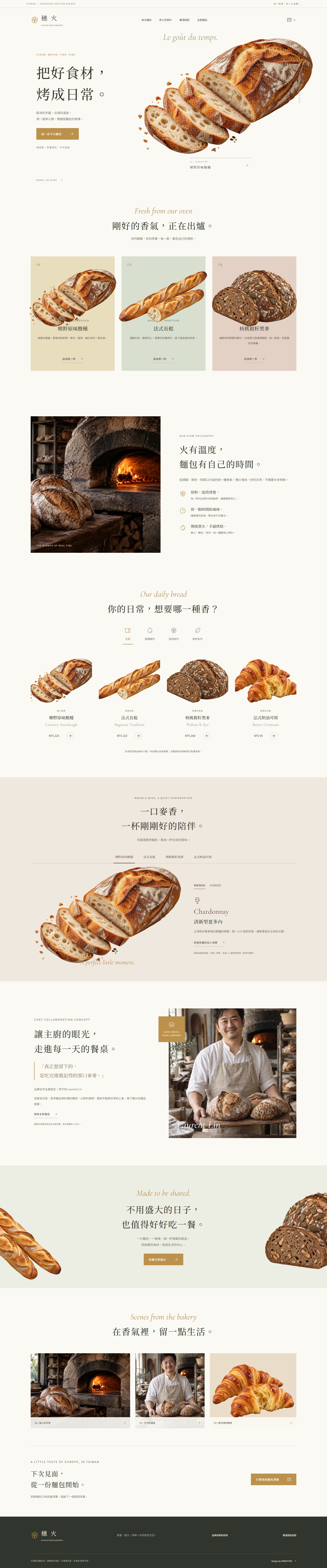
An original European bakery concept for Taiwan. Chinese and European serif typography meets isolated bread imagery, pastel product panels and a fire oven narrative, with chef curation, ingredient transparency and pairing guides.
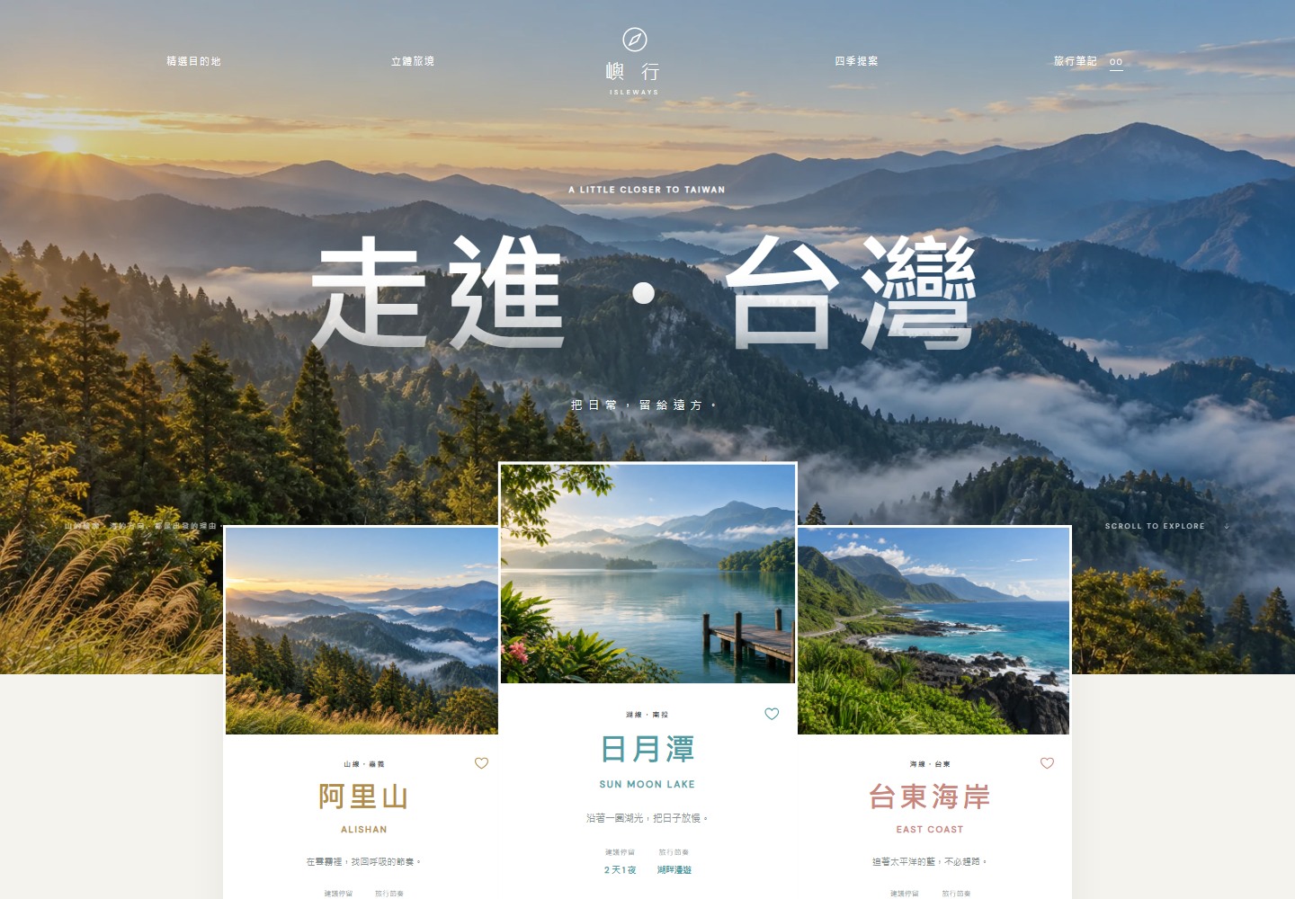
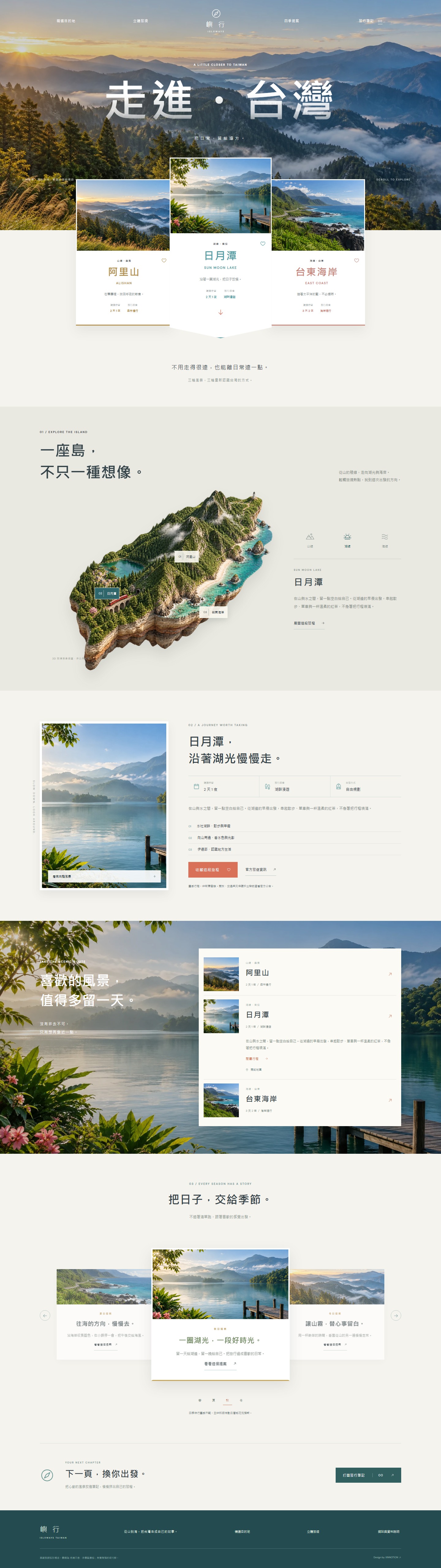
A cinematic mountain hero, raised destination cards and illustrated island connect Taiwan mountain, lake and coastal journeys. Interactive hotspots, seasonal inspiration and an exportable notebook turn exploration into a personal itinerary.
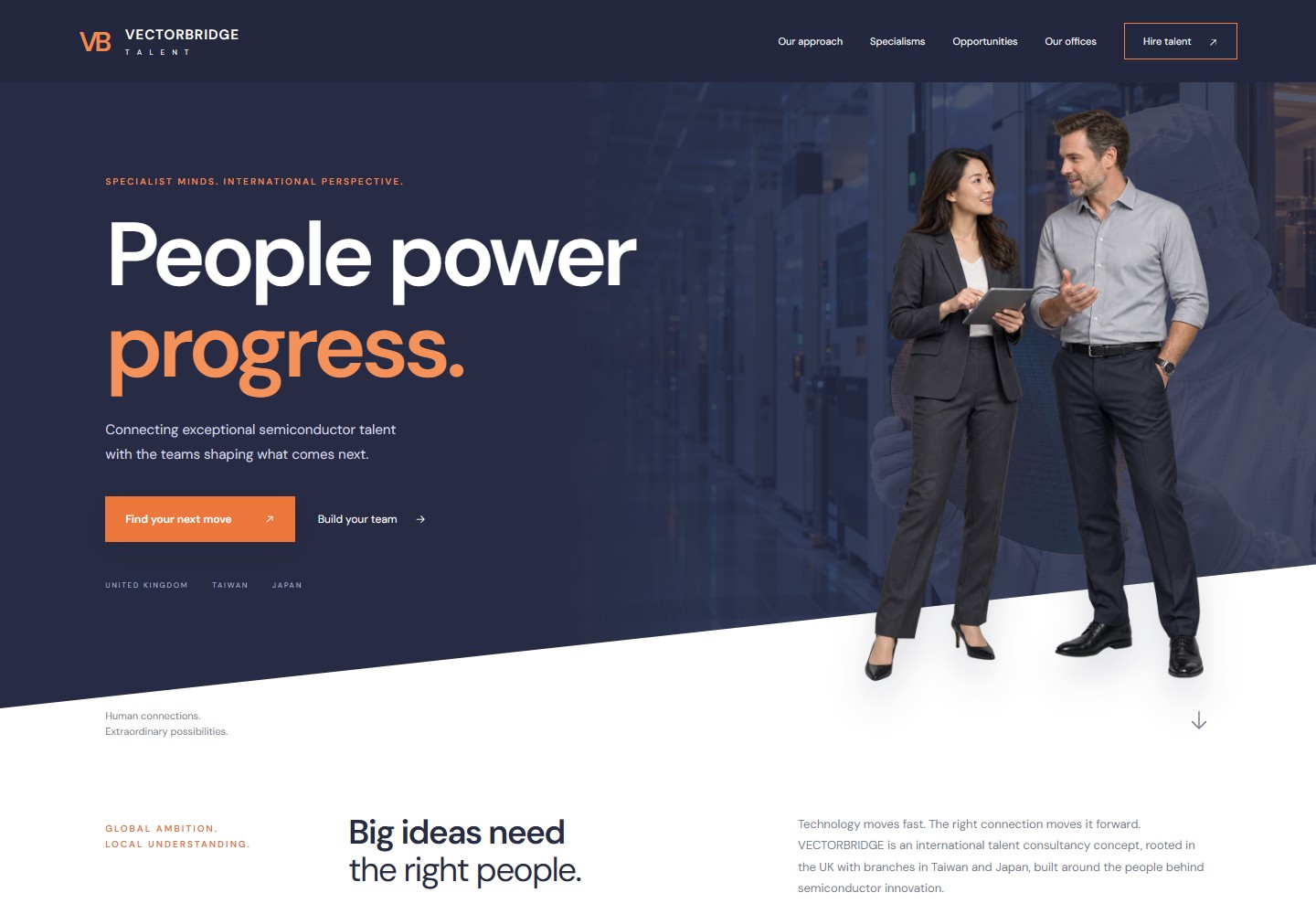
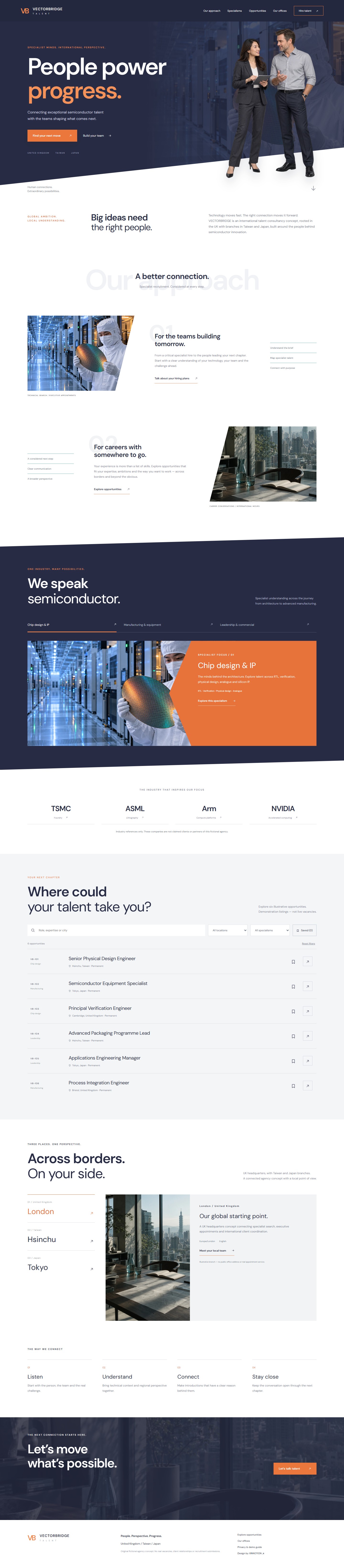
A UK-based semiconductor talent consultancy concept with Taiwan and Japan branches. A navy diagonal hero, cutout professionals, alternating services and an orange specialism stage connect employer and candidate journeys.
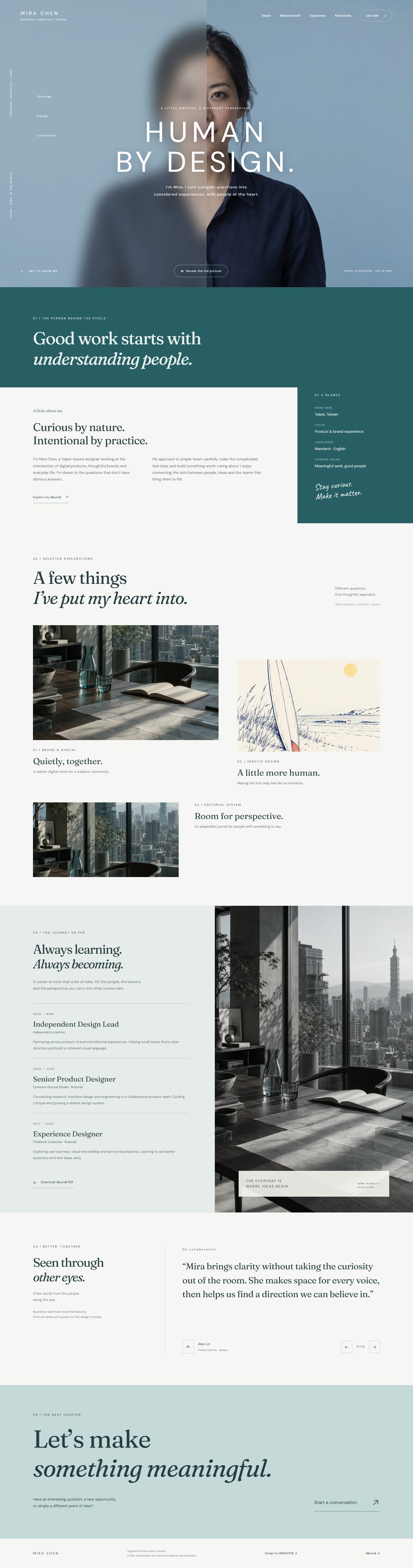
A half-blur portrait reveal introduces a thoughtful career portfolio. A teal biography, asymmetric project studies, editorial timeline and teammate perspectives build the story. Hover, keyboard and touch controls reveal the portrait, with a printable one-page resume.
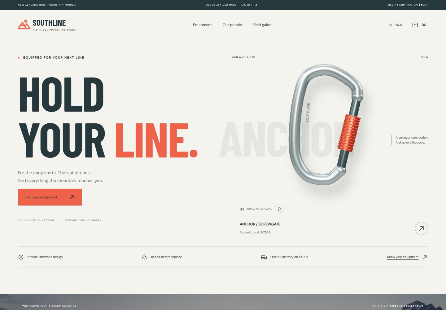
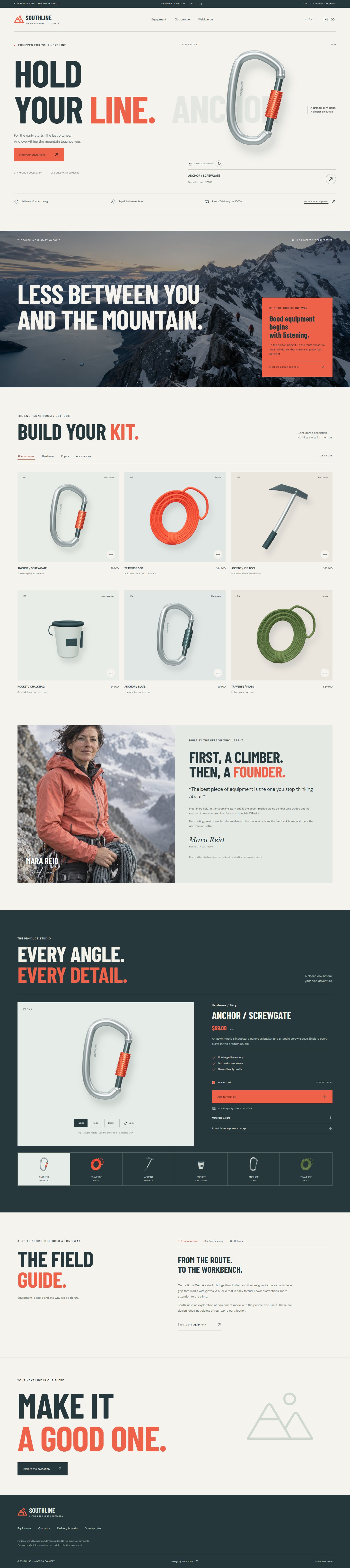
An athlete/product editorial split, atmospheric mountains and a floating product stage shape this New Zealand alpine equipment concept. Original 3D models rotate on drag, alternate views reveal product form, and an interactive basket connects the collection to a demonstration checkout.
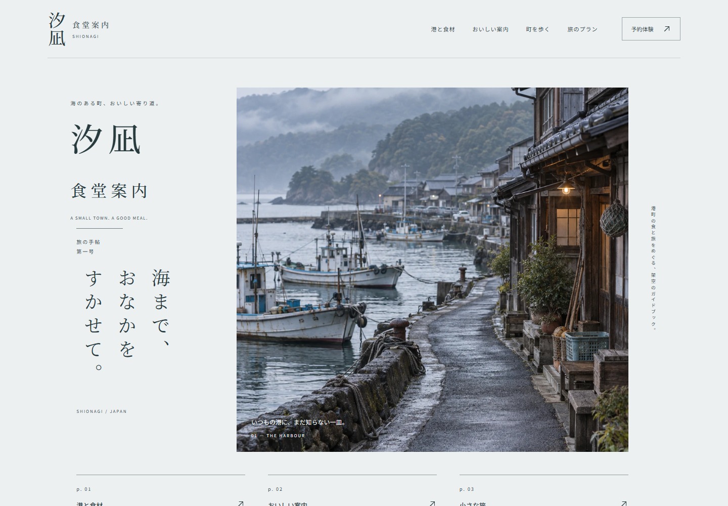
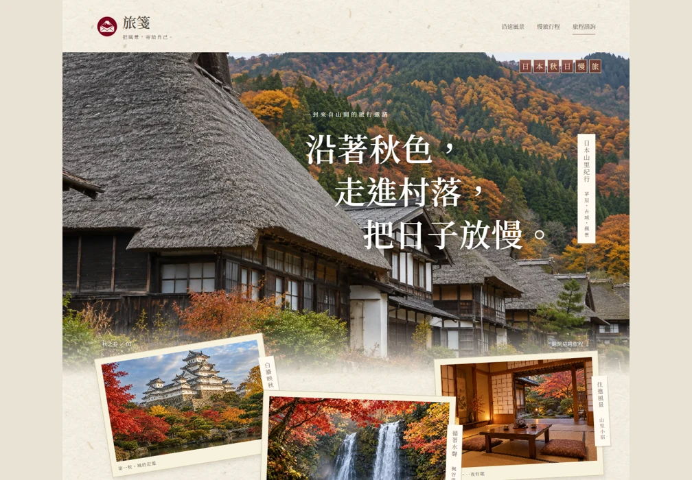
An editorial Japanese harbour guide follows the supplied layouts through cool whitespace, vertical writing and a magazine-like street photograph. Oversized dishes, a six-point illustrated map and three travel plans lead into a local booking demonstration.
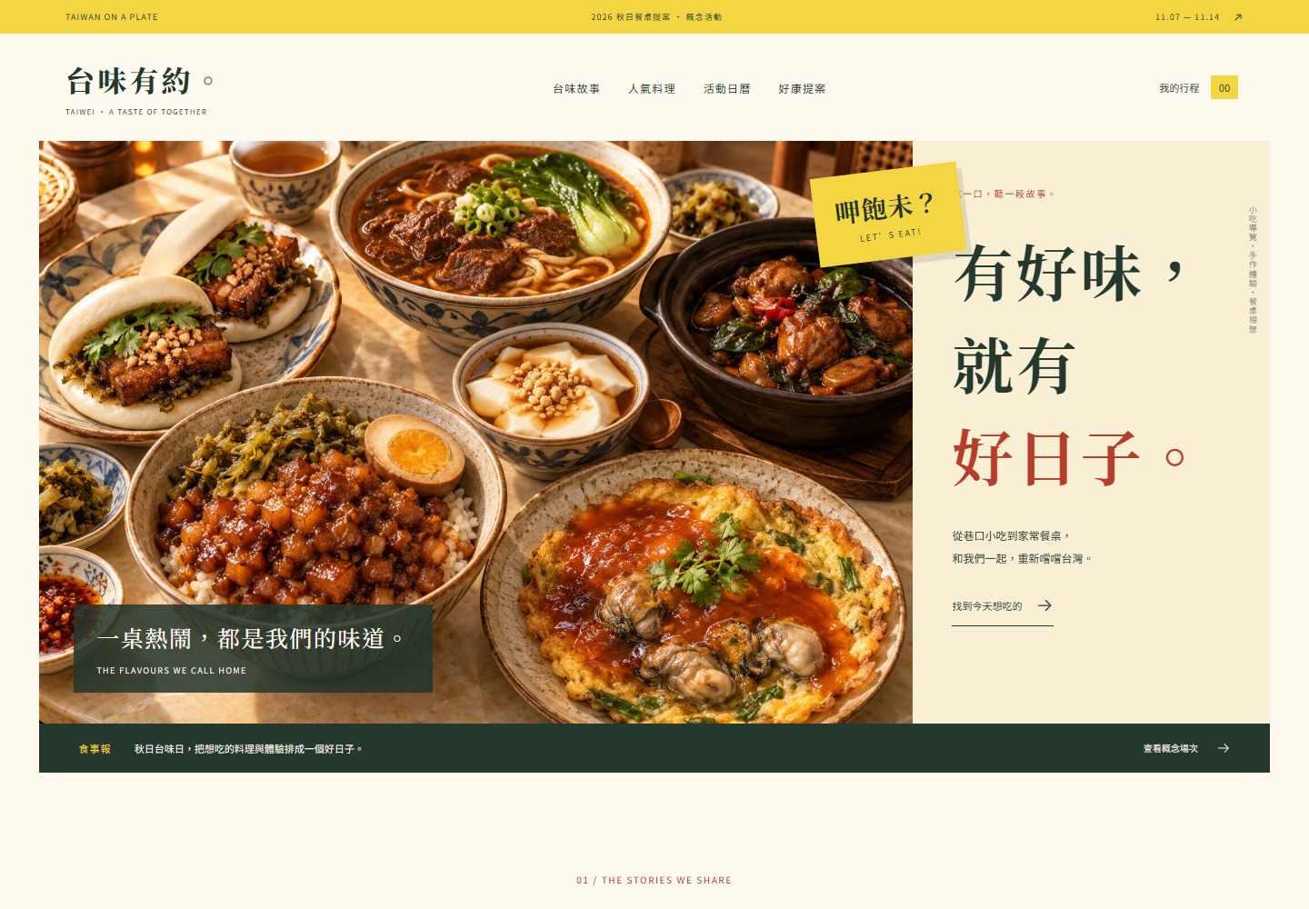
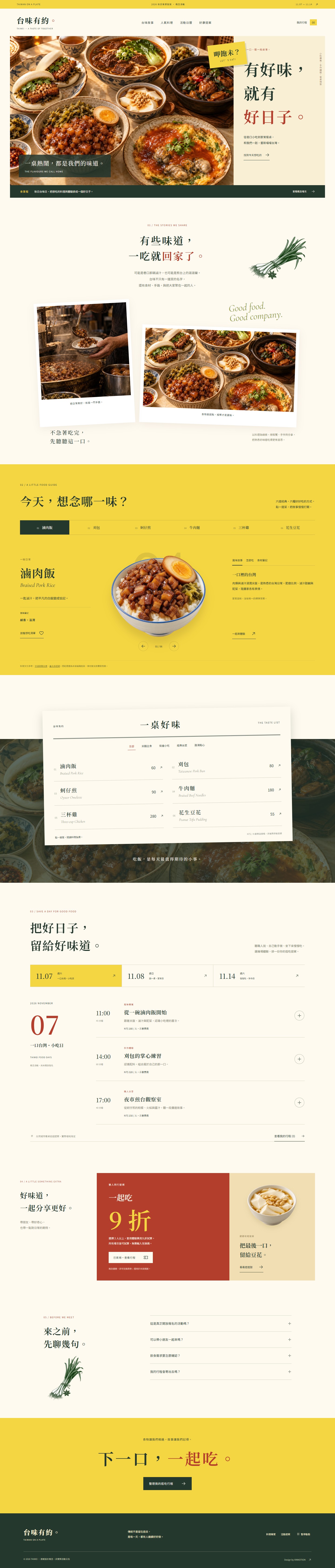
Egg yellow, warm paper and deep green frame isolated Taiwanese dishes, overlapping table photographs and a paper menu. Six food guides, a three-day event calendar and a local itinerary planner turn familiar flavours into an explorable experience.
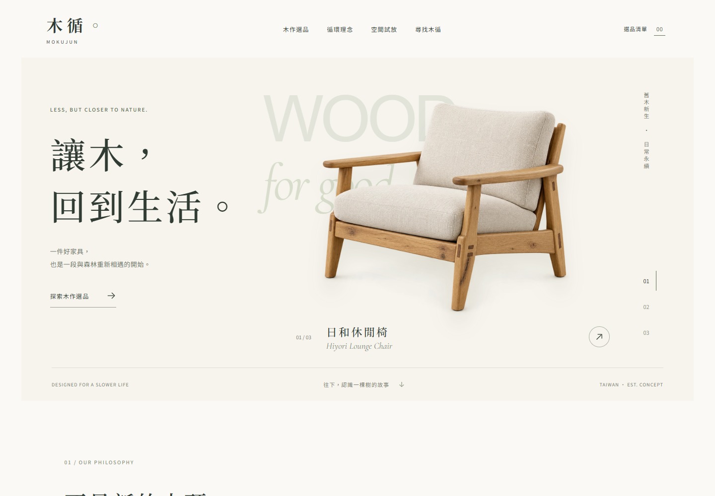
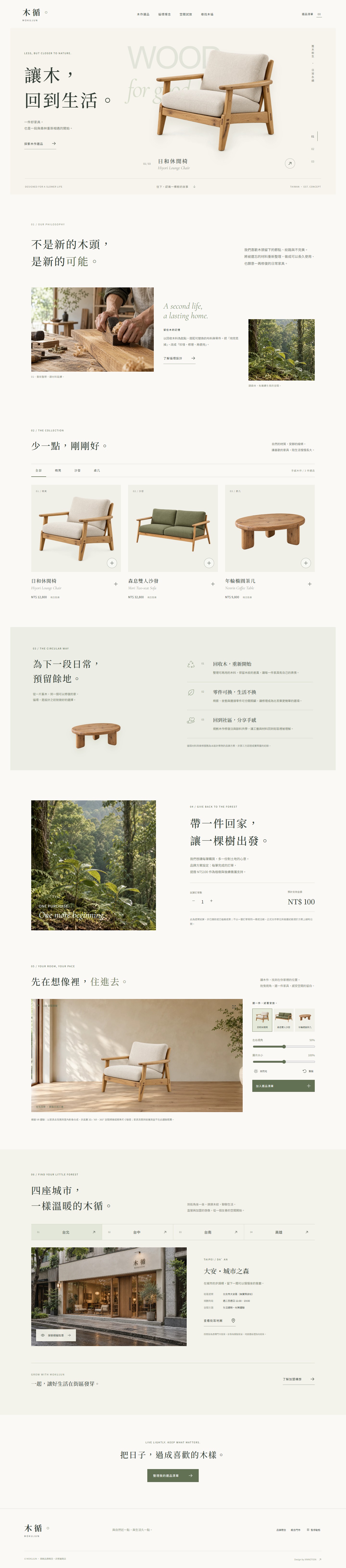
Japanese-inspired whitespace, sage and warm grain frame a circular furniture concept. Transparent product imagery, sliding detail layers, interactive room staging and four fictional storefronts connect material stories with discovery.
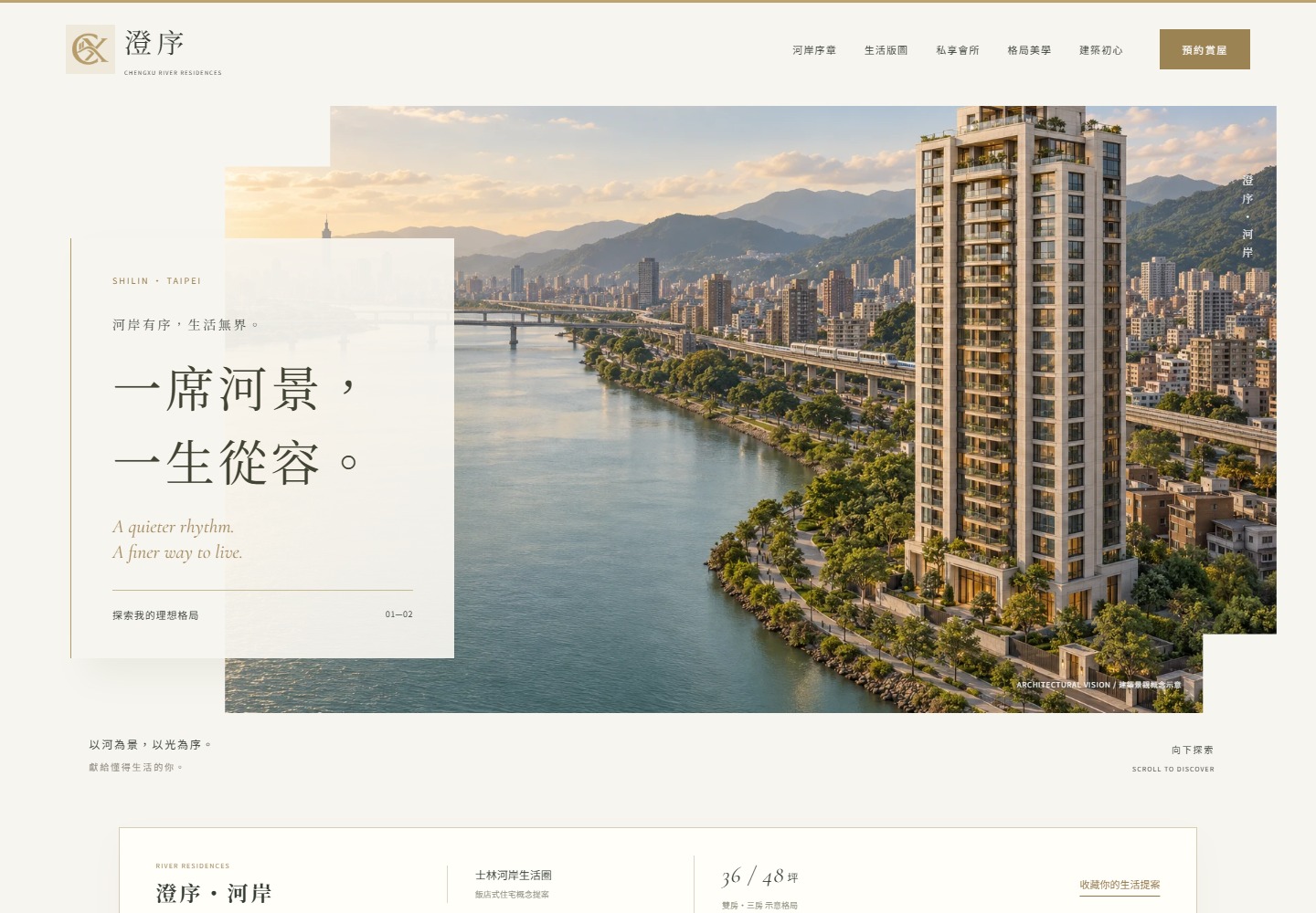
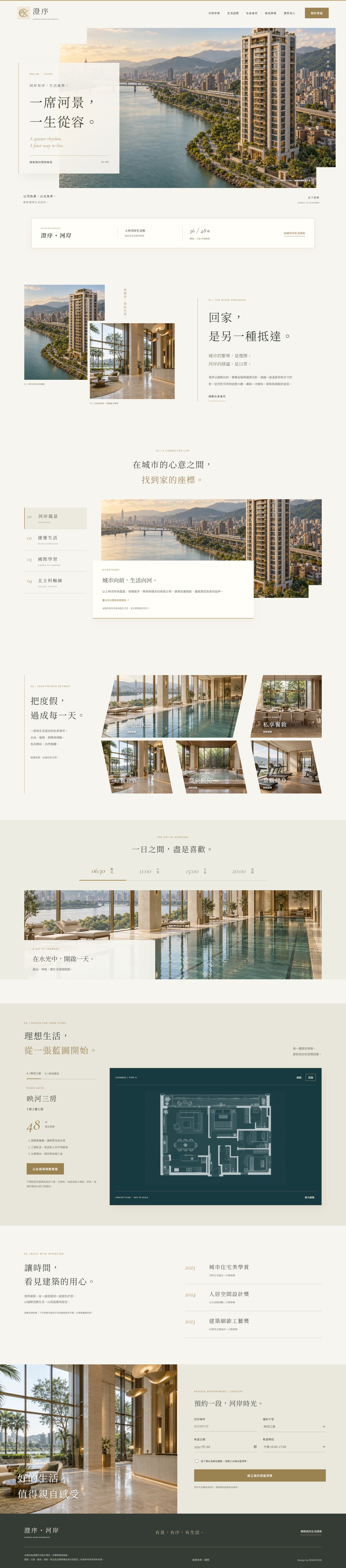
Ivory stone, champagne brass and stepped framing shape a fictional Taipei riverside residence. An angled amenity montage, two interactive floor plans and a daily-life timeline bring depth to spatial discovery.
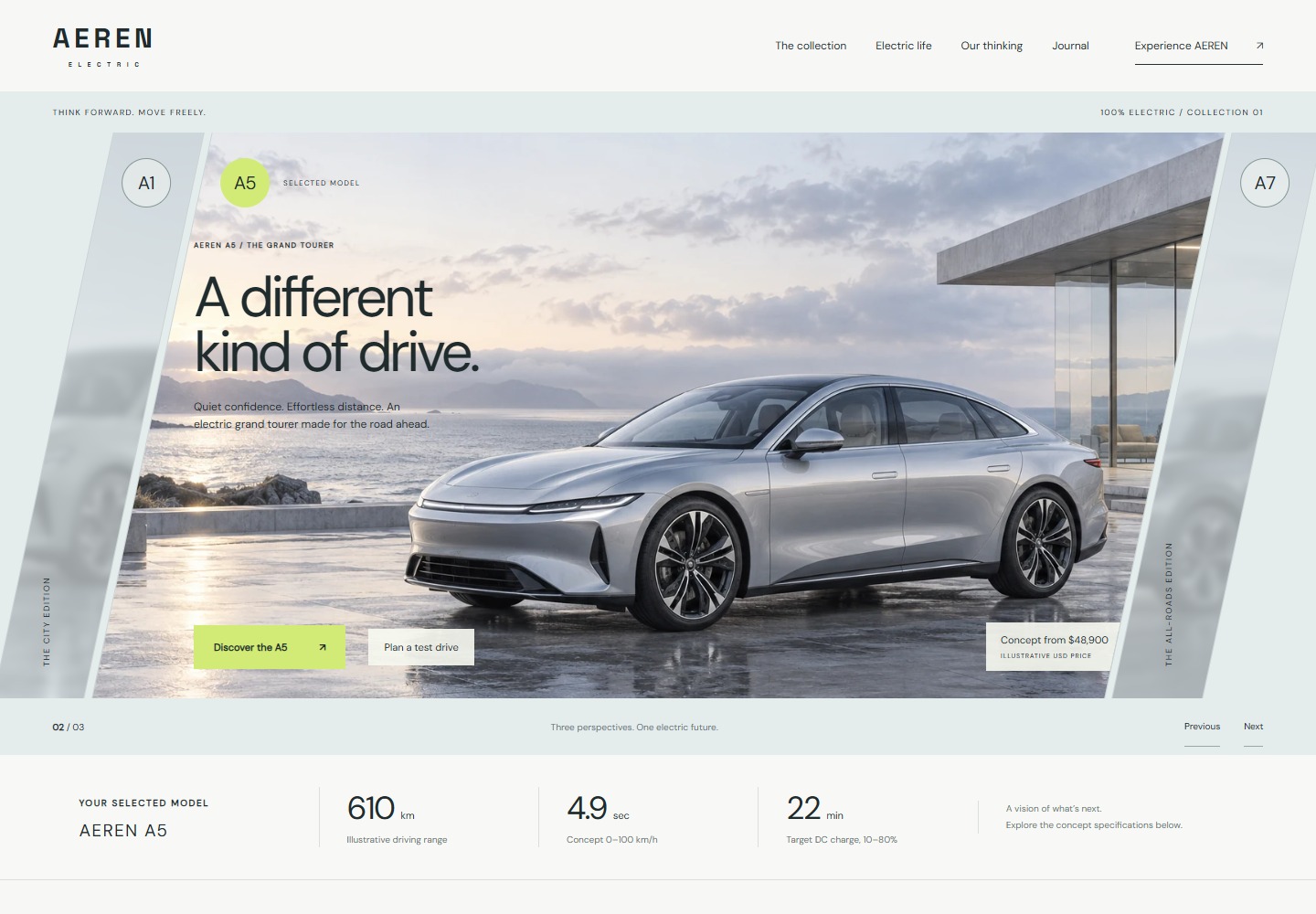
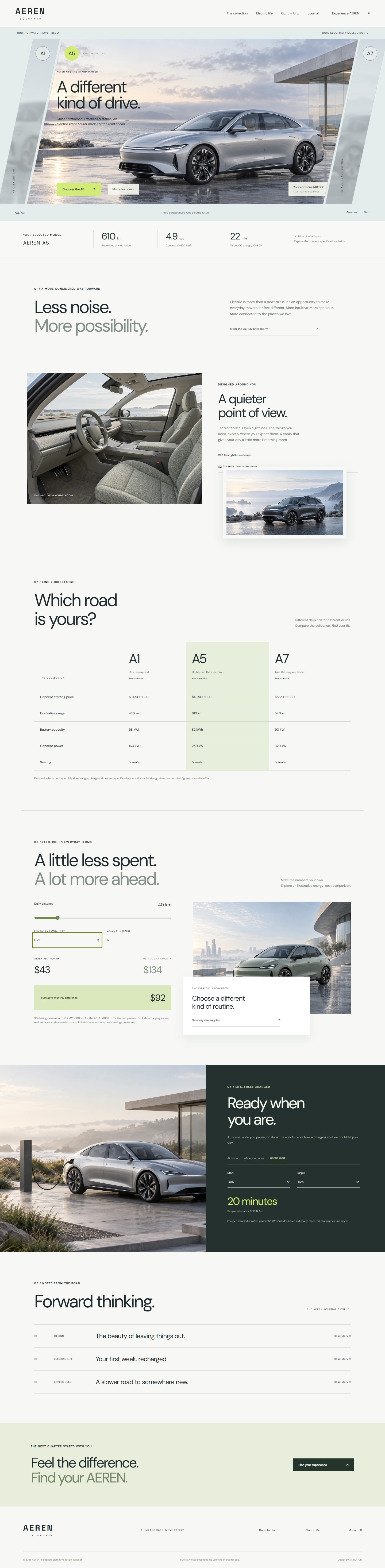
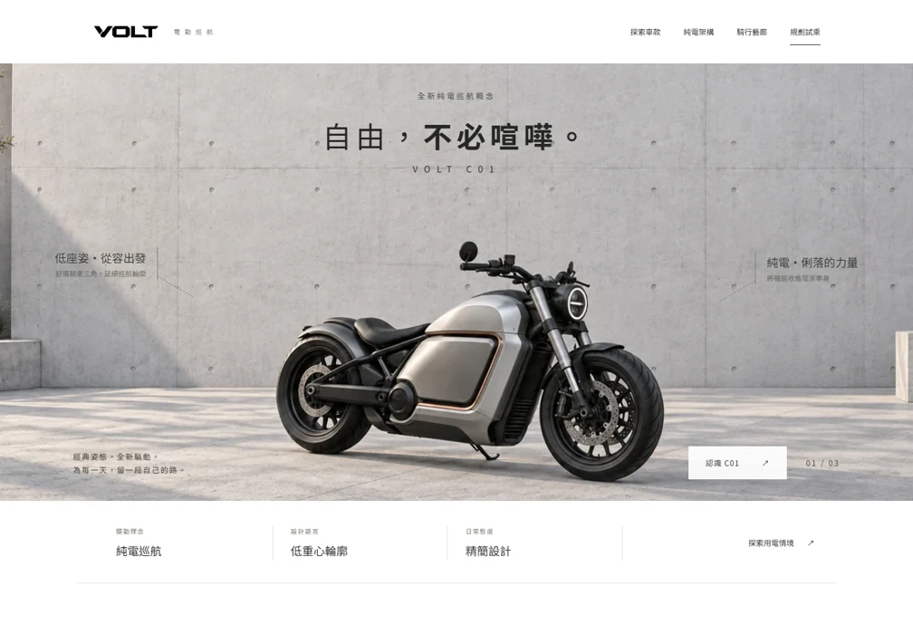
Three fictional electric vehicles share a visual language of mist silver, graphite and lime. Slanted panels, layered cabin imagery and useful calculations turn model discovery into a considered brand journey.
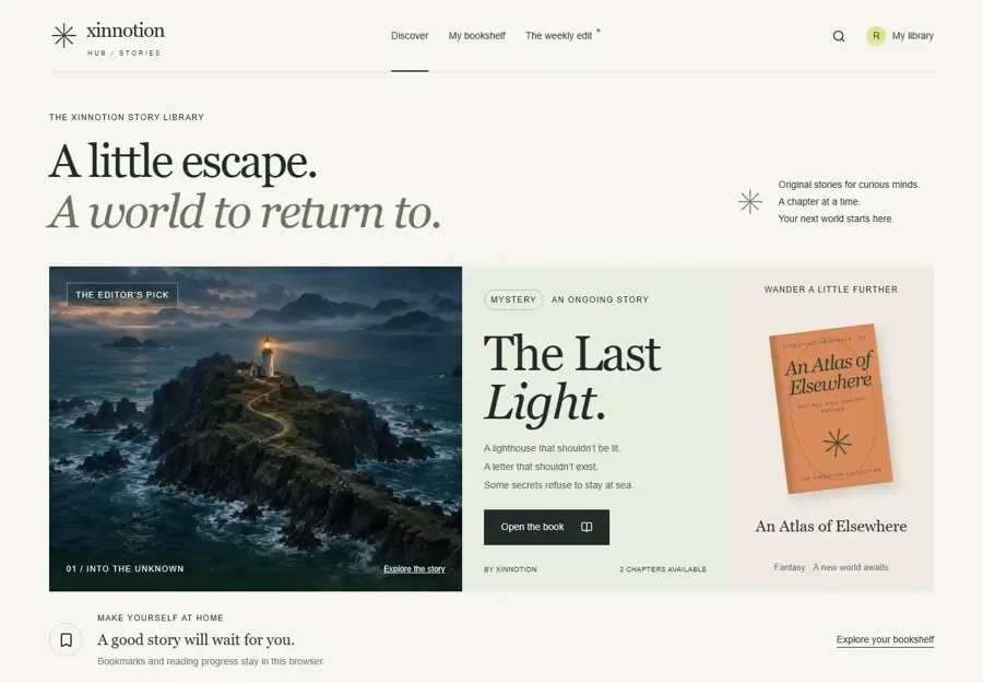
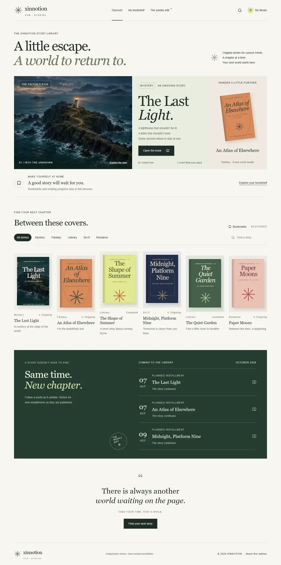
A story library direction that gives cover browsing and chapter reading their own rhythm. Categories and personal bookmarks form a useful foundation for a curated publishing experience.
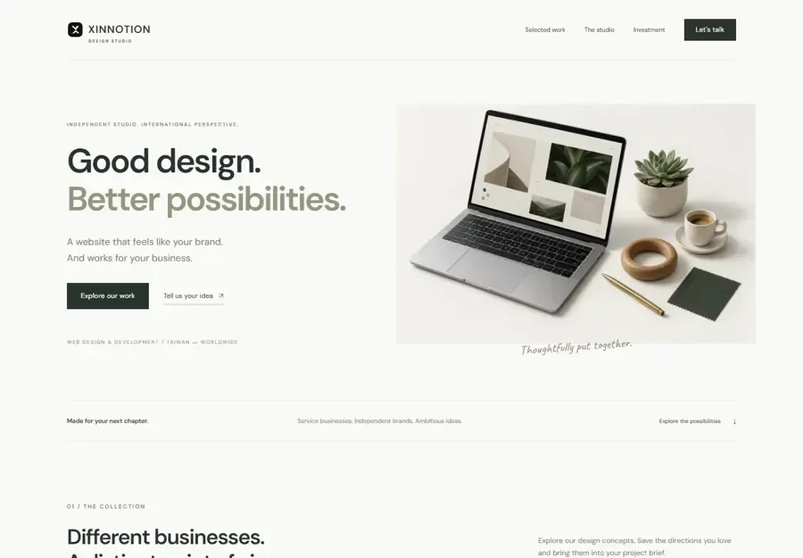
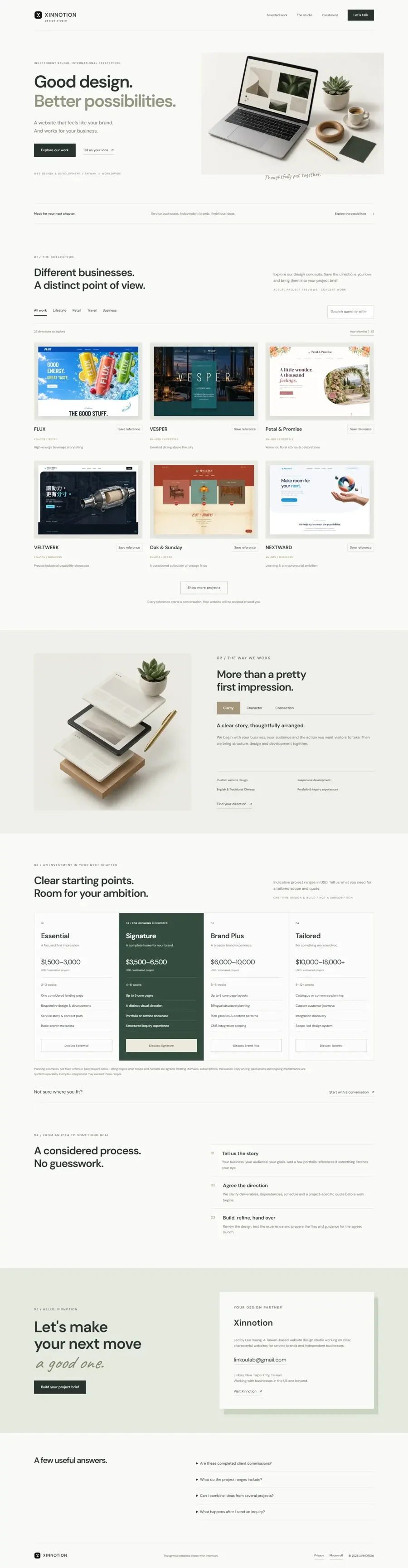
An agency direction that brings a varied portfolio into one clear conversation. Industry filters, a project shortlist and service principles help visitors express a preference and begin a brief.
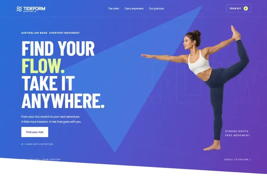
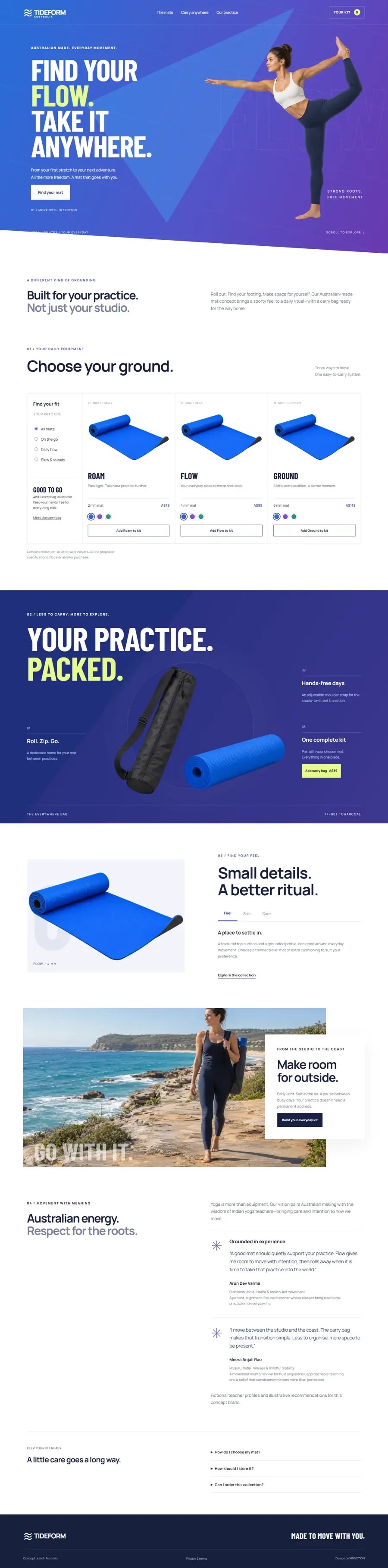
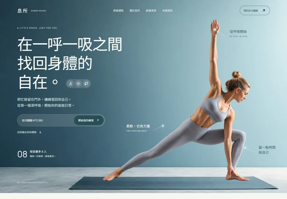
A yoga equipment direction that connects the mat, the carry kit and the practice. Product choices sit alongside feel, size and care content, supporting a more informed visual exploration.
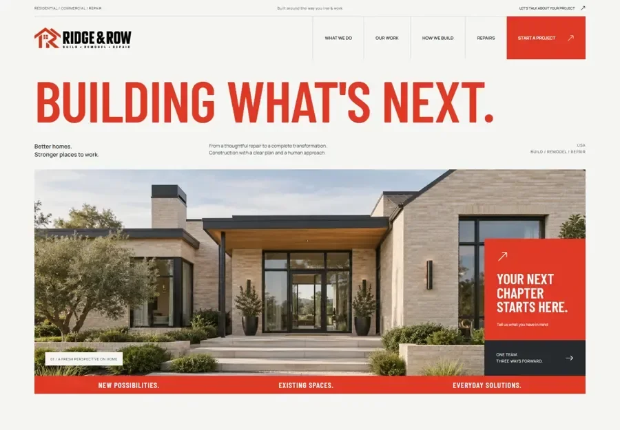
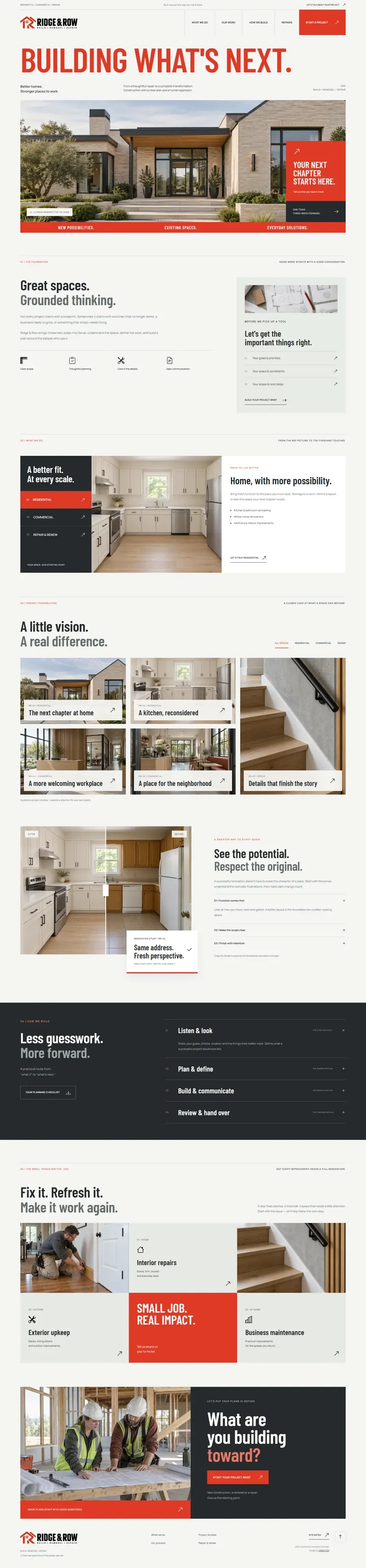
A construction and renovation direction that separates residential, commercial and repair needs. Strong spatial imagery is paired with a project brief structure to support a more focused first conversation.
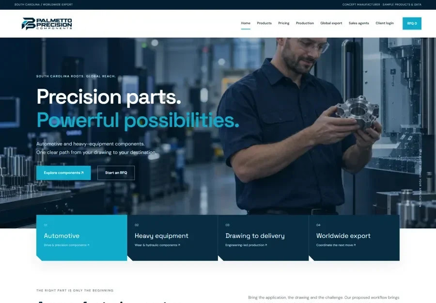
A seven-page manufacturing direction with room for processes, parts, quality and partnership information. Capability content leads toward an RFQ conversation for purchasing and engineering audiences.
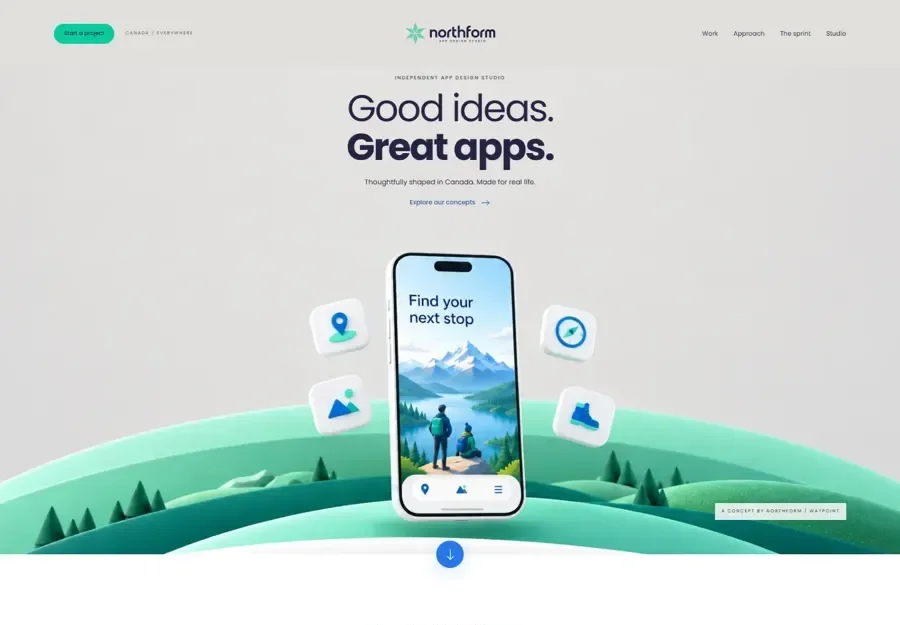
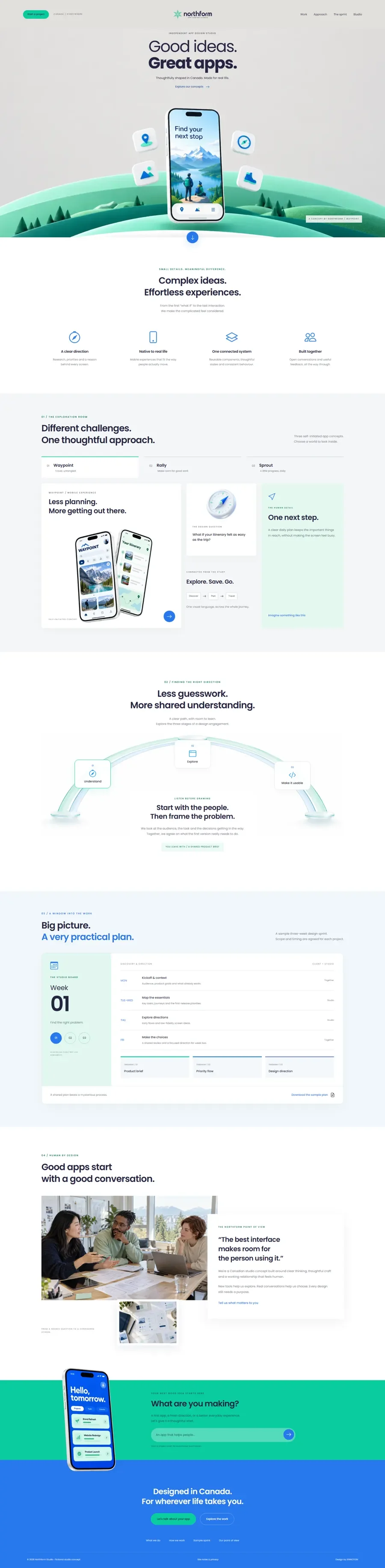
An app studio presentation that makes complex digital work easier to understand. Product visuals and project stories show different challenges alongside a consistent design approach.
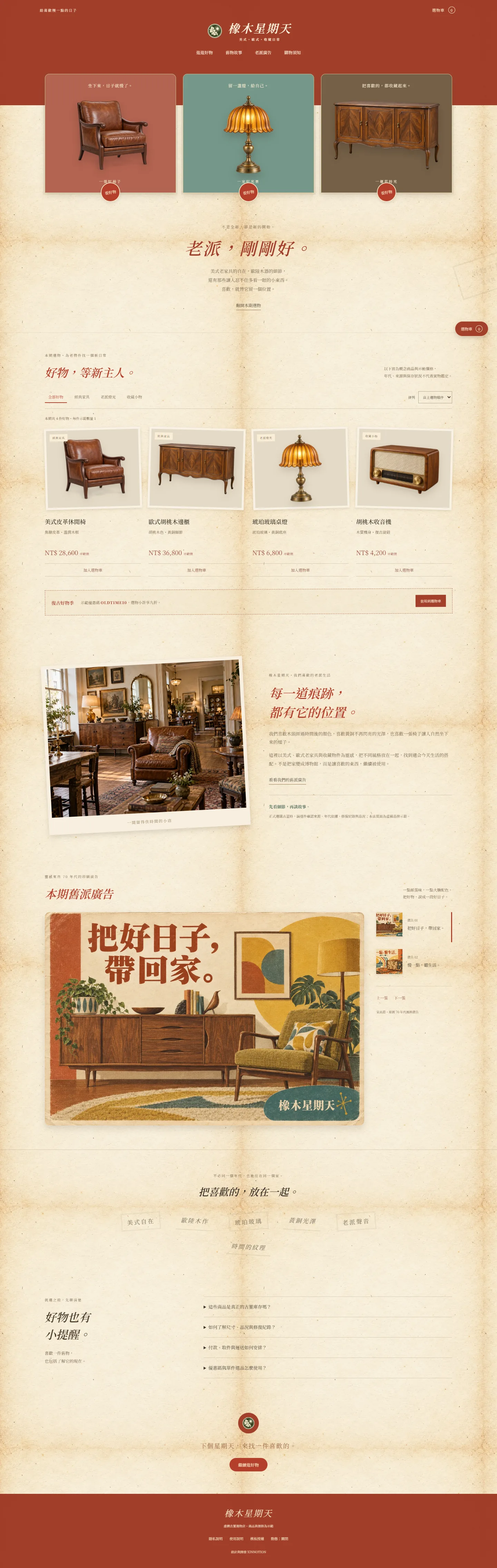
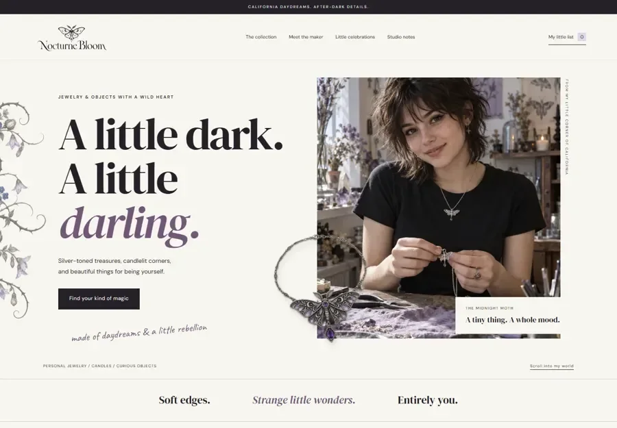
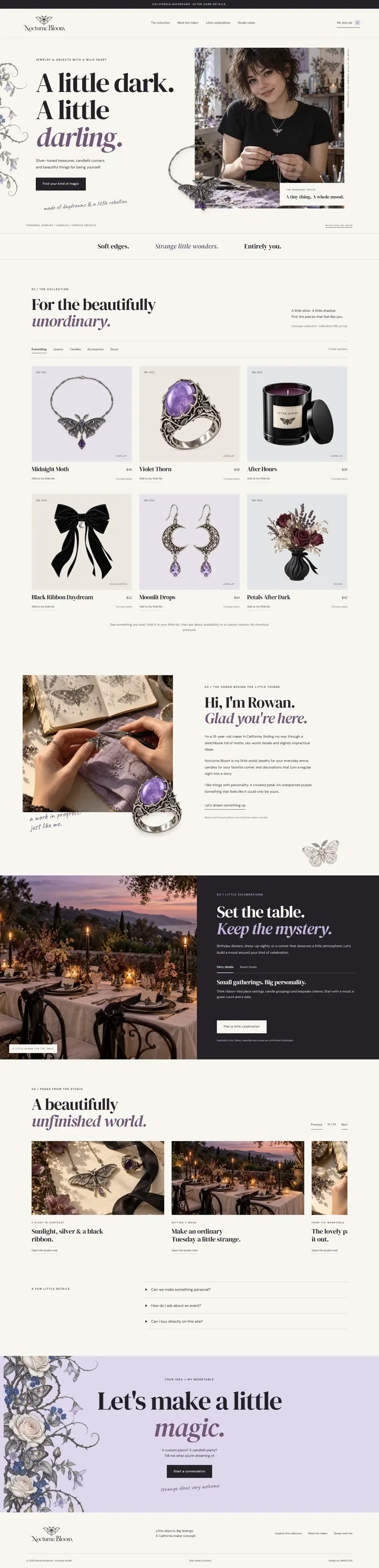
A lifestyle collection with a dark, playful personality. Jewellery, candles, accessories and décor share one visual world, supported by categories, a shortlist and gathering ideas.
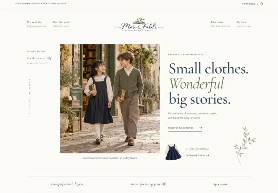
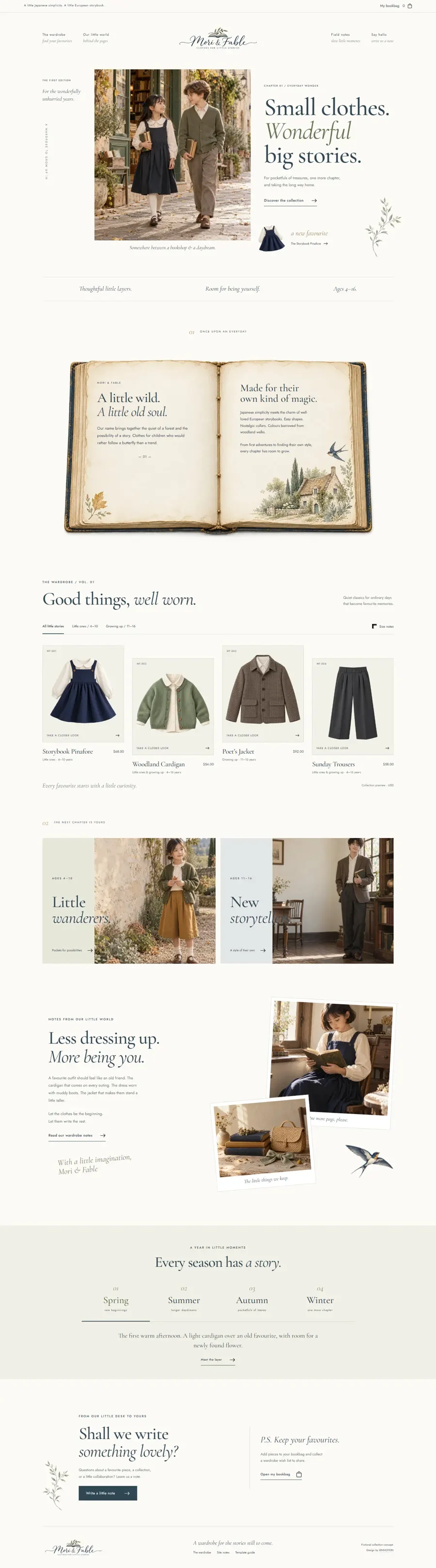
A childrenswear direction that brings clothing into a world of stories and everyday imagination. Age-based collections, size notes and a bookbag-style shortlist connect brand character with product discovery.
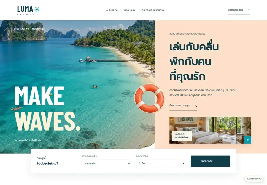
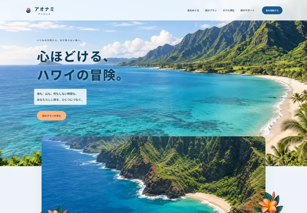
A Thai-language coastal experience built for different ways of enjoying a holiday. Activity details, equipment notes and trip selection help groups compare what they would like to do together.
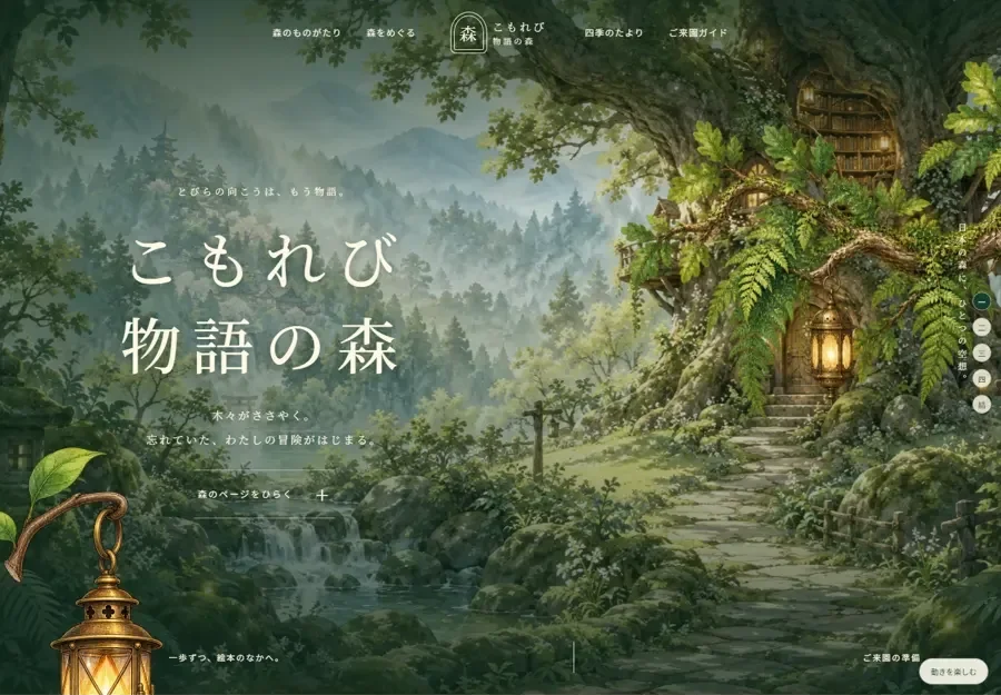
A woodland story world built around characters, places and seasons. Each destination becomes a chapter to explore, inviting families to connect with the setting before planning a visit.
A performer portfolio combining portraits, stage imagery, moving image and career milestones. The reading path moves from artistic expression to experience and an invitation to discuss a performance.
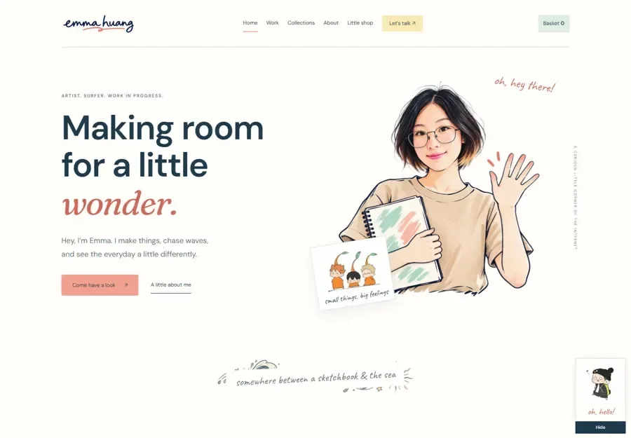
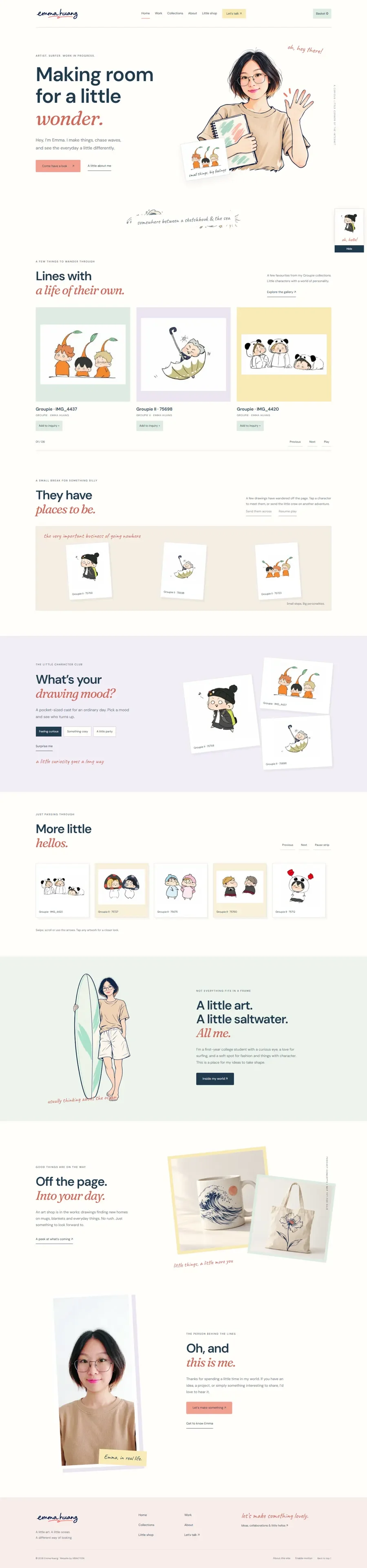
An illustrator portfolio with a recognisable world of characters and small interactions. Six pages provide room for the collection, while mood-based entry points and carousels make discovery feel personal.
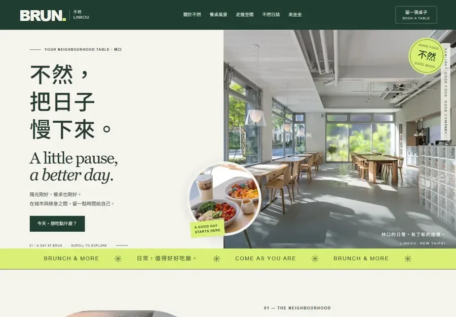
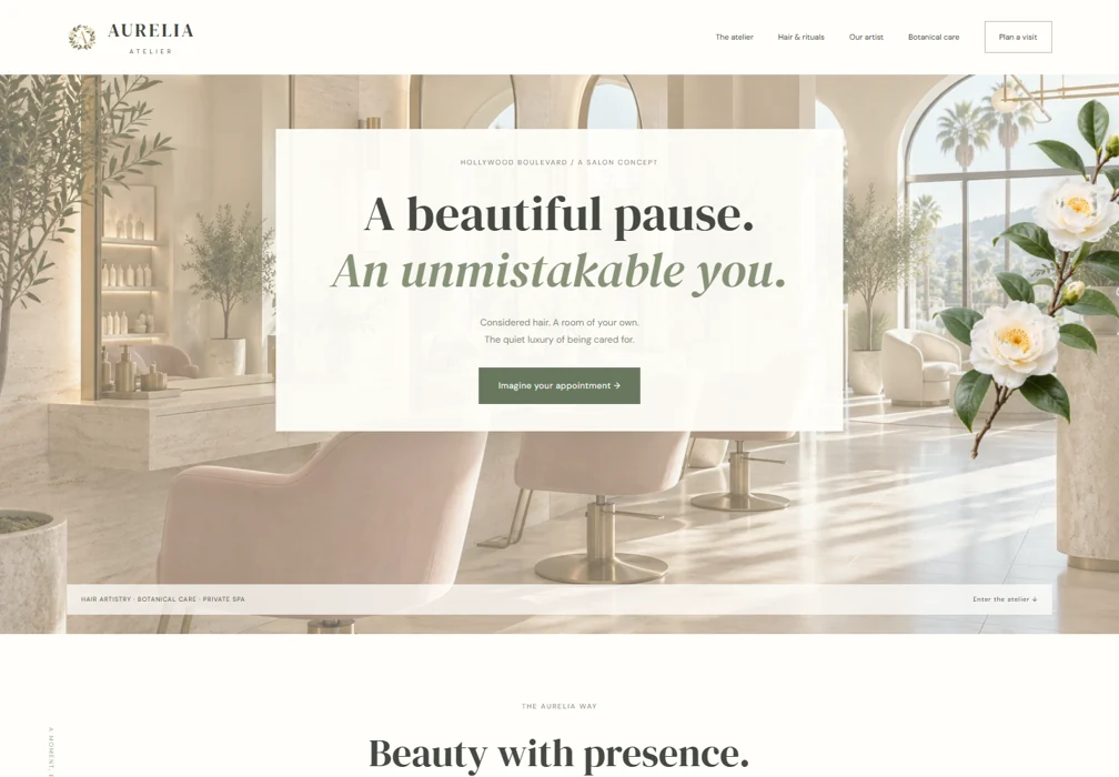
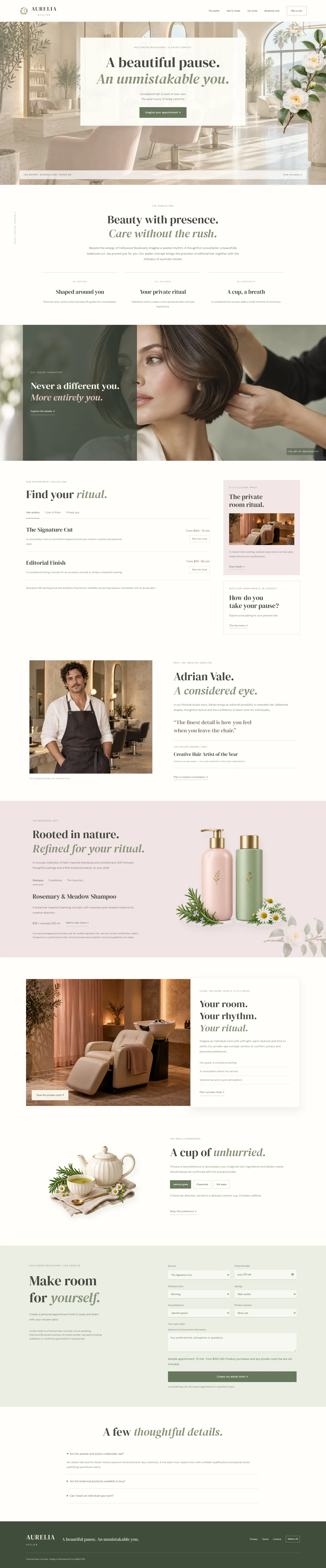
A neighbourhood café story shaped by daylight, greenery and the table. Food and interior imagery work together to introduce both the menu and the feeling of spending time in the space.
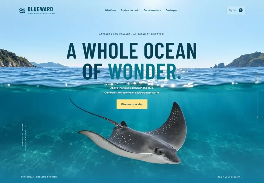
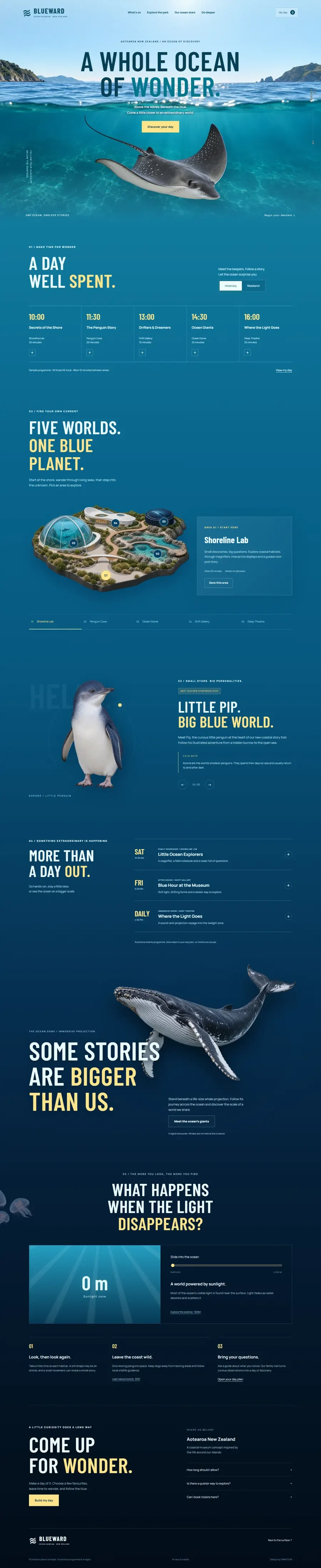
An ocean attraction presented as a journey of discovery. Distinct worlds, day planning and saved areas give families an approachable way to explore the visit before arriving.
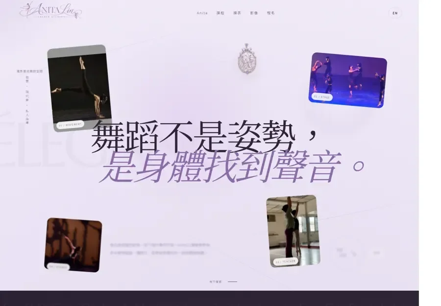
A dance studio identity that connects performance experience with teaching. Expressive photography introduces the atmosphere, while course pathways help parents and adult learners compare their next step.
We welcome design studios, marketing agencies and developers for shared delivery, project support, referrals and opportunity discovery. Start with a clear brief and agreed responsibilities.

 Art direction
 Digital experiences
 Thoughtful interaction
 Creative development
 Hover to explore